
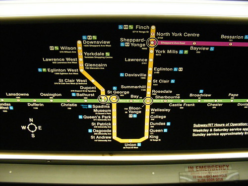
The May 2008 version of the subway map.
A brief update of an article first posted here in June: New subway maps dated September 2008 have just been spotted. The latest version is a return to the previous design, with easier-to-read text, and the return of the old station address scheme, where addresses represent the nearest street address on Yonge, University, Bloor and Danforth. The last version, with the sometimes useless (and in at two stations – Castle Frank and St. Andrew, incorrect) station addresses, may eventually become an amusing collector’s item.
Kudos to the TTC for bringing back the map that works.
The original post, dated June 26, 2008, is below.
– – – – –
The TTC has just begun installing a new 2008 edition of its subway network maps in subway cars. While there has been no expansion of the actual subway since the Sheppard Line opened, the TTC usually updates its subway maps every year or two. Map updates include information on station accessibility, whether paper transfers are required on connecting routes, and the locations of parking and washrooms.
The 2008 map updates are working their way through the system, though there has been very little change to station accessibility since the 2007 issue. In fact, apart from minor changes, the current map scheme, with white station names and circles has remained essentially the same since the opening of the Sheppard Subway in 2002. But the new maps differ considerably from their recent predecessors.
Laurence at 299 bloor call control was the first blogger (as far as I know) to comment on these new maps, and his analysis is spot on. The relatively readable faux-Helvetica has been replaced with a less readable bold font that bleeds with the back-lit illumination.
Even worse, visual clutter is increased by the new addresses on the maps. The TTC did away with just displaying the approximate address numbers along Yonge, Bloor, Danforth and Sheppard (only printing the street name where the subway deviated form one of those four streets), and now has the precise municipal address for each station. Coxwell Station now has a Strathmore Boulevard address, instead of 1568 Danforth Avenue, and Rosedale is now at 7 Crescent Road instead of 1009 Yonge.
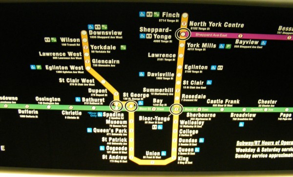
 The 2007 (and September 2008) version of the map is easier to read.
This new system is useless when looking for the closest station to an address on Bloor or Danforth. On Yonge, this is especially redundant, as not only are the stations already named for the cross streets, Yonge is also the origin point for addresses east and west of that street. So knowing that Dundas Station is actually at 3 Dundas Street East is not that helpful.
The TTC should go back to the drawing board and strive for a cleaner, less cluttered map.
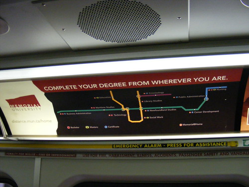
On another note, while taking pictures of the official subway strip maps, I noticed an older ad for St. John’s Memorial University promoting its distance education program. It isn’t the first time a subway map has been used in this fashion – old Dominion ads in the subway had the map with the “D” symbols showing their stores near subway stop. My favourite was the recent maps in the Montreal Metro for a brand of gum promising extensions to Halifax, Toronto, New York and Miami.
Memorial uses a variation on the iconic subway network maps to make the point that you can access their service from anywhere. But intentionally or unintentionally, the map is a poor copy, including a strange jog to the south on the east end of the Bloor-Danforth Line and Downsview appearing to be farther north than Finch Station. Perhaps the irregularities are to help distinguish itself from the official map, but to the trained eye, look sloppy.

34 comments
Has anyone else noticed that two of the addresses are wrong? St. Andrew Station should be on King Street West, not East, and Castle Frank Station should be on Bloor Street East, not West.
The municipal addresses are an excellent touch, if they could only get them right. Let’s say you’re looking for 2200 Yonge Street and don’t know which station to get off at?
St. Andrew and Osgoode have King St and Queen St addresses respectively, but St. Patrick and Queen’s Park stations have University Ave addresses. There isn’t even consistency.
Dumber than a bag of hammers …
Tuds
They really are naive about the role typography plays in legibility, aren’t they? And they obviously don’t test these things with vision-impaired users either.
Joe Clark is going to have an aneurysm.
I thought the same about the addresses – what’s the point of knowing that Chester Station is on Chester Ave? It doesn’t help me know where to get off to find 480 Danforth Ave. The whole point of the addresses was to know approximately where on the MAIN THOROUGHFARE the stations were located. This goes back at least to the Ride Guides of the mid-1970s where it said “street numbers shown are on major parallel streets served by the subway”. Back to the drawing board guys!
Oh for crap’s sake, can the bloody ttc choose a font and stick with it already??
Oh, this is terrible news. I can’t count the number of times I used the “old” address designations as navigational aids. I thought everybody did this.
I can see the need to provide the addresses of stations like Coxwell; I had trouble finding the station the first time I walked to it. The Strathmore address is useles, however, on a map you can only see if you’re already ON THE SUBWAY. This information belongs on the website and the printed maps.
This redesign reaffirms my suspicion that the people hired by the TTC to make these kinds of decisions do not actually take public transit.
I can’t think of any other transit system that even puts the station addresses on the in-car map. I always tolerated the small address numbers, as they related to the main street that the line paralleled; this business is utterly useless.
Their organization needs a complete re-education on visual design, if you ask me. How very sad.
“Joe Clark is going to have an aneurysm.”
I second that.
Insane. Utterly insane. So the TTC can’t be bothered to show streetcar lines on its rail map but feels the need to put an address only usable to someone with Google Maps?
Narrow maps over doors are line maps in every other subway — show the stations on the line so people know what’s coming up. That’s it. Use big panel signs if you want to convey the entire system… but then again, that means learning from what everyone else does and the TTC can’t get its freaking head out of the sand.
Fire every graphics person at the TTC… fire them all.
From what I recall they used to have the station names printed in the colour of the lines (e.g. B/D = green). Once the Sheppard line was added they continued with this so the pink/purple/whatever was barely readable on top of the black. They changed those back to newer/readable versions fairly quickly, so hopefully they’ll do a quick rethink of this version as well…
you can complain directly to the TTC about the maps by filling out this form https://wx.toronto.ca/inter/ttc/feedback.nsf/scomplaint?OpenForm
if they’re prone to changing or reprinting them every couple of years, hopefully they’ll go back to a useful incarnation.
uSkyscraper: you’re spot-on. Plus, what’s going to happen when Spadina goes as far north as VCC? YUS is already shrunk on the map compared to B-D, and they couldn’t possibly shrink it down any more. Another huge annoyance about the current (2007) maps is the fact that Kennedy station is shown to be about as far south as St Clair, and the RT line shows a huge distance between Kennedy and Lawrence E, and then half that distance between Lawrence E and Ellesmere (even though both are equal distances apart). I know the map is not to scale, but at least make an effort for stations to line up on appropriate cross streets!
This is a horrible change. Please fire the TTC graphic department.
The TTC needs to hire professional graphic designers.
Horrible.
This city is full of people with equal love for good design and efficient transit. Why aren’t those people employed by the TTC? I cannot imagine that some buearucrat decided that it was necessary to have the actual addresses on this map.
Oh TTC, what ridiculous, completely neglectful and inefficient thing wont you do?
Similar lack of attention to details story – A couple of weeks ago, Etobicoke homeowners got their new Garbage and Recycling Calendars in the mail with a big yellow sticker on the front saying our collection day was changing starting on July 1st and to see inside for further details. But inside the calendar there was no further details because the month of July was missing – the calendar started at August.
This morning (June 27th), a single sheet of paper that was the missing calendar page for July was hand delivered (it arrived much too early for it to have been delivered by Canada Post) to houses in the area.
You have to wonder how much extra money was wasted because the original calendars were not properly reviewed before they were sent out.
If it ain’t broke, don’t fix it…
I have not seen one in the flesh yet, but from the photos it looks like they have replaced Swis721 BT (the Helvetica clone) with Swis721 BlkCn BT. I would imagine that this is because they can increase the font size without increasing the width. (Text now 15% taller!!)
I will second the call for reinstating usable street addresses. (I suppose I could argue that the new addresses are useful if I’m on the subway going to, say, 360 Strathmore.) I am not overly concerned about the horizontal stretching, in principle, though, even if there is room for improvement — how many subway maps don’t stretch or compress things one way or another?
Correct me if I’m wrong, but wasn’t the TTC in a huge budget crisis not all that long ago? Hiring graphic designers and printing enough maps for the subway fleet and the rooms of first years at Trinity College, must be fairly expensive. Would it not perhaps be a bit more prudent to curtail the redesigning of a map that, hasn’t exactly changed at ALL, in favour of buying gas for their buses? It won’t be much cash comparatively, but come on every little bit counts. PS – anyone else remember the stickers they used to use after the Downsview extension was finished? Apparently aesthetics haven’t always been the better way.
I saw it and thought it was a further step in the ugly direction. Chucky and hard to read, it looks like a first draft that got approved.
Back to walking and biking.
This might not be a concern for a while, but has anyone thought about the TTC’s plans for expansion? The Spadina expansion into Vaughn will cause alot of problems for maknig these maps. There’s no room as there is! Plus, the whole Transity City plan with light rail, which *should* be done by 2020, will also five the map designers something to grapple with.
My congratulations to the TTC on responding to this issue in an uncharacteristic way: effectively and (reasonably) quickly. The map re-make was truly awful, but I am genuinely surprised and impressed that a relatively mundane issue like that caught the attention of the TTC well enough that they did something about it.
@The Joker: I figure that the TTC map will eventually be a square and will be posted in place of some of the ads, perhaps 3 to 4 throughout the car like in other systems. I agree, the super-short and long rectangle doesn’t seem like it will survive forever.
The new font is definitely not easier to read, it’s much denser and harder to read. The full address listed for each station clutters the map alot too. I have to squint to read this map.
It’s bloody awful! Why doesn’t the TTC hire some decent graphic designers instead of having engineers design graphics?! It’s always 1 step forward & 3 steps back with them.
Mike: The new map (not the one posted in the image, the awful May 2008 version) goes back to the fonts and addresses used in the 2007 and earlier versions. The new, new map is a lot easier to read than the short-lived May version, which will likely be with us for a while still. It begs the question why they went with the waste-of-time redesign, however.
To my knowledge, not a single qualified graphic designer, let alone a registered one (Ontario, uniquely, has a registry), works at the TTC. That isn’t likely to change given it’s a Windows shop from start to finish. That, of course, is a central problem.
I haven’t actually tried it out, but something tells me the revised addresses on the map correspond to an address you could dump into a GPS unit or something like google map. Given that most of the Bloor-Danforth stations are actually a half-block north of said streets it looks like this might be the case.
And just to add spice to this thread, the interactive subway map (gosh gee golly!) on the TTC’s website doesn’t have addresses at all, not even information telling you what intersection the stations are at.
http://www3.ttc.ca/Subway/interactivemap.jsp
It will tell you that Castle Frank is
Accessible: No
Side platform
But don’t expect it to tell you where it actually IS.
As for GPS based locations, the last time I looked most people don’t have a GPS device, especially in the subway.
Expecting everyone to have technology to access a new system is kind of like assuming everyone is a motorist and carries a driver’s licence.
I left a comment here last night, but I think the site ate it as spam.
If you go to the TTC’s website and look at the interactive subway map, it won’t tell you the address or the intersection location, but it will tell you whether it’s a centre or side platform station, if you need a transfer, and whether it’s accessible.
You will have to find the station on your own.
In response to the availability of GPS service, a lot of the newer mobile phones come with this feature (presumably to provide directions), so having the station address may have some merit. I’m not sure how to reconcile the GPS addresses with the civic addresses on the map. Perhaps some sort of compromise or simply get wireless signals underground.
The TTC did finally go back to the drawing board by bringing back the late-2007 to mid-2008 style. Fake Helvetica is used, once again, and returned back to relative street addresses.
This time, St. Andrew and Castle Frank subway station have proper relative addresses.
Too bad I did not capture a picture of it… I’ll try to get one later this afternoon.