
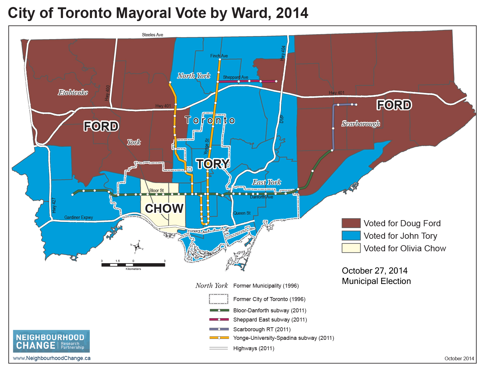
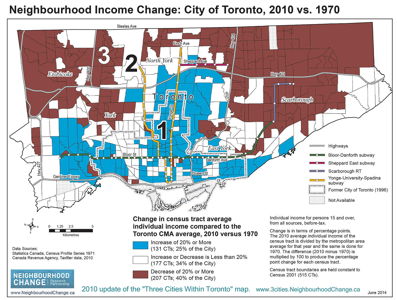
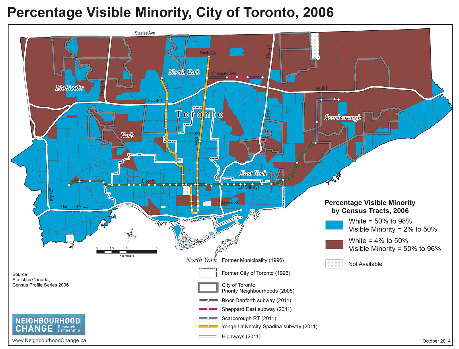
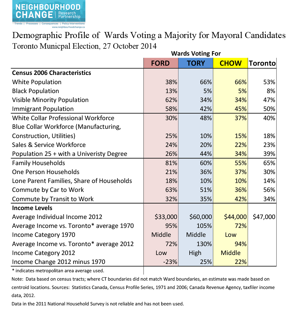
Over the past three decades, Toronto has become an increasingly divided city, economically and racially. And those divisions were starkly apparent in Monday’s election results. Toronto’s electoral divide, however, is not along partisan political lines. The divisions are based on socio-economic, ethno-cultural and skin colour characteristics. Indeed, the wards that supported John Tory and those that backed Olivia Chow share many of the same demographics: they have significantly higher socio-economic status and less ethno-cultural diversity.
The trends dividing the city began in the 1990s. The most expensive item in an average household budget is housing, due to rent or mortgage costs, and utility payments. Between 1993 and 1995, the federal Liberal government and the Ontario Conservative government ended social housing supply programs and many related housing supports. Little new rental housing is being built as existing rental buildings age. A federal minister once told me: let them live in condos. Some do – but only those who can afford to.
The loss of well paying, unionized jobs with benefits following free trade agreements, global financial markets, and ‘efficiencies’ in corporations and governments (e.g., contracting out to firms paying minimum wage) have decimated the once large and growing group in the middle of the income distribution. We have a polarized labour market, with many more at the bottom and a few more at the top.
In the 1980s Toronto also began to add ethno-cultural diversity to a population once mainly of European origin. Yet we do not talk much about, let alone act on, employment, housing and education discrimination. That’s a problem in the United States, many believe, not here. There is a growing gap in fair opportunities for upward mobility no matter how hard one works and how successfully one pursues education and training.
All this produces a great deal of resentment and a very real polarization based on lived experience between “us and them.”
What does all this mean for our new mayor — someone who earned the win in part by actively engaging in these issues in civic coalitions and a variety of initiatives?
The trends, as Tory knows, are of our own making. Most western and northern European comparator nations, with the exception of the United Kingdom, are less polarized because they make better policy choices. But municipal governments did not cause, to any significant extent, the negative trends dividing Toronto. Rather, municipal governments have to manage what our senior governments create.
It is easy to itemize the federal and provincial policy changes that have driven the loss of affordable housing, income and service supports, labour market regulations. Huge federal and provincial tax cuts, individual and corporate, helped reverse the post-war trend toward a more equal income distribution.
At the municipal level, the few available revenue sources are not as fair or lucrative as a progressive income tax. Besides the equity consideration, many municipalities are collecting less revenue in real terms than in the past, a dynamic that only adds to the growing divide.
It took thirty years to divide Toronto into three cities. And as this week’s election vividly demonstrated, those social divisions produce a divided voting pattern. Over time, it is possible to incrementally reverse these trends, year after year. But this long-term goal can only occur if city council, and a mayor with a bully pulpit, are willing to not only advocate for change, but also take meaningful steps that will help create a city with fairer opportunities for all, thereby reducing the divide writ large on our electoral map.

J. David Hulchanski is the author of the “Three Cities of Toronto” report, a professor in the Factor-Inwentash Faculty of Social Work, University of Toronto, and is a lead member of Neighbourhood Change Research Partnership, with more information at NeighbourhoodChange.ca.


9 comments
The Star had a good map of voter turnout in this election and the 2010 one (http://www.thestar.com/news/mayoral-election-turnout-over-time.html). This year, the lowest turnout was in those wards where Ford won. Not sure how this ties into your story, David, but it’s probably along the lines of voters in these wards feeling disenfranchised.
Could you include a “City of Toronto Mayoral Vote by Ward, 2014” map and/or Demographic Profile for 2010 in this article (for posterity’s sake)? Anyone with an interest in Toronto politics should read this.
Some interesting analysis, but the premise seems exaggerated. Please explain how Torontonians of colour (often highly educated professionals) are discriminated against in housing and education? Be specific. I live in Ward 41 (northeast Scarborough), and we are largely middle-class. Yes, we are mainly (around 90%) people of colour, but have you popped by lately? Don’t automatically equate colour so broadly with class. It’s a smear. The burbs have pockets of low-income housing & TCHC, but the idea that people here (53%, not a crazy majority) voted Doug Ford because they are ‘disenfranchised’ instead of the obvious (talks straight, shows his face in local areas, wants to ‘keep taxes low’, and build subways (sounds good to casual observer) seems like a convenient rather than truthful & insightful narrative. Dig deeper – do a real in-depth survey of Doug Ford voters, visit the neighbourhoods you are labelling so negatively.
The other map that is interesting is to superimpose the TTC subway map with the election results. Areas with/near subway voted Tory/Chow, those with no subway voted Ford.
Subway may not be warranted in these areas, but elevated transit or transit in hydro corridors would satisfy the need for RAPID transit.
One step you can take right now to reduce division: produce a red-green-blue saturation+hue version of the mayoral vote by ward map. Only if everyone in a ward voted for Ford should the map appear purely red, etc. If everyone’s vote helps determine the map colour, we’ll all see that the divisions are real but not as sharp as they might otherwise seem.
It seems clear from these maps that Ford did very well in lower income areas. To me, this is just astonishing. It raises the question of whether these voters understand their own interests, and how the different candidates stand in relation to those interests. I have my own view about this, but I could be wrong. I’ve heard interviews and reports of voters in the lower income suburbs who say that Ford would have kept their taxes low. That is one of their main worries: higher taxes. But Ford as well as Tory want to go ahead with the Scarborough subway, which will cost Toronto taxpayers in excess of $1 billion dollars. (Whether that subway is a wise plan is very contested.) Won’t that requires a significant tax increase, across the board? Also, lower taxes have meant cuts to social services, libraries, etc. Don’t people in lower income neighbourhoods depend on these services? Perhaps they don’t. Or perhaps they don’t make the connection between tax cuts and cuts to services. Or maybe they do see that connection, and they do depend on these services, but they still would rather have the extra money in their pockets. My own view is that they don’t see the connection, but I could be wrong. I haven’t actually gone out and talked to them, which I admit is a pretty good idea…
“The other map that is interesting is to superimpose the TTC subway map with the election results. Areas with/near subway voted Tory/Chow, those with no subway voted Ford.”
Overall income, and falling incomes, provide a better predictor of voting patterns than subway or transit access, however it likely was an issue.
Some who lived in areas without subways likely heard Ford’s subway to every subdivision promises, and voted for that. Considering that drivers made up most of Ford’s support, there were probably a lot of others that believed that getting buses and LRT off the road, or just blocking LRT expansion would somehow be best for drivers. Like most populist Ford logic it is based on the kind of simple gut reactions that don’t actually hold up in real life.
Areas with convenient transit also tend to more expensive overall, with the wealthy outbidding the poor for choice neighbourhoods with advantages. Thus, many car owners who bought into neighbourhoods along subway lines, but rarely or never us it, have priced out non-car owning families, which are stuck with long bus rides and many transfers. Many might move out of ‘Ford Nation’ if they could afford to, although buying a car is the primary goal of many in the pedestrian hostile suburbs.
It would also be interesting to see how voters differed between those who rent and those who own. Renters do not automatically see tax increases passed on (and likely never see property tax cuts). So do they vote for lower taxes without actually knowing how much tax is paid, and how much an increase actually costs?
HelenInToronto, you suggest that the author of this article, or Spacing magazine, do some more indepth research into why people in certain wards voted overwhelmingly in favour of Doug Ford to paint a more accurate picture of the election results . It is true that this sort of research is fairly generalized, nevertheless, I don’t think the election results can be boiled down to the simplified fact that people in certain wards saw Doug Ford as a “straight talker “. This doesn’t explain why people in the other wards demarcated by the author’s research view the Fords as villains. After all, the other major candidates are also “straight talkers “depending on which ward you live in.
I have had the pleasure of living in both Scarborough and the downtown core and still spend much time in both places. Surely I can’t be the only one to feel this way, but the resentment and almost hatred towards the downtown is almost palpable in Scarborough. It really does feel like two different cities to me. There is a completely different social/political culture that separates the two places. I have spent, and continue to spend much time trying to place my finger on just what that difference is. To the best of my meager abilities here are my observations and experiences : when I lived downtown, I didn’t own a vehicle (couldn’t afford one if I wanted to) and walked everywhere… To work, to groceries, to entertainment, to visit friends, as did the vast majority of people around me. This meant that I was constantly bumping into people I knew and having to meet new people everyday. When I lived in Scarborough, this simply did not happen and still doesn’t. In Scarborough, I barely knew my neighbours, and the ones I did get to know (although very nice people) I rarely saw. Both the downtown and Scarborough have their pockets of low income, working- class, middle-class and bougie neighbourhoods. But Scarborough, to me, feels more working-class whereas the downtown, perhaps due to the condensed environment, feels more mixed. Frankly, the downtown environment is conducive to a much more sociable culture, which leads to a very different political outlook than the suburbs. Neither is right or wrong, they just are, and in my opinion, unbridgeable. The solution is deamalgamation. The suburbs, such as Scarborough, need to be free of the centralized political power in the downtown core and develop their own political/cultural /social centres that they can either resent or be proud of. As things currently stand, the downtown core will forever be subject to the will of the inner burbs as long as the city remains amalgamated, and the burbs will forever feel left out. The demographics dictating this are not about to change over the next few decades. Where is the movement for deamalgamation?