
Yesterday, University of Toronto Professor David Hulchanski summarized the link between Monday’s election results and the increasing socioeconomic divisions in Toronto that he has been studying for years. While John Tory and Olivia Chow were elected in wards that have significantly higher socio-economic status and less ethno-cultural diversity than those that backed Doug Ford. There are other stories that can be found when the preliminary data (official results have not yet been released by the City of Toront0) is analysed. Voter turnout increased across the city, and there are corners of the city in which “Ford Nation” remains strong, a symptom of a disturbing trend discussed by Hulchanski.
Drilling down
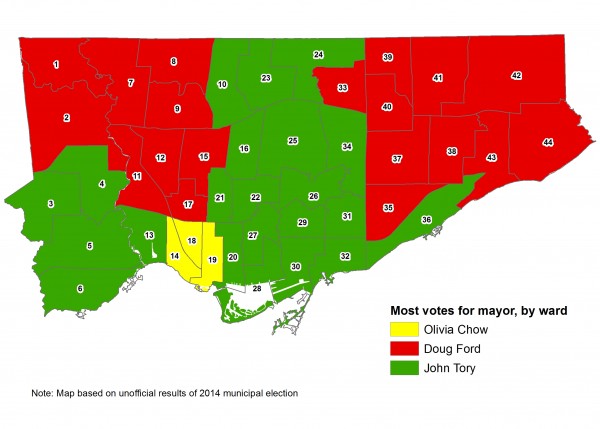
Most maps published of the results of Monday’s municipal election (all showing the support for the Mayor of Toronto) so far have shown how each ward voted for mayor. So far, most maps, like the one above, have illustrated which mayoral candidate won a plurality of voters in each ward, few show the margin of each ward’s “win.” The map below shows the margin of votes of each ward, and tells a better story. One can see that Doug Ford’s support was strongest in the northeastern and (especially the) northwestern corners of the city, and John Tory’s support strongest in four wealthier Midtown wards. Downtown, the number of votes for Tory is softened by support for Olivia Chow, in North York and southern Etobicoke, by support for Doug Ford.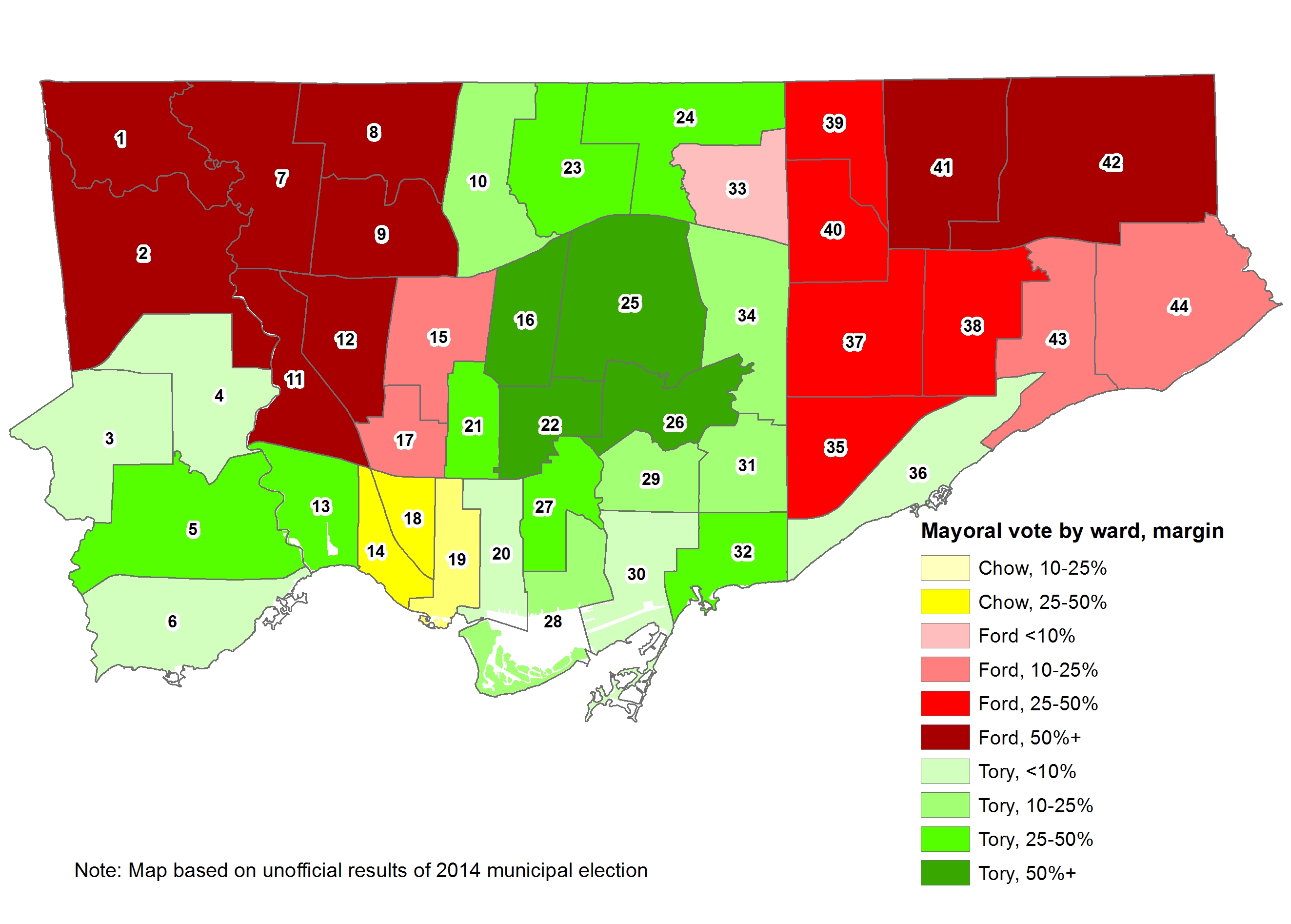
Results of 2014 mayoral election by ward
In 2010, Rob Ford won the mayoral race with 47.1 percent of all votes, and a plurality of votes in 31 of Toronto’s 44 wards, and a majority in 24 of those wards. George Smitherman, the early front-runner, got 35.6 percent of the vote and won the remaining 13 wards, and a majority only in 6 of those. Councillor Joe Pantalone, the standard-bearer of the left, got 11.7 percent of the vote and only managed to place second in Ward 19, the ward that he represented at City Council for many years. The 13 wards that chose Smitherman form an inverted “T” on a map – similar to the boundaries of the old, pre-amalgamation City of Toronto. (See map below.)
The polarized electorate is very much evident on both maps that show the margin of each candidate’s success in each ward. In 2010, 19 wards selected Rob Ford over George Smitherman by margins higher than 50 percent. With the exception of Wards 25, 26, 29, and 31, every ward located mostly outside the old City of Toronto voted for Ford by at least a 25 percent margin. The “Downtown” Wards 19, 20, 27, 28, and 30 selected Smitherman by margins over 50 percent.

Results of 2010 mayoral election by ward
In 2014, the map changed. John Tory was the first choice of voters in half – 22 of 44 – of all wards. Doug Ford came in first in 19 wards and Olivia Chow first in three. But the northeastern and (especially the) northwestern suburbs stubbornly stuck with the Fords. In 12 wards, Doug Ford got more votes than his brother did in 2010 (not completely unexpected given the increased voter turnout). In five of those wards – Wards 1, 7, 8, 9, and 42 – the percentage of votes for mayor increased for Doug Ford over Rob Ford, in defiance of the prevailing mood of most of Toronto.
John Tory, the newly elected mayor of Toronto, has his geographic base of support in Midtown Toronto – the leafy neighbourhoods between Bathurst Street and the Don Valley Parkway and between Bloor Street and Highway 401. This contrasts to 6 wards in northern Etobicoke, Downsview, and York South-Weston, where Tory could not even win 20 percent of the vote. This – the last bastion of the Ford Family’s power base – is a large part of the city that desperately needs to be united with the rest of Toronto – economically, socially and politically.
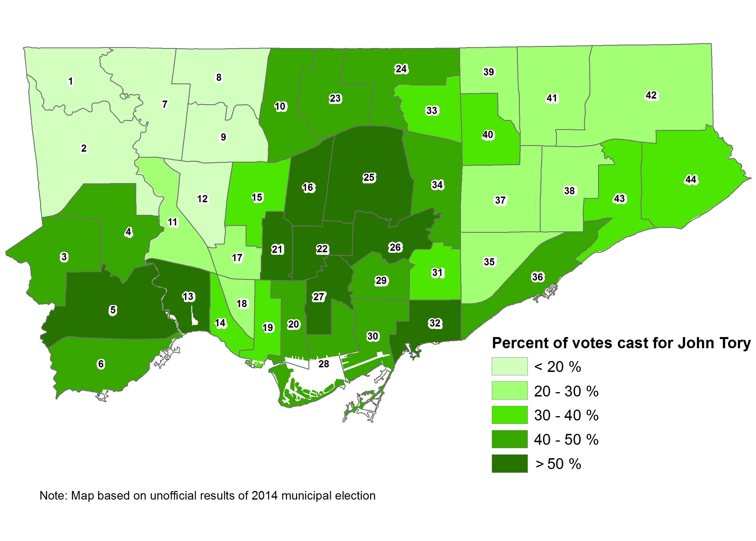
Percentage of votes for mayor-elect John Tory by ward
Voter Turnout
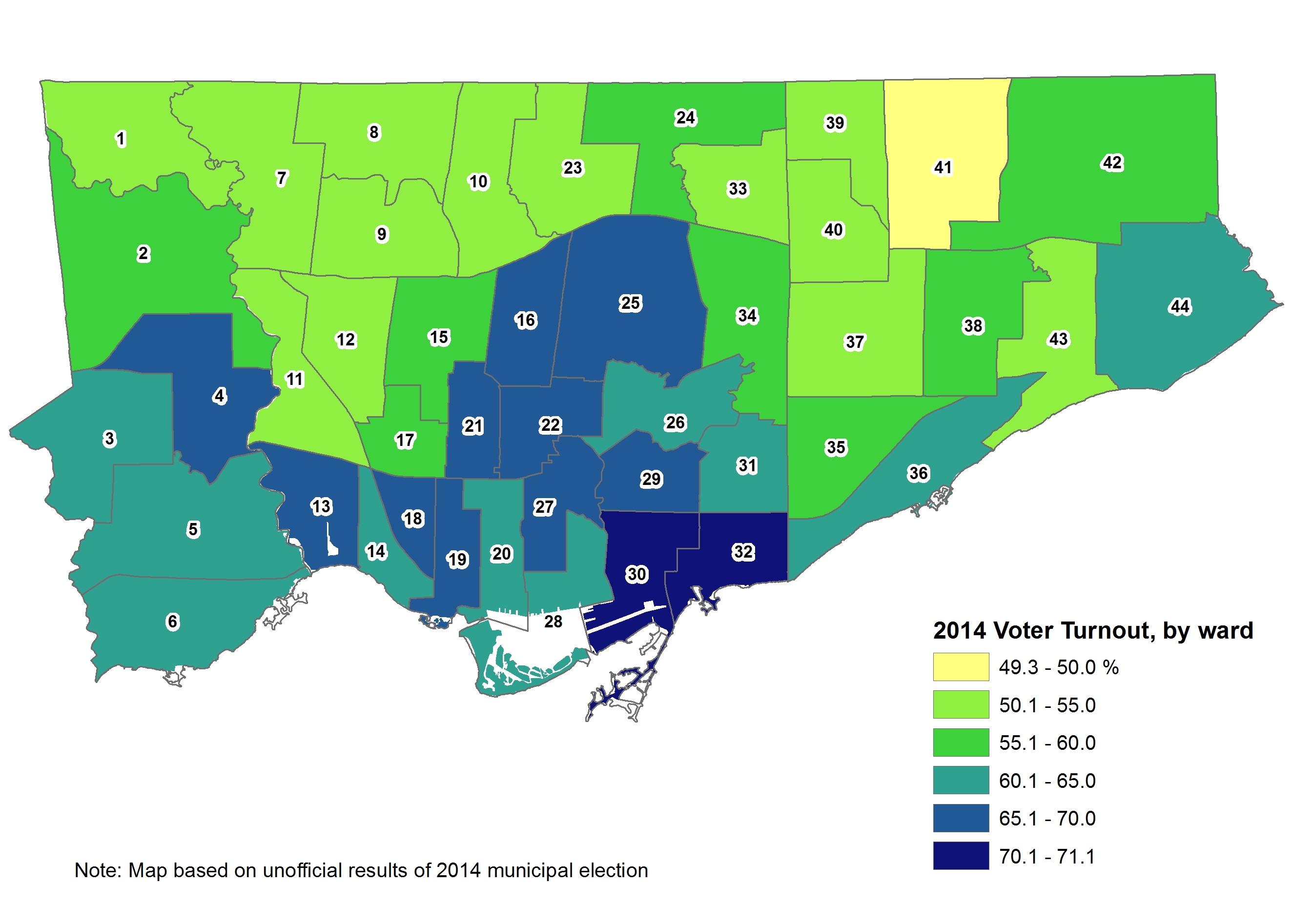
In 2014, voter turnout was 60.3 percent, the highest in the history of the amalgamated City of Toronto, and a significant increase from the 2010 figure of 50.6. The highest turnouts were in Wards 30 and 32, both featuring high-profile council races; the lowest turnout was found in Ward 41, in northern Scarborough, where incumbent Chin Lee was easily re-elected. The second map shows the change in voter turnout in 2014 versus 2010 – while every ward saw more voters heading to the polls, those in wards that voted for Tory or Chow generally saw the highest increase in voter turnout.
Voter turnout in municipal elections is an interest of mine. A recent study written for the Maytree Foundation, by Ryerson professor Myer Siemiatycki and myself, examined voter turnout in the 2003, 2006 and 2010 municipal elections. It found connections between high concentrations of immigrant and visible minority populations and lower voter turnout (with interesting exceptions, such as in Thorncliffe Park). Desmond Cole wrote an excellent summary of this study in Torontoist last week. The overall increase in voter turnout is encouraging, but the same patterns of high and low voter engagement identified in that study appear to persist.

7 comments
There is quite a strong correlation between voter turnout and voting intentions in the case of Tory and Ford: I’ve plotted the data by ward here, see http://imgur.com/5J66RCe. In the case of Tory, it’s a positive relationship, and in the case of Ford it’s a negative relationship. When a lot of people turned up, they really didn’t vote for Ford!
My last attempt at a comment seems to have gotten mangled. I’ll try again.
On the “Percent of Votes Cast for John Tory” map, the less than and greater than signs in the legend look like they’re flipped.
The “> 20 %” (greater than) should probably be “< 20%" (less than) and the " 50%” (greater than)
Hi Geoffrey. Thanks for the feedback. I’ll make the fix as soon as I can.
The map also correlates with rapid transit lines. I wonder if the opening of the Spadina extension will reduce Ford support in York Centre and York West by 2018.
I’m curious as to whether Tory’s margin of victory can be attributed to higher turnout in areas that supported him. Would probably require a slightly complicated set of calculations.
@Dylan Reid, the correlation analysis I mentioned in my first comment here certainly suggests this!
Dylan,
Pretty straight forward math I would think, if you have the numbers.
You’d need Tory’s support as a % of votes cast in a ward (t), and the total number of votes cast in the ward (V).
t x V will give you the total number of votes received by Tory in that ward… if you change V, but use the same t value, you’d get your new hypothetical total votes cast for Tory.
You could come up with a similar function for Ford in each ward. If someone tells me where the numbers are centralized, I’ll play around with it on a spreadsheet.
I suspect you’ll find that the passion with which “Toronto” showed up to vote for anyone-but-Ford, as opposed to the milquetoast passion with which “Etoborough” showed up to vote had a lot to do with his defeat.
R.