
This summer, a pilot project will be launched to test a new wayfinding system in the PATH — Toronto’s subterranean navigation-slash-commercial network of tunnels, shops, and food courts. The system, currently being called #PATH360, will dispense with some of the more frustrating aspects of the current system (which hasn’t seen a major upgrade since the 1990s) and will implement what designers hope will be an easier to navigate, clearer, and simpler approach to wayfinding in the PATH.
Designed by Steer Davies Gleave, the system is touted as “the first step toward a world-class wayfinding system,” by James Brown, the principal consultant on the project. “It’s really a very important part of urban infrastructure,” says the Toronto Financial District BIA’s executive director Grant Humes. “This is about helping people move through the space” and “place the PATH within the context of the city.” By forging more links with the above-ground TO360 wayfinding system (the new downtown map totem system was also designed by Steer Davies Gleave) and with the city’s subway system, the hope is that the PATH will become a more integrated part of city navigation. The first step, beginning this summer, is a pilot project to test the new map and signage system. By 2018, designers and the BIA hope that the existing signage in the PATH will be replaced with the new system.
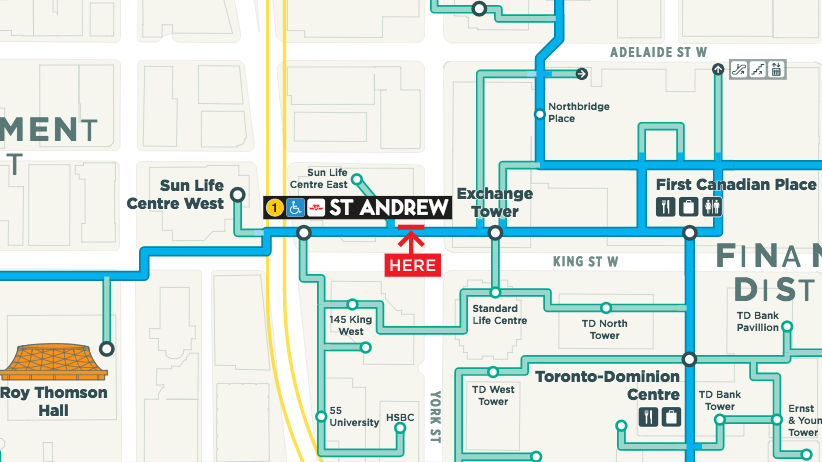
This will come as welcome news to anyone familiar with the uniquely unpleasant experience of navigation within the PATH network. To properly appreciate the announcement, it became necessary to establish a baseline of experience. Perhaps in the name of journalistic science, or perhaps out of sheer self-amusement, Spacing’s editor Matthew Blackett sent me in to the PATH network with a goal: get from the Hilton (at University and Richmond) to One King West (at Yonge and King), then to Bell Trinity Square (beside the Eatons Centre), to Roy Thomson Hall (at Simcoe and King), and back to the Hilton. By Google Maps’ estimation, this walk should take 42 minutes end-to-end in the PATH network — almost exactly the same length of time estimated for the above-ground trek. On the surface, this doesn’t seem so difficult. Hitting these three destinations would be no problem above ground; how much harder could it be underground, where the city has put in signage “developed to provide pedestrians with better ease of use and functionality?”
I have yet to fully forgive Blackett.
LOST IN THE PATH
11:00AM
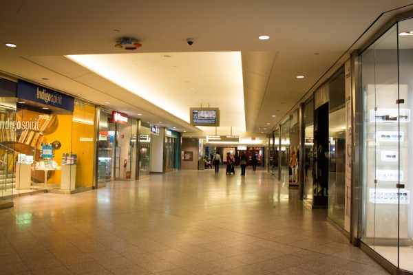
The City of Toronto calls the PATH network a “downtown underground pedestrian walkway.” As far as I can tell, this is a vast oversell: after a first-hand experience navigating in the PATH, it is hard to see any reason why any unfamiliar pedestrian would make the free and uncoerced choice to use this system to get anywhere on time. (One of the major benefits touted is the fact that the PATH offers respite from the elements, which upon reflection feels rather like being animalistically forced underground.) The PATH is a mall, first and foremost. Beyond access to over half a dozen food courts, at least two massage parlours, and more sushi restaurants than I cared to count, I put it to you that, with its existing wayfinding system still in place, the PATH offers nothing especially preferable over supra-terranean navigation.
There’s an old text-based adventure game from the 1970s called Colossal Cave Adventure, where the players have to navigate through a maze, where the description of each room is exactly the same: “you are in a maze of twisty little passages, all alike.” Trying to find your way around the PATH, with its current wayfinding system, feels a bit like this. It is a seemingly endless maze of mall corridors, hallways, and atriums. Unless you are a person for whom the distinctions between Jamba Juice and Jugo Juice are particularly meaningful, everything in this place feels exactly the same; with each new tunnel you encounter in here, the space expands physically while being visually constricted. Because this space lacks the distinctive landmarks that you often find above ground, there is very little to distinguish it from every other mall you’ve been in. The more of it you explore, the less it feels like you could ever remember any of it.
The thing about maps, especially those in the PATH, is that they are essentially useless to anyone who is good and truly lost. A significant portion of the maps don’t have a handy red YOU ARE HERE marker on them, compounding their uselessness. A good chunk of them are oriented something other than north-upwards.
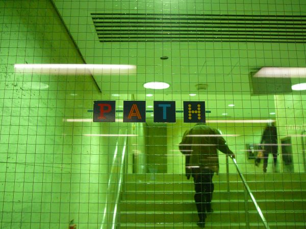
I don’t consider myself a bad navigator. Actually, I’m somewhat smug about it. I’m the kind of person who doesn’t understand how anyone doesn’t have an ingrained sense of north-south-east-west. I was fairly certain that this particular quality might actually lend itself useful here, because here’s another thing about the PATH: the whole system works on compass directions, except that instead of the standard and broadly agreed-upon alphabetic representations, the entire system is predicated on a seemingly arbitrary colour code: Blue for north, yellow for east, red for south, and orange for west. Should you occasionally and at fortuitous locations glance upward, small markers will remind you of this codification, but in general, the wayfinding system assumes that you caught this on your way in. The logic behind it, as best I can tell, is that if you know you need to go east, you simply follow as many yellow arrows as it takes to get you where you need to be. Except that, since the network of tunnels that make up the PATH network follow no discernible pattern and generally deviate from the city’s street grid, there is no guarantee that any trip east-ward won’t include significant north- or south- or west-ward deviations. Why anyone would dream this system up is anybody’s guess.
11:08AM
I’ve followed a blue arrow and have ended up somewhere in or around the Richmond-Adelaide Centre. I’m in a food court. The PATH is full of food courts. Actually, the PATH is just full of food, period. There are full sit-down restaurants, sushi restaurants, coffee shops, a whisky bar and many iterations of the type of place that exist only in mall food courts: fast-food outlets that sell bland, quick versions of ethnic food. These places are always named ‘something Express,’ as in Teriyaki Express or Thai Express or Curry Express or Bayou Express. There’s a few people eating, all of them alone. I’m beginning to wonder just how long they’ve been down here.
11:31AM
The PATH’s confusing, twisting network of tunnels is the lasting legacy of the haphazard way that the tunnels were built. Prior to the 1970s, the ancestors of the PATH network were a handful of tunnels build to connect various different buildings, the first having been built in 1900 to connect Eaton’s with its satellite buildings. In the 1970s, more tunnels were built between buildings in the downtown core, without any attempt at central planning. Since the owners of the buildings technically owned the land underneath it, they simply built tunnels to nearby buildings, rather than into a larger system. The City inherited this network in 1987, when it took over coordination of the PATH and were tasked with developing a wayfinding system It was not until the early 1990s that the PATH had its first coordinated set of signage and maps — a wayfinding system designed by Gottschalk, Ash International.
For a design firm planning a wayfinding system, there are at least three principles to follow, according to Mark Foltz, who wrote his MIT master’s thesis on the subject in 1998. The first is that a navigator should be able answer the questions: ‘where am I?’ and ‘which way am I facing?’; the second is that navigational decisions should be easy to make; the third is that the navigator should be able to accumulate knowledge of the system as he or she goes.
By my estimation, the PATH system’s current wayfinding system fails each and every one of those criteria. It’s difficult to figure out where you are; while a compass system — even a nonsensical colour-based one — could be useful, it is substantially less useful when you are underground, away from the sun and the city’s visual landmarks. And it is frustrating when signs telling you to go red towards a building aren’t accompanied by anything telling you which way red is. This is all assuming you know what red signifies, which there’s a significant chance that you do not. Decisions about which route to take are difficult to make, since the whole system lacks major corridors. And it is quite difficult to develop any directional memory — using a Starbucks, or a sushi restaurant, or even a massage parlour as a waypoint is somewhat useless when there are so many of each.
At the heart of the PATH network is a glowing, molten-white core of open-concept, laboratory-ish commercial excess called the Hudson’s Bay department store. It’s a rectangular area, decked out in white tile that itself seems to glow, with make-up, sunglasses and jewellery kiosks in the middle, stores on the outer edges, and department store tables displaying couch cushions, knick-knacks, and the like lining each corridor. The Bay is where it is most apparent that navigation and transportation might be pretty low on the priority list of the PATH. The balance between mall and transit network is slanted heavily towards the PATH’s commercial interests; the dominant incentive of the landowners is to keep you in their slice of the PATH, not to move you through efficiently. And while you’re down here, every need you could ever have is met: there are dental offices, luxury watch shops, jewellery stores, grocery markets, food courts, massage parlours, and phone stores. This place is not so much about meeting the singular need for easy, all-season walkability as it is about meeting every need except that one. My emotional response after my third lap of the Hudson’s Bay Centre trying to find my way north is pure hopelessness. It strikes me as particularly ironic that there are so many sunglasses stores in a place whose entire existence seems predicated on your never seeing the sun again.
12:10PM
When I was fifteen or so, my family came to Toronto on a weekend trip and we were then, as now, lost in the PATH network. As we stared at a map, a man rounded the corner. He was dressed in a pink dress shirt and white jeans, huffing and puffing, red-faced and dripping with sweat. His pit stains alone are a thing of family legend. He looked a bit like a sweaty Raj Binder (Shaun Majumder’s bespectacled satirical correspondent on ‘This Hour has 22 Minutes’). At the time, I did not fully understand his distress.
I now suspect that it was the PATH that made him that way. Because the PATH is making me that way. I am rushing through the halls, passing people who are slower than I. I’ve got a scowl on my face. I’m swearing under my breath. The PATH is pushing me over the edge.
I am Sweaty Raj.
I’m over an hour in to what was a 40-minute trip, at least in theory. I cannot stress enough how much of the PATH’s benefits to city mobility are theoretical. And I’m only halfway done. By now, my curiosity for the experience has been replaced by a frustration-driven determination to do this as fast as possible. As soon as I see the doors to Roy Thomson Hall, it’s a quick turnaround: I snap the photo and charge off in the other direction, determined to get out of here. I make one stop at a map, doodle out the quickest path to the Hilton, and off I go. Somehow, by sheer force of will and probably more than a little bit of luck, I nail this leg of the trip. I emerge into the Hilton lobby, check my watch, and note the time: 12:37. The PATH network’s confusing halls slowed my trip by almost an hour.
Clearly, the current system isn’t working.
#PATH360
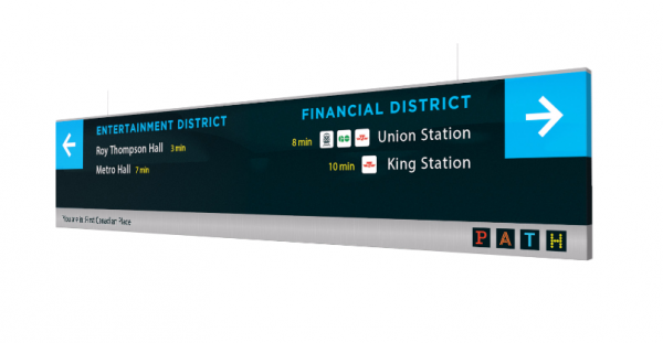
Despite its name being a hashtag (the relative merits and lifespan of which are debatable), the proposed wayfinding system seems, on the surface at least, to be a significant improvement over the current mess of signage and colours. It’s easy to sit and talk about the underground PATH system that you might want, but the designers were tasked with designing a wayfinding system that worked with the PATH system that Toronto has, which is to say a somewhat labrynthine network of tunnels and pathways that were never designed to be a single, coherent system. The main feature is the creation of a hierarchy of routes: there will now be main corridors that form a skeleton of ‘connector’ routes, with ‘branch’ routes building off of them. Perhaps most helpful will be the fact that these two different types of corridors will be mapped in different colours, easily distinguishing each. In support of this concept, signage will be re-designed to be more prominent, easier to understand, and more consistently designed throughout the system.
“We’ve introduced more than we’ve got rid of,” says Brown. Still, there are some significant and not-to-be-mourned casualties in the new system: the colours are gone. The designers have kept one of the colours — the blue signifying north — using it as the main contrasting highlight colour that will make the system stand out throughout the whole system. Also gone: the reliance on compass directions, which Phil Berczuk of Steer Davies Gleave agrees makes no sense, as it offered no connection to the environment you are in. In a survey conducted in conjunction with the redesign, 81% of people agreed that the signage and wayfinding system was inadequate. The designers hope that by working with what they have, they will be able to chip away at this number. People “will still get lost,” says Brown. “You can’t eradicate everyone getting lost.”
The process of designing a new wayfinding system goes beyond the task of creating new signs to the point of re-thinking how people use and interact with space. “I think a lot of people see wayfinding as signage,” says Brown. “If it works,” he says, “then nobody notices it.” The end goal, then, is not to create a system that responds to your needs, but actually anticipates them and heads them off before you are aware of them. In retrospect, much of the experience of navigating the PATH makes this point clear: I constantly felt like I was playing catch up with a system that doesn’t even move.
Looking at the new maps, and envisioning the new signs, it’s hard to imagine that I would get as lost as I did. The main feature of the redesign, the connector/branch route hierarchy, is a badly needed improvement to the mapping system that, as it stands now, leaves wayfinding mostly up to you, and does not offer any suggestions as to how you could (or should) get to your destination. By leaving it up to you, the current system is infinitely customizable but uninstructive; the current system’s approach corrects this by establishing main routes while reserving the branch routes for either exploration or shortcuts.
If all goes well with this summer’s pilot project — to be implemented in an as-yet undetermined sector of the PATH — the new system should be in place by the start of 2018. Since the signage in the PATH network is actually paid for by the buildings, the 2018 target date allows for individual buildings to have enough time to budget for the installation of new signs and information kiosks.
Designing wayfinding concepts is, in essence, the process of designing a solution to urban spaces which are not necessarily conducive — either by design or by error — to human navigation. The task of wayfinding is most prominent in spaces with larger mechanical functions, like airports, rail stations, and hospitals, where space is determined largely by functionality. The PATH is both like this and unlike this: space within the PATH has been determined by a certain version of functionality — namely to connect individual buildings to other individual buildings, which is a different from the function of moving people through those buildings — but has also been adopted as a part of a transportation network, where the main function ought to be navigability. This internal tension, that there is a desire to use the PATH for a function which it was not necessarily designed, is what makes the PATH such a difficult problem for designers — and what makes wayfinding such an important concept. With the piloting of #PATH360 everyone involved — designers, the BIA, and city officials — hope that a trip into the PATH is no longer a descent into confusion, hopelessness, and the feeling of being lost.
top photo by Steve Harris; middle photo courtesy of Wikimedia Foundation
2 comments
Hilarious and accurate – a few years ago while taking a class at Commerce Court during the winter, I occasionally challenged myself to get to the Hilton using the PATH to avoid the cold.
Even after repeated attempts, I *never* made it there, usually giving up somewhere between the Sheraton and Hudson’s Bay Centre… despite having an excellent sense of direction and a very determined attitude. The one bonus is that I was usually so irritated with the attempt that I stayed warm for the above-ground jaunt home.
Looking forward to the improvements!
I remember when this “system” went in. The cutesy little celestial arrows that almost nobody understood, the map that is unreadable even to someone with a strong sense of surface navigation. I will not mourn these one bit.
At the time, there was pushback as I recall from some building owners who didn’t want a unified signage that did not fit with “their” design standards, and particularly not signs that might lead folks to a competing mall.
We wound up with a half-assed implementation that I am sure must have won some theoretical graphic design award somewhere, but did nobody any good and was not pursued diligently once in place.
A new scheme cannot come too soon!