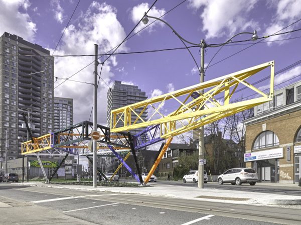
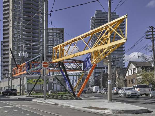
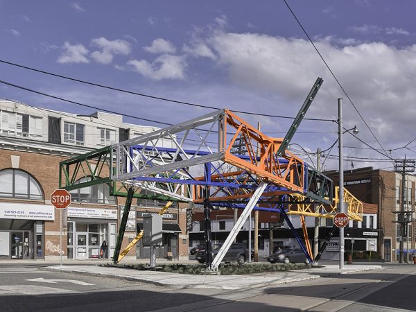
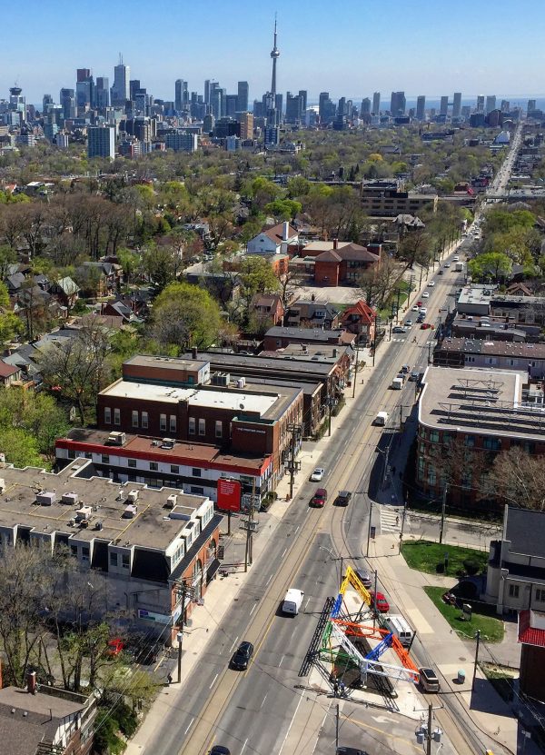
Daniel Young and Christian Giroux’s new public art piece— Three Points Where Two Lines Meet, located at the intersection of Bathurst and Vaughan—has elicited visceral responses from some Torontonians. The artwork, an elevated triangular structure made from powder coated-aluminum beams that resembles girders, has provoked outrage from some due to the unfinished look of the work, with one commentator describing the work as a “crane graveyard,” and another Torontonian asserting that the artists should “resign from art immediately.”
Three Points is exactly the kind of piece Toronto should be commissioning, as it is site-specific works such as these that contribute to the cultural identity of Toronto.
When critics and defenders alike speak of this piece, they seem to be hitting upon the same features of the structure that make it an object of ridicule for some and praise for others. For people who stand behind the work, it is the unfinished and fragmented nature of the piece that makes it so engaging. In an interview on CBC Radio’s Metro Morning, Young emphasized the site-specific nature of the work, stating that it is a kind of “urban room” that acts as a “direct response” to the site itself. Inspired by the form of the space in which they were working, the artists resolved to use the traffic island they were allotted as their guide for the realization of the work, deciding to make a triangular structure that would itself be made out of triangles.
As it happens, works commissioned by the City of Toronto, such as Three Points, are more likely to be site-specific than those commissioned through the Percent for Public Art Program, which directs funding for public art on privately-owned or publicly-owned land. In the Percent program, all developers must set aside one percent of their project budget towards the commissioning of a public work of art.
The works commissioned by this program can be divided into two categories: on-site works, which are funded by private developments and remain on privately owned land, and off-site works, which are funded by private developments but are built on city-owned land.
While a concrete definition of site-specificity is often disputed, a vague and generally agreed upon definition of a site-specific work of art is one that refers to or is somehow shaped by the site where the work resides. There are a number of ways in which one can interpret what counts as a site, including the history of a given area, its culture, natural setting, political connotations, etc.
A work of public art is less likely to be site-specific if it resides on privately-owned land because developers, at least some of the time, want to use the work to enhance the marketing and prestige of the building. In the case of Rising, a work of public art found in front of the Shangri-La Hotel on University Avenue, the conceptualization of the piece was inextricably linked to the vision of the developers. The work, a giant stainless-steel sculpture representing the body of a dragon engulfed by birds, is inspired by the luxury-ethereal brand of the hotel itself. Commenting on the piece at its unveiling, artist Zhang Huang declared that his “dream is to leave earth and rise up to the sky…rising to mythical heaven.” As he concluded: “I believe this heaven is the Toronto Shangri-La Hotel.”
Because this work was meant to act as a marketing tool for the Shangri-La, there was no way for it to be site-specific, for it was the hotel itself, rather than the site, that inspired the realization of the piece. While works such as these contribute to the beautification of the city, it is important that we also have artworks that reflect and represent Toronto, whether that reflection is rooted in its historical, geographical or cultural spaces.
Public art not only beautifies a city, but helps shape narratives and brings out certain daily truths about the metropolis in which we find ourselves. In creating art that reflects and represents Toronto, public art can help to build an image of Toronto that citizens can re-present back to themselves, allowing us to form collective imaginaries and identities together.
This re-presentation and collective identity need not be one that homogenizes Toronto’s diverse citizenry. Rather, as in the case of Three Points, the artwork can be read as manifesting certain features of city life that, through their representation, become solidified in the spectators’ images of the city. While this picture may become collective, it need not undermine the spectators’ own separate identities. Instead, the spectators would be engaging in a collective imagining of the city in which their own separate identities were preserved.
Three Points not only re-presents the city’s state of perpetual flux, but it also makes this fluctuation playful. With its multi-coloured girders and its provocation for interaction from passersby, Young and Giroux’s piece turns the typical grey, austere construction site into a space of exploration and possibility. Three Points gives Torontonians the possibility of imaginatively interacting with the construction of the city, and in doing so renders the sites sprinkled throughout Toronto as fanciful in their potentiality and fragmentation.
We should, then, be encouraging more site-specific works that can bring to life certain features of our city. When public artworks are commissioned by the city or located on publicly-owned land, Torontonians are given the possibility to imagine their city in new ways. By contrast, this re-imagining is not possible when a work of art is constructed in order to enhance the prestige of developers for marketing purposes. While a piece like Rising may be fanciful in its imagery and presentation, its playfulness does not allow us to re-imagine the city, as it does not make reference to any characteristics that are specific to Toronto. Rising may be a great addition to our public art collection, but it does not allow us to re-imagine the metropolis in which it stands. So, instead of a crane graveyard, let’s think of Three Points Where Two Lines Meet as a budding place of possibility, where we can re-imagine Toronto and our place in it.
photos by Young & Giroux/City of Toronto
Sarah Ratzlaff is a recent graduate from the University of Toronto with an interest in philosophy of art and public spaces. Follow her on Twitter at @ratzlaff_sarah



14 comments
This is a visual distraction to motorists. It is also an eyesore!
Ray — Then no table-top OCAD, no crystal at the ROM, no CN Tower, no AGO, no soldiers statues at corner of Bathurst and Front, no Adam Beck memorial on University, no Prince’s Gate at the CNE. You know, because they distract drivers too.
Kidding aside, I’m not a big fan of the piece but love where it’s been built and how it challenges viewers. Art doesn’t have to be easy.
If this is a “visual distraction” you shouldn’t be a “motorist” Raymond.
I believe in public spaces and art too – however if anyone to this public work of art (space) actually walks the perimeter… you will literally be “hit in the head” on the Bathurst side of the street! (oops)…
Also seems to be a huge missed opportunity for a couple of benches, not everyone in the city moves by car or public transit… Where is common sense these days?
As a result I think this work has missed a huge opportunity to improve our public spaces and entice the public outside 🙁
Also perhaps journalists should actually visit these works in the public space first before regurgitating what seems to be glorious self serving press releases by the “for profit developers” and their best buddies/patrons in the political system…
Again disappointed, at what could be, versus what is.
DR Smith
Toronto
DR Smith — If you’re insinuating our contributor didn’t visit the site, you’re sadly mistaken. Not sure why you even mentioned it as it’s clear the writer has seen the piece in person. She is even listed as the photographer of the images used in the piece.
A correction to the comment above: You will NOT be hit in the head. You can clearly see in the images that you’d have to be 9-feet tall to hit your head on it. The City takes extreme care to make things safe that are on city property (Spacing should do a piece o the number of lawsuits brought against the city for things like falling on a cracked sidewalk, etc).
Yes, contextual public art is both needed and welcomed. Unfortunately, you lost me when you wrongly criticised a piece of art that is both contextual and beautifully challenging (Rising) and defended a piece which is just challenging. A good piece of art can challenge but most importantly, it must edify the soul in some way. “Three Lines” doesn’t do this. Being “contextual” is not enough.
Announced in May 2014, supposed to be installed by fall 2015 & this is what the city gets? It looks like a knex set built by a 5 year old who’s never seen the outside world.
A correction to Mimi’s comment above: you actually CAN hit your head if you walk too close to it, so pedestrians are pushed towards Bathurst St., which feels (and is!) quite dangerous. The City has heard residents’ complaints about this, they checked it out, and they will be making some adjustments to it. So while they City does take extreme care to make things safe, they don’t always get it right the first time.
Simon — I see on that side there is a *little* area where the piece gets tight to the sidewalk. But that’s the crap people use to fight against things they don’t like — the line of thinking goes, “I know we can’t get this thing removed, but let’s find small problems with it so that we can keep chipping away at it’s legitimacy.” Textbook NIMBYism, or more precisely neighbourly whinery.
I saw it. It’s ugly. Such a busy area there. Would have been perfect as a public space instead of art display for something unattractive. Imagine a fountain and some benches. There’s enough metal in this city .
Baron: So, a fountain in the middle of a thin traffic island? That kind of thinking is part of the problem. You can’t create a public space out of a tiny scrap that is hostile to sit and loiter. You’re of the kind that would say, ‘What a waste of a bench/fountain’ if it that was installed instead.
“deciding to make a triangular structure that would itself be made out of triangles.”
in art school we used to call this a “one to one” concept. it’s like the apple building on the 401. “This building is for apples, so why don’t we, uh, make the buillding an APPLE!!”
In case you’re wondering, no, that’s not something you should be aiming for and it was a straight route to a C/B- grade.
Accusing people who note genuine problems with a project as “whiny” and “NIMBYs” is lazy and a sure-fire way to ending up with a crappy public sphere. Of course if projects have problems, those problems should be fixed.