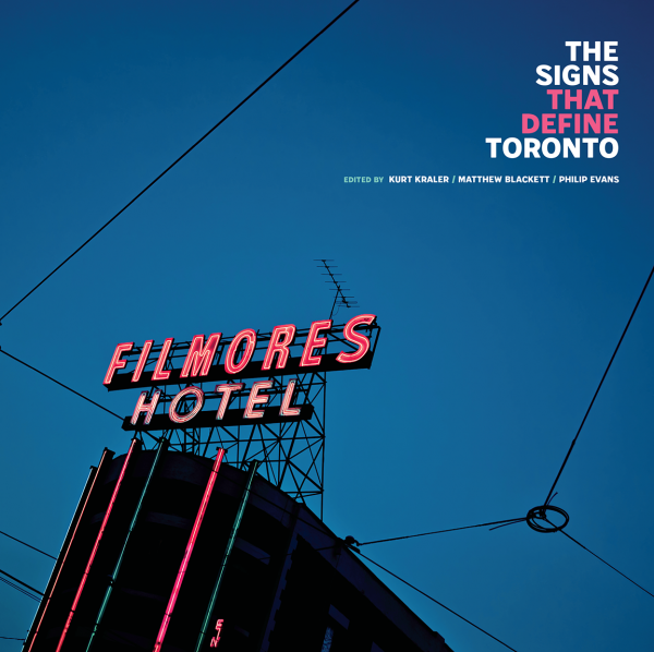
Spacing is happy to announce the release of our eleventh book, The Signs That Define Toronto. Published in partnership with ERA Architects, Spacing’s Matthew Blackett teams up with ERA partner Philip Evans, architect Kurt Kraler, and 20 other contributors to reveal the history, culture, and stories of the city through its unique signage. The book is packed full of gorgeous historic and vintage photography that is accompanied by thoughtful essays on the social and cultural value of the city’s signage. ORDER: purchase via the Spacing Store ($35)
“Introduction” from The Signs That Define Toronto
by Kurt Kraler
In the span of a decade, Toronto lost two of its most iconic signs, sparking outrage and questions about how quickly the city was changing before our very eyes. It started in 2008, with the removal of the infamous neon rotating vinyl discs that had marked the entrance to the flagship Sam the Record Man store on Yonge Street for almost 40 years. Then again, in 2017, the glittering and ginormous Honest Ed’s marquee was dismantled to make way for a new residential development at the southwest corner of Bloor and Bathurst Streets. Petitions were signed, op-eds were penned, and Facebook groups were formed to protest their removal and share stories of what these signs meant to residents. The conversation turned to heritage preservation and how signage contributes to the visual identity of the city. In both of these instances, what became apparent was the significance of the signs themselves and how they often define otherwise unremarkable building facades.
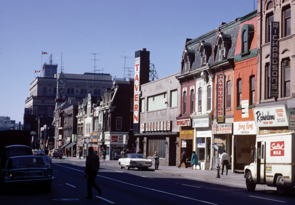
The Signs That Define Toronto is an attempt to document the culture of the city through its signs. Cities are shaped by their signage, from the iconic signs that dominate the streetscape to the more modest signs of small businesses. Signs offer a glimpse of the occupants who live and work within the buildings they adorn and are accessible to a broad range of commercial tenants. This accessibility is due in large part to innovations in illumination technology that keep the costs of making signs relatively affordable. As a result, signs produce a more accurate record of the life of the city than buildings and architectural styles ever could.
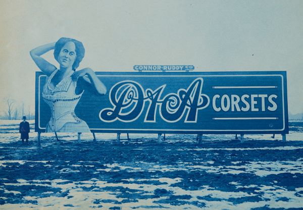
We’ll explore the advances in the signage technology of commercial businesses over the years in chronological order, beginning with the fascia and projecting signs of the 19th century, followed by the sprawling hand-painted billboards of the E.L. Ruddy Company that covered blank side walls across the city. Next came the proliferation of electric signs like movie-theatre marquees and neon signs, which peaked in popularity by the 1950s, and then the more ubiquitous backlit signs that line the streets today. With the evolving nature of signage, we’ll speculate on the future of signs and what the city may look like in the coming decades. Looking at the patchwork of signs that define Toronto, we see the many languages, flags, colours, and symbols that broadcast to various demographics and customers, contributing to the collective visual identity of the city.
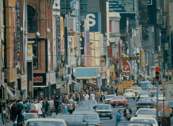
Downtown Yonge Street is the locus for much of Toronto’s signage history, a commercial strip with retail stores like Sam the Record Man, music venues like Le Coq d’Or, and strip joints like Zanzibar all competing for eyeballs. This display paved the way for the ultimate saturation of signs that is known as Yonge-Dundas Square, with billboards covering wide swaths of building façades and projecting from rooftops. Michael McClelland interviews one of the square’s designers, James D. Brown (of Brown+Storey), and former city councillor Kyle Rae about the origins of Yonge-Dundas Square. Co-editor Matthew Blackett, a long-time Toronto public space advocate and publisher of Spacing, shares his view of the square’s evolution over the past 20 years.
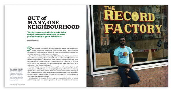
Beyond downtown Yonge Street, we document the cultures that are represented through signage in three distinct Toronto commercial corridors of Little Jamaica on Eglinton Avenue West, the Iranian community colloquially known as Tehranto on Yonge Street between Sheppard Avenue and Elgin Mills, and the historic downtown Chinatown on Spadina Avenue. There is also a series of case studies, iconic sign features, and photo spreads that delve into the stories behind the signs that populate the city’s streets. We’ve also included interviews with several individuals who have documented or directly contributed to Toronto’s signage landscape, including sign maker Dizzy Minott, painter Chris Rouleau, scholar Linda Zhang, and photographer Tanja Tiziana.
My personal interest in signage began with my graduate thesis research into the history of development in Las Vegas, a city known for its dazzling array of signs that are constantly evolving in a bid to attract tourists. This rich history is on display at the Las Vegas Neon Museum, which features a collection of signs salvaged from various establishments both on and off the strip. Visitors are guided through the collection by tour guides who tell stories about the businesses behind each sign and their contribution to the history of the area. What became clear was the critical role of conservation and how buildings and their signs convey a historical sense of place.
In the 1960s, architects and educators Robert Venturi, Denise Scott Brown, and Steven Izenour led an ambitious survey of the new American commercial strip that had emerged in Las Vegas. They documented the often-disregarded building typology, a result of the widespread adoption of the automobile as a primary means of travel. These studies were later published in Learning from Las Vegas (1972), which positioned the strip’s “lowbrow” populist buildings as a subject worthy of study amongst architects, just as the Pop Art movement had embraced crass commercialism. More importantly, the book identified the prominence of the sign within commercial architecture, relegating the building to its basic functions of providing air-conditioned space and shelter from the elements.
Interestingly enough, Toronto shares some similarities with Las Vegas in its growth and signage evolution. The opening of the Hoover Dam in 1936 supplied Las Vegas with an abundant supply of cheap electricity, similar to how the Niagara hydroelectric dam had transformed the streets of Toronto decades earlier. Access to an affordable and reliable source of electricity provided business owners with the opportunity to expand their approach to advertising and utilize electric signs to stand out in an increasingly cluttered urban landscape. This led to elaborate signs that would forever transform the visual identity of the city.
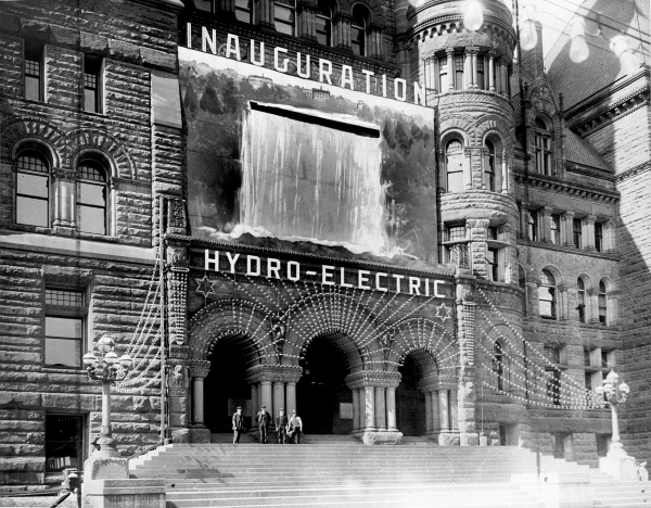
The city launched the Toronto Hydro-Electric System in 1911 with an opulent display designed to catch the public’s attention. Mounted above the front steps of Old City Hall was a hand-painted mural of the Niagara Falls, with several strings of electric lights cascading outwards over the gathering of curious onlookers below. When the opening of the electric system was officially announced, water poured out of a slit at the top of the mural, drenching the jubilant crowd under the makeshift waterfall. This display would be the harbinger of decadent electric signs to come and launched a new era in commercial signage that was largely driven by movie palaces and automobile showrooms.
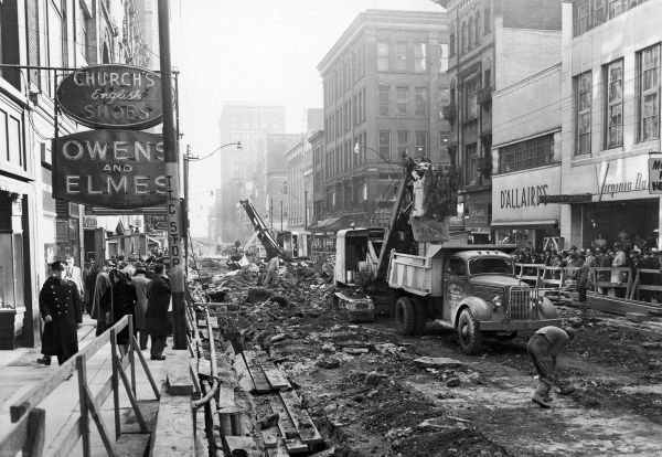
By the end of the 19th century, signs had taken over every square inch of building surface in urban centres, with businesses resorting to a variety of sign types, styles, placement, and colours in a bid to stand out from each other. At the same time, the City Beautiful movement emerged as an effort to clean up city streets and reduce urban blight. The social reform movement was started by a group of concerned citizens in the United States, advocating for fewer signs and more trees, quickly gained traction north of the border with policy makers and residents alike. Tatum Taylor Chaubal delves into the campaign to remove projecting signs along Yonge Street in the 1950s in an attempt to beautify the street, a philosophy that continues to influence signage policy in the City of Toronto to this day.
Signage is a reflection of the society it advertises to. While we remember the most vibrant and colourful displays, we can forget how signage has been used to impose discriminatory laws and business practices that segregated people on the basis of gender or race. While there were no official segregation laws implemented in Canada, the influence of American Jim Crow laws were apparent north of the border. For instance, some theatres would only allow Black patrons to sit in cordoned-off areas demarcated by signs, or restaurants and hotels would refuse service altogether. Up until the 1970s, drinking establishments had separate sections for men and women, with exterior signs that would mark the entrances for each. During my research as a heritage architect, I have come across countless historic photographs of large billboards that depict images or words that portray racist stereotypes of Black and Indigenous people, as well as others from a variety of backgrounds.
It’s critical to note which communities may be underrepresented through signage. Until recently, lesbian, gay, bisexual, transgender, questioning and two-spirit (LGBTQ2S+) establishments remained largely unseen in the public realm, often relying on coded names, double entendres, and discreet signs to reach the community. Prolific queer historian Ed Jackson, chronicles the evolution of signs in and around the Church-Wellesley neighbourhood and how business owners have creatively reached their target demographic. Over the years, Indigenous businesses have also forged a presence in their respective neighbourhoods with distinctive signs, including Nish Dish, Pow Wow Cafe, and Tea-N-Bannock. While businesses only form one aspect of a community, they powerfully claim space on city streets and their signs render visible cultural values and symbols.

There are ongoing discussions about where and how to properly display salvaged signs, including the famed Honest Ed’s sign. Toronto has its own neon museum initiative, which has been collecting signs over the past several years, spearheaded by the Downtown Yonge Business Improvement Area (DYBIA). There is hope for an eventual physical location to display these signs, but no immediate plans have been made available. However, a neon museum should be a last resort; heritage restoration efforts should always seek to retain signs in situ. Often, the reason a sign is considered significant is a result of its surroundings and the unique placement of the sign on a building façade. For instance, the iconic Filmores sign — captured on the cover of this book — is distinctive for its location on Dundas Street, just east of Yonge, where the road curves north a block away from the Jarvis Street intersection. The sign is purposefully mounted on the prow of the building and extends the full height of the façade, attracting attention in several directions. It would be difficult to recreate its historic prominence and site-specific configuration in the context of a neon museum.
Restoring historically significant signs in place should be a priority as it lends historical weight and significance to a building and its surrounding neighbourhood. Signs should also be restored with their original technology if possible. The recent practice of replacing neon signs with LED strips may not offer as many advantages as initially thought. Vancouver sign historian John Atkin notes that plastic LED strips do not last nearly as long as glass neon tubes, are too intense in colour, and do not emit ambient light onto the sidewalk below. Colour LEDs also consume an amount of energy comparable to neon signs, challenging the notion that they’re more energy-efficient. Lastly, LED lights don’t photograph very well, with film productions often resorting to neon since the LED bulbs produce less-than-desirable white hotspots when captured on camera.
While it would be impossible to include every memorable Toronto sign in this book, we hope this is the beginning of a conversation around the importance of conserving signs and preserving their stories. This preservation can take on many forms beyond restoration of the physical object itself and can include photo documentation, artistic drawing and painting, capturing the stories of sign makers and business owners, sharing nostalgic memories with friends, and so on and so forth. To look at the signs that define Toronto is to see a reflection of the city’s inhabitants, one that reveals the rich layering of cultures through the languages displayed, colours used, and types of businesses and services provided.
Cover photo by Sam Javanrouh; Honest Ed’s bulbs by Matthew Blackett; other photos courtesy of Toronto Archives

