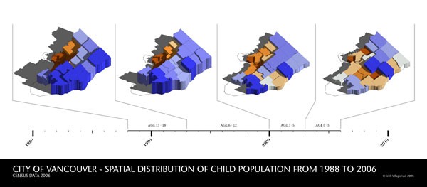
For a larger version, click here.
![]()
[Editor’s Note: This is the final piece of a five-part series looking at the spatial distribution of children throughout Vancouver. Originally written in 2011 for Re:place Magazine – the online magazine that would eventually turn into Spacing Vancouver – I recently discovered that it was in danger of being lost forever, as the old site closes for good. They will be re-published in rapid succession here for archival purposes, as an important snapshot of demographic Vancouver’s history.]
At last, we’ve reached the end of our child-tracking journey. As I mentioned in the last piece, I want to end off by looking at the all of the children spatial distribution maps together in order to see any larger patterns. But before we launch into the graphic, I’d like to touch upon one of the aspects that I’ve repeated a few times throughout the series and that serves as the foundation of the map we see here: more specifically, in going through the age categories from youngest to oldest, we simultaneously went through the spatial distribution of children back in time from most recently born.
I’m very aware that this is a very simplistic assumption given that many other factors – such as population growth, family mobility, income, and ethnicity – really affect how and where people live. Particularly in a growing region like ours. But we have to make some accommodation for the limited information we have and the implications that this brings with it. So…..if we are willing to suspend immediate judgement and believe for a brief moment that each individual map we’ve seen so far gives us a reasonably accurate snapshot of the distribution of families with children at the time that each age group was born, an interesting pattern becomes evident.
To explain in a bit more detail, this graphic places all the maps together on a timeline with divisions that roughly correspond to the years in which each age category was born. All neighbourhood names have been omitted to facilitate looking at the larger pattern. Furthermore, I’ve included the corresponding census data age categories right above the baseline in order to clarify the original data set and allow one to cross-reference with the original maps.
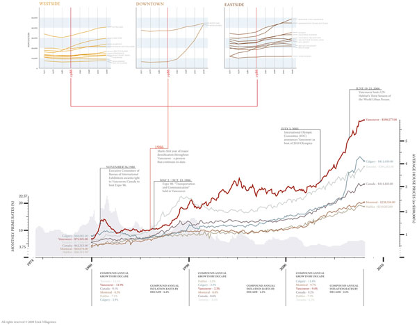
Aside from the very obvious fact that the densest areas of the city are Vancouver’s “child-free” zones, the eroding pattern of above-average (blue) neighbourhoods from left to right shows the eastward movement of families with children. This phenomenon generally corresponds to the increase in land/housing values over the past 18 years – as we can see from our house costs graph below – that makes more expensive areas on the city’s West-side less attainable to the average family.
For years, people have casually mentioned this situation in passing, without any quantifiable evidence. Within the context of our assumptions, this graphic substantiates those claims and should really raise some red flags to anybody interested in the future of the city. After all, families with children account for the majority of our population and it seems reasonable to assume – based on the pattern here – that this demographic will literally get pushed out of city limits if nothing aggressive is done about making Vancouver’s built landscape more suitable for these people.
Based on what we’ve seen throughout this series, one of the main lessons learned is that continuing the standard type of developments that characterize neighbourhoods around False Creek – such as podium towers and high density apartment buildings – won’t suffice. If we intend on adding density (and I definitely think we should), we have to aggressively ensure that we provide several different models for dense living – in terms of cost and domestic space – instead of leaning on our typical urban formulas. Cramming families with children into tiny condo won’t suffice, let alone asking them to pay excessive money for it.
Also, given the eastward movement of families with children, we have to ensure that those areas that have seen a decline in children over the years do not lose the amenities associated with them. The natural tendency is for services and amenities to follow their target demographic. Given that finding ways to accommodate families with children is likely to be implemented over a longer term, short-term incentives to keep services and amenities relatively equally distributed around the city should be given – in tandem with the more aggressive strategies.
Now, a quick word on a recent BTA Works report that looked at public school enrollment numbers since 2004. The map is seen here. I’ve been approached a number of times as a result of this report and that it seems to conflict with the census data provided. True enough, at first glance it does. But there is a lot of unresolved questions once reading into the information. Firstly, and most importantly, no information is given to compare relative values. So, for example, the fact that downtown schools have experienced an increase in enrollment is not surprising given that prior to two decades ago, there were no children there at all. Consider this in tandem with the fact that the child population downtown has continued to increase (albeit negligibly based on the census data) and this finding seems to make sense.
To make things more complex, given that child enrollment is no longer confined to their local neighbourhood catchment area, the number of children in each community is not necessarily reflected in the enrollment numbers since parents can drive their children to “out-of-neighbourhood” schools that they see fit. Numbers in private schools, not analyzed, add to the confusion.
With this in mind, the enrollment numbers can simply be a reflection of schools that are popularly perceived to be the “best” schools – or perhaps the newest. These perceptions may be true or not. Needless to say, there can be several reasons for the school enrollment numbers given – ones that don’t necessarily have a direct relationship to the percentage of children in each neighbourhood that I’ve analyzed.
Still, their general conclusions – focusing on the increase on a more affluent population in the city (and diverting children from the public school system) as well as the disappearance of the families – can find parallels with the pattern we see in our timeline.
Moreover, we’re both in agreement about one significant thing: that children and their families are an intricate part of a successful (and sustainable) city, and one of the fundamental challenges that lies ahead of us is ensuring that they remain among us amidst all the pressures that are working to push them out.
***
Other Where Are The Kids? series articles:
**
Erick Villagomez is one of the founding editors at Spacing Vancouver. He is also an educator, independent researcher and designer with personal and professional interests in the urban landscapes. His private practice – Metis Design|Build – is an innovative practice dedicated to a collaborative and ecologically responsible approach to the design and construction of places. You can see more of his artwork on his Visual Thoughts Tumblr.