
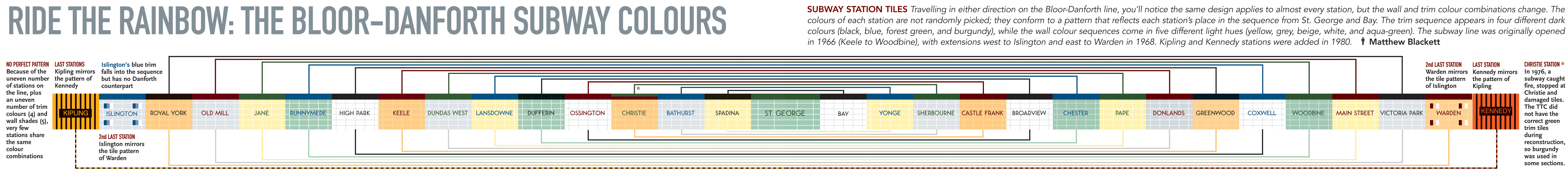
Since there has been a lot of discussion in the post just below about preserving the TTC’s subway tiles, I thought it would be a good time to post a graphic that ran in Spacing #8 (winter-spring 2007) that shows how each station’s colours are part of a pattern. Readers may differ on whether they like Toronto’s subway station platforms, but recklessly breaking up this sequence — and over 40 years of history, mind you — is something worth debating at the TTC.
Click on the image to see a large or even larger version (and the graphic’s Flickr page).

35 comments
It’s odd how I always confuse the actual Bathurst grey and Spadina yellow. They look nearly identical to me in practice.
Devil’s advocate: Other than making each station look like a bathroom in an airport, what function does this tile pattern serve? Does it say anything about the TTC itself? Does it provide information that is accessible and functional? Does it say anything about the neighborhood or location in which the station is located? Does it have artistic merit? Cultural value? When taken as a whole, it is a great system… but it is never, and can never be, seen as a whole other than in the amazing graphic that Matt links to.. And given the lack of a comparable pattern over the rest of the system (I’m assuming.. I could be wrong), what is its point?
Furthermore… why doesn’t Spadina have the same wall pattern as Bay?
Just saw the other posting with its loads of comments.
So the driving force behind the choice of colours was the desire to create a repeating pattern across the subway line. That explains a lot…
Nice poster but it implies some grand vision in terms of TTC station colours and design that just isn’t there. The explanation is graphically beautiful but that is all it is. The rider experience is different and needs to be addressed from that perspective.
I don’t know… I get the point and all, but sometimes you have to acknowledge that not every design idea worked and is worthy of preservation This is one of those times. I would certainly be supportive of preserving one or two stations exactly (spending money to restore every last 1960s detail) and filling them with exhibit posters (instead of ad posters) on the history of station design, but I think it is unrealistic to make it a goal to preserve the tiles in all stations, for all time. The system will change over time and replacement and renovation will happen, and necessarily so.
While the system sorely needs uniform signage there is nothing in the subway rule book of the world that says all stations should look alike. Go ahead with the Montreal-Vancouver approach of individual stations, while keeping a nod to history here and there of the original DC-New York style repetition along the line.
The problem with uniform stations is that people like me (who daydream while on the subway and miss their stop more often than one would like to own up to) could use a few additional visual cues to identify each station. Then there are those times when one is buried so deeply among the commuter bodies that all one can spot of the station is a glimpse of a few subway tiles. I need something more obvious than the subtle difference between off-white, light grey, light yellow to know where I am.
Unfortunately the person(s) who decided on the tile pattern and colours are not here to speak up for their choices, as they are mostly likely deceased or elderly so it’s easy to bash them. Obviously there was a pattern, and the colours were supposed to be the visual clue of where you are (now we have station announcements as well). I guess the simple Modernist take on things in the 1960s just isn’t good enough for today’s sophisticated and world-class Torontonians.
Eight percent (8%) of males and one percent (1%) of females are colour blind. There are different intensities and sensitives, with some people not even knowing they are.
This is why relying on just variations or shades of colours between the stations is not recommended. There has to be some sort of obvious visual differences. This is why we need changes in styles of tile, art, physical differences, lighting, or other designs to allow us to know what station we are at.
Test yourself: is that green light really green, or is it blueish-green, or blue?
http://www.toledo-bend.com/colorblind/Ishihara.html
“I guess the simple Modernist take on things in the 1960s just isn’t good enough for today’s sophisticated and world-class Torontonians.”
While I’m guilty of a few snarky comments on the subway tile colour scheme, I haven’t made any critical comments about the people who love them. Let’s not go there, OK?
Let’s not forget, the original Yonge stations had a guiding theme all their own – each had a unique combination of three background colours (gray, yellow, pale green) and four foreground colours (black, blue, red, green).
Of course, Eglinton’s the only one that went untouched. Is that what we’re gonna be doing to the Bloor line? Because if it is, I want out.
It’s not the tiles that are reminding you all of a public bathroom — it’s the puddles of water, the surfaces that you wouldn’t want to brush up against, and the occasional condom ad.
Rob, how about this view of the simple Modernist take on things:
“And really, couldn’t we brighten up those ‘bathroom’ stations of ours? Clean they are, but do they have to be so sterile?
The lobby of the Yonge station on the north side of Bloor St. is a cavernous place with long, empty walls of blank yellow tile. Why not display along those walls a selection of prints from whatever is currently on view at the Toronto Art Gallery? Or why not display the dramatic winners from the annual newspaper photo contents run by the police and firemen’s unions? Or why not children’s art from the schools? Anything to relieve that inhospitable Canadian sterility.”
That was Ron Haggart on page 7 of the Toronto Daily Star, February 26, 1966 — the Monday after the extension opened.
Even after looking at the beautiful colour schematic I still don’t see the merit for the TTC tile stations. I gutted a bathroom in my place with horrible 60’s decoration (how fitting) and I don’t feel at all bad about it. If they want I can give them a hand in ripping out ugly 60’s tiles, I gained some experience by doing the same in my bathroom last summer.
I’m all for preserving aspects of mid-century modernist design. However, I think we’ve learned quite a bit about visual communication since the opening of these stations. You will have trouble convincing me that the 50s were the heyday of wayfinding design. One only needs to look at the massive black with white type directional signs to see room for improvement.
Carlos> Our house had the 1980s bathroom tiles ripped out and replaced with specifically picked “Subway Tile”. You can pick from a few kinds at the tile shop on Davenport south of Dupont. They are gleaming, white, and make showering great.
Displaying art or posters or whatever is a great idea to liven up the “inhospitable sterility” but that didn’t imply mashing up the unity of the system. I don’t believe that every last tile need be preserved in every station, but the platforms should remain intact.
The implication in my earlier comments was that people and ideas that were considered both modern and functional are now looked down upon and treated with contempt like they were some naive bumpkins, which is not fair. If you take offense at that, well then all I can say is that fity years from now, people will probably be looking at designs from today and saying “rip it out”!
Sorry Shawn, I hate subway tiles, too sterile for me. I picked a natural slate instead. Back to nature is what I always say. At least I cleaned and renewed the old iron cast clawed tub. Now that was an early 20th century beauty, not the ugly 60’s tiles that came after.
Wow. I just visited Joe Clark’s website. I don’t think I can defer expertise on graphic design anymore. Just because you bark the loudest doesn’t make you an expert I guess. Anyone else with a strong opinion want to put their design portfoio forward?
As a designer myself and being in the design community I’m always delighted to hear how the majority of people seem to think they can design something better and 99% of the time they try and make a disaster out of it. This goes to explain why the ttc needs to hire actual designers to not recreate the errors created in the system since 1980. Mind you, they got Downsview right but that was a stroke of luck.
I personally love the white subway tile. They cator to everyone while offending no one which is what they were meant to do. They typesetting and organization was thoroughly thought out and it shows in areas where that system is maintained.
While I agree there can be a happy medium where some stations are maintained and renovated to their original beauty, some stations could use some new direction. Mind you the problem I see is that until there is someone at the TTC to actually know what beauty is, I think its in everyone’s interest to stop them before they do another disaster like Museum, King, College, Dundas or any station North of York Mills.
““I guess the simple Modernist take on things in the 1960s just isn’t good enough for today’s sophisticated and world-class Torontonians.â€Â
While I’m guilty of a few snarky comments on the subway tile colour scheme, I haven’t made any critical comments about the people who love them. Let’s not go there, OK?”
===============================
Funny. The first time I saw that quote, it was in fact the “today’s sophisticated and world-class Torontonians” part that registered as snarky.
Maybe because it’d be snarky coming from my person (oh, deah, we’re soooo provincial, so un-sopheesteecated and un-world-class)
Adam, that *was* the part I was referring to (it didn’t come across?) – though I read it as “You’re all being snobs” because I could just picture my daughter saying it, complete with rolling of eyes: “Yooooour just too sophisticated and world-class,” in response to a shocking remark on my part, like “I don’t like Pizza Pizza”. Well, OK, she’s too young for those exact words, but the spirit is the same.
Besides, why assume that those of us who aren’t fans of the subway stations don’t like any Modernist designs? I love the art building at Central Tech. If I’m still alive 50 years from now and people are screaming “rip ’em out” about some of today’s buildings, I’ll be the little ol’ lady with the walker screaming right with them. I’m an equal-opportunity loather and there are so many hatable buildings out there, I wouldn’t want to limit myself to a single time period.
Yes, many of the stations could look great with changes to elements other than the tiles. But could lighting and changes to flooring and ceilings really save any station with green tiles? I’m open to suggestions, really. You have to understand – I grew up with an avocado green fridge. It’s hard to look happily on most shades of green after such a traumatic experience.
I’m all for giving stations unique looks based on cultural significance of the neighborhood and the buildings nearby, but are we taking about the same Bloor-Danforth line?
Besides Greektown, there isn’t a whole lot in the way of cultural significance on the line. Nor is there much in the way of landmark buildings.
The Yonge-University line is another story, with many of its stations passing under places of significance.
Just doesn’t seem worth it to me. Use the money to repair the existing stations instead of pretending the Bloor/Danforth is a cavalcade of culture.
Ah, but these days, vintage avocado green fridges might carry retro-cool cachet–if they’re verboten, it’s more likely for environmental than aesthetic reasons…;-)
Baray (I fixed your all-caps problem), I am not now nor have ever been a graphic designer, let alone a registered one. But I think my nearly 20 years of published graphic-design criticism provides some indication of my knowledge of the field. I mean, why do I get invited to conferences?
Thanks for correcting a problem I didn’t have Joe. I didn’t return the favour with your kerning.
I don’t want to challenge your authority too much on these matters, but knowledge of graphic design or being critical of it doesn’t make one an expert on matters of built form heritage.
Based on the majority of points made on the issues of proposed TTC station upgrades, I can’t help but think this is more about the TTC letter spacing than actual architectural merit. In my opinion–and that’s all anyone has really offered here–the Modernist restraint that many have referred to is not all that special. If all we want is to retain the visual identity of the stations, then certainly that could be done within any improvements.
Baray (Mr. or Ms Caps Lock 2008), explain how kerning is governed on Web pages. Explain also how kerning and letterspacing differ.
You’re boring me Joe. Your website is still crap and hard to read.
How about tell you all us neophytes why the kerning (which is between pairs) OR letter spacing (of which kerning is a component) of the TTC stations is in anyway important to the end that nothing can be done at all? Why don’t you enlighten us on why the stations can’t be upgraded on an architectural basis?
Perhaps its best that you stick to criticism and leave the real work to those who really know how to improve the physical environment.
Ryan…you, you, you Yonge-University snob!
Who cares? The tiles are ugly and no one uses their colours to navigate the system. I couldn’t really care less if the TTC replaces them or not. I would agree, though, that replacing the tiles isn’t the best use of funds so it’d probably be best off just spending the money on some hybrid buses.
Baray, Man or Woman of Few Words But Lots of Majuscules, consider using the numerous alternate stylesheets provided on many of my sites. Unless of course you’re using IE6.
Also consider staying on topic.
Scott, I use nothing but the Bloor Danforth line. Oddly, despite the lack of monuments and distinct areas, it is where all my travel seems to be focused.
“Who cares? The tiles are ugly and no one uses their colours to navigate the system.”
==========================
Just because you say no one uses their colours, doesn’t mean no one uses their colours. Believe it or not, the frequent (and non-colour-blind) subway users among us *do* identify and associate the stations (and sequence thereof) through their tile colours.
Now, if we don’t use them to “navigate the system”; well, duh, that’s why stations have names…
Our fan of majuscules should be aware that he, she, it, or they achieved his, her, its, or their goal of causing me distress.
As you all will see shortly, this is pretty much it for me and TTC signage. I appreciate everyone’s help and have carefully registered everyone else’s opposition.
Sean Galbraith asks: “Furthermore… why doesn’t Spadina have the same wall pattern as Bay?”
BOTH St. George and Bay are out of sequence, and I suspect that’s because, when they opened, they were both two-level transfer stations where one could transfer from the Bloor-Danforth line to the University subway.
Transit Toronto has a full essay on the Spartan tile design of the Yonge, University and Bloor-Danforth subways here:
http://transit.toronto.on.ca/subway/5009.shtml