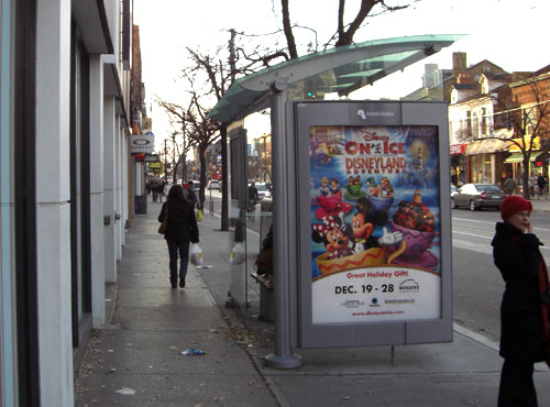
New TTC shelter at Queen West and Peter
In recent weeks, while walking on routes which have been familiar to me for years on Queen Street West and Hoskin Avenue, I have noticed that the sidewalk space suddenly feels cramped where new transit shelters have been put in. These shelters are in locations where there was previously an older type of shelter, but those older shelters did not create the sense of crowding the sidewalk to the same degree.
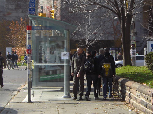
New TTC shelter at Hoskin and St. George
I decided to investigate, armed with a tape measure, a camera, and a determination not to be worried if people looked askance at someone measuring sidewalks with a tape measure.
It turns out that the sidewalk spaces where I was getting the cramped feeling beside the new shelters are less than 1.6 metres wide (usually around 1.55 metres). The City of Toronto’s accessibility standards call for 2.1 metres of clear space on sidewalks on main roads, and 1.7 metres of clear space on other roads. These standards are to allow for easy pedestrian flow, and to allow unhindered passage for people using wheelchairs or other mobility devices. The absolute minimum accessibility standard mandated by the provincial government for sidewalks is 1.5 meters.
So the new shelters are violating the City’s guidelines, especially along a main road such as Queen Street West, although they leave just enough room to meet the provincial standard. All of the shelters I looked at are in locations with very high pedestrian traffic (the Queen West shopping strip and the University of Toronto campus), and the narrow sidewalk certainly interferes with easy flow when there is a high volume of walking traffic.
The thing is, it’s not supposed to be this way. Quite the opposite. The new street furniture program, of which the transit shelters are a component, is supposed to herald a new era where the City makes sure sidewalks are well-managed. The city introduced “Vibrant Streets” guidelines that direct how sidewalk furniture should be placed to ensure clear sidewalks that meet the city standards, and it set up a street furniture section within city staff to implement them.
I brought up the issue of these new shelters at the November meeting of the Toronto Pedestrian Committee, and staff indicated that there is supposed to be quite a thorough vetting process before any piece of street furniture, including shelters, is put in place. An external engineering consulting company is supposed to review all proposals, and then City staff in the street furniture section are supposed to make sure it complies with the “Vibrant Streets” guidelines.
It looks like the process is not working the way it is supposed to.
I decided to compare the measurements of the new versus the old shelters in more detail to make sure the cramped effect wasn’t just an optical illusion resulting from a different design. Some of the older style of shelters provided by an ad company, introduced in the 1990s, are still in place along Queen West. My measurements with a tape measure aren’t necessarily exact, but they’re accurate within a few centimetres.
The older style of shelters are about 1.37 metres deep. The new ones replacing them now are about 1.63 metres deep at their widest point. So the new shelters are about 0.25 metres deeper than the older ones.
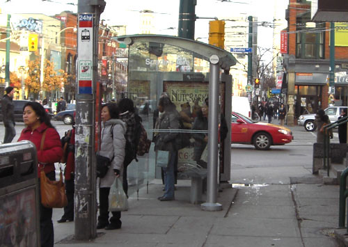
Older-style shelter at Queen West and Spadina
As well, the older-style shelters, where they are placed on the roadside, are set back from the road by about 0.6-0.75 metres, whereas the new ones seem to be set back a minimum of 0.9 metres from the curb. Although it’s not really noticeable to the naked eye, that’s an additional 0.15-0.3 metres of depth.
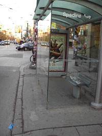
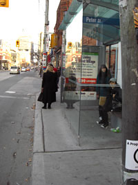
Older setback on the left, newer setback on the right
So the total extra space taken up in the walking section of the sidewalk by the new shelters is something like 0.45 metres. It may not sound like much, but it’s about the width of an average person. It’s also the difference between leaving just enough sidewalk to barely meet the provincial minimum (say, 1.55 metres) and almost meeting the higher city standard for a main street (say, 2.0 meters). So, while the old shelters in these locations might not have met the City’s standards for clear sidewalks on main streets either, they came a lot closer and certainly left more room for pedestrians. And, at least for me, the switch made enough of a difference in the perception of the space that I noticed a change for the worse.
The reduced space for walking past shelters makes a small but real difference both in practical terms, creating a bottleneck when there is a high volume of pedestrians, and in terms of the look-and-feel of the experience of using the sidewalk. This is especially true on a street like Queen West, where the sidewalk space is both heavily used and already limited, and whose vibrancy depends on pedestrians.
And there are alternatives. The new street furniture program provides a wide range of possible transit shelter designs. For example, this new transit shelter on the north side of Queen West at Simcoe provides good shelter but leaves plenty of space for people to pass, even on a narrow sidewalk.
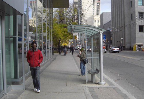
The problem, of course, is that this nice thin shelter doesn’t provide space for ads — and ads are what are paying, not just for the new street furniture, but also for the new street furniture section of the City of Toronto bureaucracy that is supposed to control these installations. There may be some danger of conflict of interest in this situation, at least in terms of the fact that the City could lose revenue if it enforces its standards and disallows these new shelter installations in locations where there were previously shelters with ads.
On the other hand, it should be possible to design a shelter that takes less room but still provides space for ads — after all, the older shelters did. It’s up to the City to stop the implementation of these new shelters where the sidewalk space is too narrow, and push the ad/street furniture company, Astral, to come up with a more streamlined design for these situations.


29 comments
The inner suburbs have the REAL ‘old’ bus shelters…
http://www.flickr.com/photos/dalmond/1024011962/
The thin shelters are useless as shelters go. You might as well be standing under a pie plate. Let’s go back to the good old days when people waiting for streetcars and buses huddled in doorways and didn’t obstruct the sidewalks with their shelters. The old brown shelters also didn’t have that huge gap at the bottom like the new ones have, which allows the wind and snow to blow in. So let’s see, the glass roof doesn’t provide shade, the space at the bottom allows in the snow, the shelter takes up more space on the sidewalk … That’s progress for you!
Spacing, I love you.
Good work!
Thank you for investigating and presenting this issue so clearly.
I too have noticed how cramped the new shelters can make the streets. It’s unfortunate that some of the city’s busiest sidewalks in places like Queen West were never really intended or built to handle the amount of foot traffic (or any type of traffic) that they do convey. I believe they are only 20m across from face of building to face of building. Maybe this is part of the charm and scale of Queen West, The Annex, West Queen West, The Beach, etc. But it sure makes for some hectic walking. On a good Saturday, the crowding on Queen West can feel as busy as a Manhattan street, even though the pedestrian traffic is only 3 people wide!
The important issue here is wheeled accessibility. Add some crowds, add some doors opening, and then a huge bus shelter and a wheeled person just can’t get through. That’s not acceptable, especially considering the number of people who live in these neighbourhoods.
I’d rather have a covered shelter for those freezing winter days with 40km winds.. than space on a sidewalk. People need to just be patient and courteous when sharing a sidewalk. That’s my two cents.
On a side(design) note, what’t the deal with some shelters not having glass covers? Are they waiting to put them on or are they not putting them?
After years of squeezing past the old shelter on Bay at the northwest corner of Bloor I hope we’ve learned some lessons about shelter design. The new-style shelter at Queen and Simcoe would work perfectly in that high-traffic/narrow-sidewalk condition. But do you think anyone will have the common sense to make sure it happens to complement the nearby Bloor Street upgrade? Don’t bet on it.
Speaking of shelters, I’ve also noticed that quite a few have the wrong street/crossroad name on them. For example, on Sherbourne and Howard St., the Shelter says “Linden” (or something like that).
argh, once again, city FAILS at managing its projects – even if the specs were right at the time of tender and contract award, checking the implementation is a MUST…these are the most basic tenets of any project management! You would think there is someone in the city hall who would have a f#$%ing clue….
Good job Spacing on spotting this.
…and they don’t always match the name that the TTC’s automated stop announcement spits out. (But in my experience the street name on the shelter usually seems more appropriate.)
Crowded on Queen West? I was in San Francisco in December 2005 and around Union Square the sidewalks were a solid mass of people on Saturday afternoon, many carrying shopping bags. I’ve never seen a sidewalk in Toronto packed like that with shopping traffic, the only thing that comes close is the ACC letting out. Despite the crush, everyone kept moving and it sure gave the area around the square a lively pedestrian atmosphere, despite a couple of very busy main roads passing through.
The southwest corner of Queen and University is the worst for pedestrian traffic; between the shelter and the subway entrance, there’s barely room for single-file movement.
Well, it would be the worst … except for the northeast corner.
Also notice how the roof drains onto the sidewalk and not the street side (SOHO). This will create a slipping hazard when water pools and freezes. IBI is the company doing the site planning. Seems odd that the NEW placement is not to city spec… Pressure from the ad company? Also new provincial guidelines are coming out for accessibility these will hopefully be followed by IBI.
The ad market has crashed lately and may doom Astral Outdoor next year.
One more thing. Don’t lean on the glass on the new shelters. Don’t leave your kids unattended in the shelter. Don’t even touch the glass. 300lbs of tempered glass will come crashing down.
This is actually quite disturbing — we were given many reassurances by City Hall, both on the political and staff sides, that “our” worries about this street furniture program were unfounded. And here, already, there are problems.
I’d like to hear from somebody from Transportation or the Mayor’s office on this rather quickly. This contract is for what, 20 or 30 years – and big problems in the first few months?
Nice investigative piece, Dylan.
Instead of looking for that protective personal space, I think it would be nice if we nestled like birds in cold weather, coming together to share body heat. Too much to ask Hogtowners at this stage I guess.
Also the new shelters’ gaps at the bottom are way bigger than the previous model, AND they aren’t sealed at the top so wind goes RIGHT through them.
Nobody has ever slept in my streetcar shelter before, I don’t see why they would start if they made it just a little more comfortable in the wind. Jeez.
I think you will find the newer shelters are taller as well adding to the sense of their being overbearing. That the sign faces are canted to face the street makes it all the more clear these are designed for motorists. Hey CofT. This is broken.
Now wait until you see the street furniture installations. Roncesvalles got a nice new bench/barcalounger south of Garden Av that manages to make the sidewalk all the more difficult to navigate past the pinch point the old style bus shelter and vegetable stores present. The new style bus shelter here will all but break access for the zimmer bound.
Geez, there’s no pleasing you guys sometimes.
As noted the shelter you suggest would provide no..what’s the word?…shelter from the elements on the most unpleasant of days, which I will take over crowding on the sidewalk.
The real issue for you is obviously ads, otherwise no sane person would think that Queen St. shelter was sufficient and you would be complaining about the TTC not looking after its passengers while they wait for their vehicles.
Asher – if the issue were ads, I wouldn’t be suggesting in my last paragraph that the city use something more like the older style of shelters with ads.
Another issue is how far away they place shelters from the bus stops themselves. The one on the northeast corner of King & Jarvis (previous design) is about 2/5 store fronts away from the streetcar stop. So by the time you run from there to the vehicle in the rain, you’re soaked. That’s not exactly sheltering people.
Then there’s the shelter at Yonge and Briar Hill. Again, it’s not right at the bus stop and it’s so close to the fences for the patio at Gabby’s, there’s no room for 2 people to pass. Then try adding in someone on a scooter or walking a dog. If the shelter was beside the bus stop, there wouldn’t be that bottle neck.
Someone’s asleep at the design desk.
Oops. I meant 2.5 store fronts.
Thanks for noticing my photo Joel.
Also, those skinny shelters are next to useless when it is raining. Unless of course the rain happens to be going at the only angle they provide cover.
Not only do I agree with Janet’s concern, but I’m also noticing that, due to the bottlenecks that are now occurring, more often than not, I’m opting to walk on the street side of the new & “improved” shelters. This may have worked all right while the weather was nice, but now that it’s turned to rain, I’ve discovered that puddles in the road DO splash that far. And I’m willing to bet that, once the snow starts to fall, they won’t be plowing there… So, not only will the snow be packing in to the shelters, by slipping under the bottom of the glass, but it’ll also leave us to climb meter wide snowbanks in order to get to the street.
Personally, I’m not looking forward to any of it.
The new Astral benches are also installed too far from the curb.
Remember, with Astral, never ascribe incompetence to an action that can be explained by devious intent.
If everyone bought cars, no one would need to use public transit and we could take down all the shelters. As well no one would be walking so all the side walks would be clear!
CMAK: I don’t think your vision is going to make the pedestrians in my neighbourhood, who have to walk in the road to get around the cars parked on the sidewalk, feel better.
New problem. Yonge and Lawrence. They’ve just updated the traffic signals with left turn signals like you see in the suburbs. In conjunction with that, the city is installing separate posts for the buttons to change the signals.
They’ve put them in the centres of the wheelchair ramps at the corners. What is the logic in that? Creates a problem for wheelchairs, scooters, strollers, and people walking dogs to get around; new bottle necks and a major hazard for anyone on skateboards or rollerblades because that intersection is on a hill and these wide polls are in the middle of the sidewalk as you enter/exit the crosswalk.
The south east corner (with the library on it) has 2 of these poles!
Why oh why can’t the buttons go on the poles the lights are on????
*Also notice how the roof drains onto the sidewalk and not the street side (SOHO). This will create a slipping hazard when water pools and freezes.*
Adshel also has a contract with council here in Auckland NZ, and places bus shelters around the city. Our problem here is the rain in winter.
The design of the bus shelters here, and from what it looks like, and by various people’s observations, over in TO as well, is to achieve one thing and one thing only. To keep the advertisement dry. Nothing else matters. The ad brings in the moolah, so the shelter is designed to keep it dry.
As for the users of the shelter? Council’s, both Auckland and Toronto, don’t give a flying toss about them. And neither does Adshel.
Consequently when it rains I have to stand on the seats as floors are usually pools of water, the ceiling drips like a sieve, and the walls turn into mini-waterfalls. The ad however, is pristinely dry.
With public transit being heavily pushed nowadays(*because of climate change and greener living) you’d think anything that had to do with transit improvement would be happily accepted by the public. But here we are, puting down newer and better shelters to protect us from these horrible winter months.
Private space my a@#^* (*pardon my french) Squeeze together for a few seconds people. It’s not going to kill you.
Sincerly,
Ariel > you’re forgetting that a) walking is even greener than transit, and therefore needs to be encouraged as well, rather than discouraged, and b) that it is perfectly possible to provide good shelters while leaving more sidewalk space, as the older shelters-with-ads show. These new shelters don’t make an appreciable improvement to transit over the older style (they’re newer, but not particularly better), but they make walking worse.