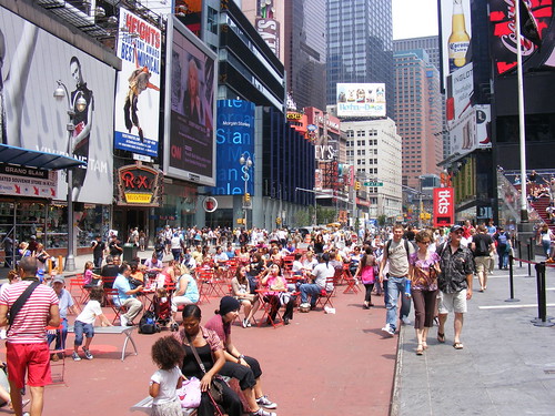
I have to admit that the first time I visited New York, I hit a lot of the tourist must-sees; the Empire State Building observation deck, walking across the Brooklyn Bridge, and visiting Times Square. As a first-time tourist, Times Square felt exciting: there were hordes of tourists and local theatre-goers, gawking at the neon advertising signage, and buying cheap souvenirs and dining at middle-American chain restaurants like TGI Friday’s. While wowed at the time, I came back with a feeling of disappointment. There was little “square” to Times Square, and really, there was no reason to pass through except changing subways or walking to the Port Authority Bus Terminal or to a nearby Broadway theatre.
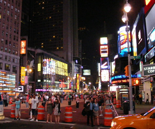
But the square was put back in Times Square in this year’s Memorial Day long weekend (one week after Victoria Day weekend, May 23-25, 2009) as part of a trial project. Broadway was closed to all traffic for five blocks through the heart of the area, and a similar measure was taken at Herald Square, at 34th and Broadway. The closed off pavement was eventually painted a terra cotta colour, and more permanent bollards and directional signage were erected, making it likely that this will be a permanent fixture in Midtown Manhattan.
Tables and chairs are put out every morning (and caged up in the late nights) and have quickly become a popular meeting place, a spot to enjoy a snack, or just take a short rest in the hustle and bustle. But before any sense of New York envy kicked in, I remembered that this feels like a more constrained version of Dundas Square in Toronto, which has had simple patio furniture for several years now, attracting summer crowds, and which also serves a very simple function. The overall redevelopment of Yonge and Dundas has been at best a mixed blessing, but the square is now undoubtedly one of Toronto’s most successful public spaces.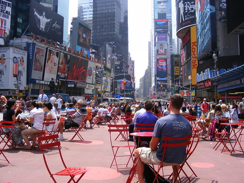
The Dundas Square redevelopment was sold to Torontonians as our very own Times Square, complete with neon and video advertisements, entertainment, dining and shopping. To an extent, our permanent square has worked. Children enjoy playing in the fountains, and it is a very popular meeting place in the summer. While Times Square has the cache and hoards to give it it’s unique energy, there is some enjoyment in the slight irony that New York has used an idea from our “Times Square” for the “real thing”.
Of course, Toronto has flirted with pedestrian malls before, including Yonge Street in the 1970s (I am not sure that it would work again, even now). While it’s hard to think of a location that would draw as much of an all-day crowd in Toronto than Yonge and Dundas, there might be some opportunities for smaller scale street closures. Front Street in St. Lawrence Market, or Queen West (with allowances for streetcars) may be the best locations for such a bold intervention here.

24 comments
Sean:
I think an important aspect of any “square” is that the space is more open than the typical street space. This can happen in various ways.
Dundas and Times Squares are both places where the street geometry creates a wider space than would exist at a “normal” 90 degree intersection or midblock.
Queen West in the wide stretch east of Spadina has a different feel for exactly this reason, and the open space of the parking lot at Peter Street, even though mostly full of cars, actually creates a lively space that might not exist if this were a block of new stores or (heaven forbid) a 40 storey condo. Compare this with the absence of street activity (other than passing pedestrians) near King and Spadina.
If we’re going to create a new semi-permanent space in Toronto, it needs the room to breathe, to get sun for a good chunk of the day (lower Yonge Street is hardly the place for that), a place where people don’t feel they are crammed into a little spot marked “please don’t feed the pedestrians”.
You wrote:
While Times Square has the cache and hoards to give it it’s unique energy, there is some enjoyment in the slight irony that New York has used an idea from our “Times Square†for the “real thingâ€Â.
Can you give a citation or reference where NY officials looked to Yonge-Dundas as an example of ideas? It seems to me that many squares the world over have tables and chairs; however, it would be really neat to see that Younge-Dundas was the specific idea generator.
Thanks!
I pretty much agree with Steve’s assesment as far as adding more pedestrianized squares/speaces in Toronto goes. I think Dundas Square could be made a little bigger by closing Dundas Square Street, but otherwise I would save pedestrianization to places like Kensington Market, Baldwin Street, perhaps St. Lawrence Market, etc.
Sean, were you able to talk to any cabbies and get a sense of what they think about Broadway’s closure?
Times and Dundas square are great if you like corporate logos and want look to heavens above for a cakll to consume consume consume. Not my idea of a public space.
I think a pedestrian only or ‘priority’ area would be great. It seems I hear ideas about this every week! But the ideas get bogged down in seeming unending debate over the details of the design and where to put it. I think it would be a good idea to just ‘test’ an area and see how people use it. Perhaps we could just throw up some barricades (like in the last picture above) and see what people do with it, ask users what they think, etc. We could easily test out some protected bike lanes this way too.
Thinking about some of the pedestrian areas I’ve visited (In Brugge, Brussels, York, London, Dublin…) their qualities vary (wide streets, tight ancient alley ways), but they tend to be in an area that attracts a wide range of people (locals, tourists, young, old, etc). As much as I’d like to see Kensington Market become a ped only area, its potential would be limited considering the low car traffic in the area already and its an area that doesn’t attract a lot of people (in the same sense that Queen St or Dundas Square does).
I think Queen from University to Spadina or further makes sense, but also I think what we have in the Distillery District could be replicated elsewhere in a more centralized location (in some of the larger abandonned parking lots perhaps?) only with a bit more of a mainstream edge to it to attract more people and make it a vibrant place. A self contained pedestrian area gives us the best of both worlds (ped area without having to give up the roads) and might be the best way to move forward.
Otherwise, if we want to shut down Queen or any street, the main issue we’ll have is convincing local business owners that it’s a good move. Considering most don’t even like street parking being eliminated, it could be a tough sell.
It’s “cachet” and “hordes” 🙂
St-Catherines in Montreal has been turned into a pedestrian mall for the summer from Berri to Papineau(?), all through the gay village. The problem with many of Toronto’s car-free experiments is that they are too short-lived to justify any investment by local businesses in responding to the change. Whereas in Montreal, most of the restaurants and cafes along St-Cath’s had built out semi-permanent patios, giving the street a very different feel.
Nearly everywhere merchants rant and rave at the thought of losing street parking. However there are areas where it really is not an issue. I think there should be more studies done like this one for the Spadina-Bathurst stretch of Bloor Street. It showed that the bulk of shoppers were local, and arrived by transit, bicycle or foot. I wouldn’t be surprised if the findings for Queen West were similar.
http://www.cleanairpartnership.org/pdf/Bike%20Lanes,%20Parking%20and%20Business%20-%20Report%20-%20Final.pdf
Perhaps it’s time to revisit the Dundas Square “compromise” and build a real civic square: shut down the underground parking lot; flatten the square to street level; build a new stage that does not completely obstruct the view from the East; remove the sidestreet and extend the square completely south to the café. While we are at it, we could also demolish the pedestrian walkways at Nathan Philips Square to open up that gorgeous, enormous civic space and unleash its full potential. The Gardiner Expressway is also an example of “historic modern architecture” (built 1955-1964); that doesn’t mean it should be spared from some judicious editing. I am biased towards the classical civic square design because it evolved over hundreds of years to accomodate people, not traffic. To me, the Dundas Square debacle proves that when it comes to civic squares, you cannot compromise between traffic and pedestrians–a space is either a square or not a square. Dundas Square tries to be both. Try an experiment: stand at the SE corner of the “square” and look NE and tell me what you see. Do you see a civic square? You will see the entrance to a parking garage. Then stand on the East side of the “square” looking West and tell me what you see? Do you see a public space? You will see the back end of a stage and often a pile of metal barricades. In a classic civic square there is no frontstage or backstage; I suggest that is why they are so irresistably charming and humane. We should have a few in downtown Toronto.
One idea I heard and liked was turning John Street into a pedestrian mall. It would connect all those touristy hotspots that run along it from the AGO at Dundas, past Queen and King and down to the CN Tower and Skydome. The desolate parking lots could become hotbeds of activity like street vendors/markets.
Nice analysis, Sean.
The most astonishing thing about the new Times square (and the Broadway boulevard that connects it) is not its public space attributes, but how it was planned and executed. It owes its existence entirely to the efforts of one Transportation Commissioner, Janette Sadhik-Khan, and the power and influence she has over city planning there. She has proven that one can be both progressive and authoritarian.
I think that you have to be a command-and-control planner if you want to create grand civic gestures. In our Jane Jacobs world this sort of urban planning generally leaves a bad taste in our mouths and is associated with Robert Moses and the urban renewal disasters of the 1950s and 60s. But in a post-Jacobian world it should also be associated with luminaries like Enrique Penalosa, Ken Livingstone and Jaime Lerner; planners who drowned out petty dissent and foisted upon a cynical public progressive examples of civic design. If you listen to every merchant complain about on-street parking; if you listen to every concerned mother, or irate ratepayer, you end up with watered-down compromises that few hate but just as few love.
Dundas Square is a good example of one of those “watered-down compromises” between public and private space; the car and the pedestrian; the shopper and citizen. The planners tried to think like a car and a person at the same time. Sometimes it makes sense for planners to think like a car; but when you plan a square, you need to think like a person.
Like someone else said here, Times Square is not really a “public” square, but instead a mass intrusion of advertising and light. It’s famous because it simply goes overboard. But the new public spaces opened up at Herald Square (Broadway/6th Ave/34th St.) and at Madison Square (5th/23rd/Broadway) are arguably greater public areas. Macy’s is located on Herald Square, but the area is much more aesthetically pleasing than Times Square and not as hectic or crowded. The space on Madison Square is a real gem, as it basically expands Madison Square Park and offers a head on view of the architecturally famous Flatiron Building, a view only gotten dangerously before in the middle of the street. This doesn’t even include areas in the boroughs that have been improved by this program.
New York’s programs to close or narrow streets is not all about public space, however. Traffic through these areas have improved, and, especially in Times Sqaure, the sidewalks are no longer so crowded that people have to walk in the street.
I realize that my Dundas Square proposal may seem radical to some, especially since it would likely mean shutting down an underground parking lot in a city designed for cars; but I really believe what I’m saying. Let me suggest an analogy to law: there was a time when legal statues and contracts were written by lawyers who were paid by the word. This resulted in legal documents that were filled with interminably long and unintelligible sentences–meaningless clutter; today, these statutes are being completely re-written using straight-forward plain language that any reasonably intelligent person with some effort should be able to understand. I believe that the pedestrian walkways at Nathan Philips Square and the very awkward parking garage entrance at the SE corner of Dundas Square are architectual cousins to the meaninglesss clutter of 18th Century legalese. I don’t think it’s all that heavy-handed to suggest that this clutter be removed (or edited).
I totally agree with Steve.
Yonge-Dundas is a disaster in terms of scale. It’s too confining and makes me feel like I’m on the bottom of a fish tank.
Having been to New York this spring, I didn’t feel quite as intimidated in Times Square as I thought I would be because the area is more oblong, more like a tunnel or canyon rather than a box.
A key component is the pebbly-paint surface and insta-planters that have been used. There is a huge, vast psychological difference in how people view public space when you add colour and greenery. For example, I just got back from vacation via Toronto and I couldn’t help but notice that although the new terminal at Pearson is freaking gorgeous, the asphalt and concrete surfaces at the entries made the building rather stark. As biased as I am towards YYZ — my old firm helped design it — I have to point out that Oklahoma City (http://bit.ly/cAJiX) or even, gasp, Buffalo (http://bit.ly/pmpUY) do a better version of “International Curvy White Steel Airport” because they employ greenery and colour that Pearson lacks.
Back on topic, Times Square and the other pedestrianized and enhanced squares in Manhattan would not be succeeding if they were simply chairs scattered on the bare pavement. The painting is a brilliant move that makes people think of the space as surfaces for people and not cars; call it the Brady Bunch Effect if you will (after their notorious astroturf backyard) but colours associated with grass or decorative pavers trigger public-space responses that grey or black (colours for car surfaces) cannot. Sprinkle in a few planters with tall, grassy greenery and some cut-granite blocks for seating and you greatly reduce the chance that this “temporary” pilot project will ever go away.
Great designs, great use of space, but really admirable psycho-architecture in making these spaces work.
I would like to through into the mix, Queen’s Park circle. It is one of the treasures of the City that is ignored and underused yet sits close to every and is virtually ignored as a public space.
Montreal closes 15 blocks of Ste Catherine for 4 months; a square km of streets further west on Ste Catherine for Jazz, Francofolies, FFM from July to September; St Denis and surrounding streets for 2 weeks of Just for Laughs; St Laurent, Mont Royal, Crescent, Ontario, Masson, Berri etc. etc. for numerous 4-day street festivals. Also, de La Gauchetià ¨re in Chinatown and Prince Arthur on the Plateau are permanent pedestrian streets and may soon be joined by St Paul in Old Montreal. They also have 100’s of km’s of protected bike lanes and about a dozen non concrete, non ad-infested downtown squares.
OK, now back to the NYC wannabe talk. Talk, talk, talk. It’s all harmless, nothing will ever come of it.. except for more condos.
Given that the discussion here is about the creation of permanent squares in the city, and not temporary closings, I don’t find the discussion of New York’s initiative inappropriate or wannabe in the least. Todd’s comments strikes me as unnecessarily acerbic.
1 East Bloor Street please. Thanks.
In order for Times Square and Herald Square to resemble other squares in NYC (Union Square, Washington Square, &c.), they will need vegetation, like trees. It can be awefully hot on those expanses of pavement.
Was just in Tokyo’s Shimokitazawa last night. Imagine a Japanese cross of Queen West and Kensington but about four times the size of both combined… without cars!
Needless to say, it makes me despair of Toronto.
I dunno. I think I liked the area better when there weren’t all those tourists seated in the street over there. I walk down that street coming home from church and now there’s just so many of them in one spot.
It is really crowded there at all times. I think it’s mostly tourist though.