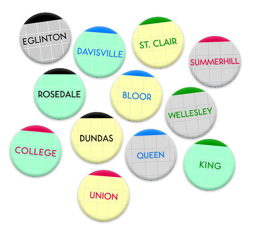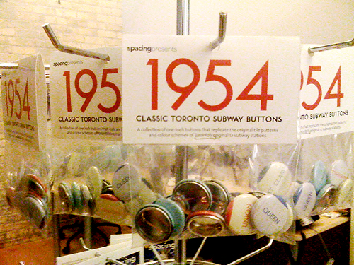
Just before Christimas of 2004, Spacing launched our first batch of Toronto subway buttons. Five years later we’ve sold over 100,000 buttons that pay homage to the tile patterns and colour schemes of our subway platforms.

To mark the occasion we’ve decided to release a special edition of our buttons, this time focused on the original colour schemes of Toronto’s first 12 subway stations opened in 1954 from Eglinton to Union underneath Yonge Street. (Many thanks to Jose Ongpin for the research work previously done on the TTC subway)
There is only one catch: for the time being you can only get them at our release party on Wednesday night. They’re for sale at $10 a pack. After our Wednesday party we’ll announce the retail locations the buttons will be sold at.
If you wish to learn a little more about Toronto’s subway history check out this fine article on Transit Toronto.
Click on photo to see a larger version


17 comments
“Transit Progress is Civic Progress”. There could be a T-shirt in that 🙂
What an excellent slogan “Transit Progress is Civic Progress”.
The TTC should bring this back.
Damn Spacing, always tempting me with their products. Oh well looks like I’ll have to buy more of their stuff.
Re: the photo at the bottom — there was British funding for the TTC??
The subway cars came from Britain.
The photo is amazing, simply amazing. The pride, the tradition, the modernity all in one sign. They should make a vinyl stick-on reproduction and plaster it on some stained, decrepit station wall in one of the Eglinton concourses to spruce the place up.
Britain is the mothership.
Handsome buttons. Have a great launch party — as always I am there in spirit.
The British government provided written assurance that it would do everything possible to ensure that materials would be available to build the subway cars, despite the restrictions imposed by the Korean War. The government had to lean on some suppliers or the cars wouldn’t have been ready in time and the subway would have opened much later than it did.
Awesome buttons!
Maybe Toronto should ask for some more transit funding from Britain instead! 😉
If only your party was 2 weeks later, I’d be in TO to attend. This is the first party I’ve had to miss since I learned about Spacing in the Spring, and I’m kinda bummed out about it.
And that sign IS terrific. And I totally want “Transit Progress is Civic Progress” on a button for my bag along with my other Spacing buttons.
Indeed, re. Transit Progress is Civic Progress slogan: interesting to see how sentiments change over the years, with whingers complaining now “why should I pay taxes to support transit – build more roads!”. Transit supporters need to get the message out that everyone benefits through the construction of transit lines, even those who exclusively use cars as their modes of transport, through reduced congestion. Transit lines really are city building efforts – look at how Spadina has been revitalized, and the huge changes happening on Sheppard.
That’s a neat juxtaposition of buttons in the top graphic — it shows effectively how the pattern of wall colour interacts with the pattern of trim/text colour, in addition to geographically. Just need to nudge Union over a little to the left, and maybe move Summerhill down a row to the left of Rosedale. As a comparison, This presents it in a matrix format but not geographically.
The text/trim colours look a little on the bright side in the top graphic, but in the photo of the packaging the colours look a little closer.
Brent: the graphic is a little brighter than the actual buttons (the red looks a little magenta-y). I’m pretty sure I nailed the colours on the actual buttons.
Where was this big sign located?
Nice buttons btw.
I’m sure to drop by Wednesday night and introduce myself to the Spacing folk because I didn’t know till now that the work I did back at OCAD helped out for these buttons and I’m sure to get them too! On one note I have to update the posters to reflect the true colours of Osgoode and St. Andrew 🙂 Much appreciated that my research work contributed to this.
Why purchase 50’s era buttons when I can get my nostalgia fix by purchasing 50’s era tokens, tickets and paper transfers? The TTC should market itself as a ‘trip down memory lane’ transit system. An unintentional benefit of being years behind just about every other first world (and developing world) transit system.
‘1950’s fare system… Humbug!’
The weakness of the token system has shown itself during the fare hike, but in many ways it works fine. ‘Smart’ cards are subject to fraud too.
How does it feel to carry around the millenia-old technology known as the key? Are we backwards for still using them? No, they work fine for many daily uses.