
When I was young the Toronto of my imagination was not Victorian, precious or gingerbread in anyway. It was concrete. Slabs of it. Along the ground, up walls, flying into the air defying gravity or sliding down a ravine. It was the future — or a vision of the future — and as solid and eternal as the pyramids or Greek ruins. It was these modern concrete buildings that stuck in my head and first suggested that Toronto was a good and interesting place to be, and a place I would eventually move to.
I’ve been reconciling that sexy utopic image in my head with the actual Toronto since I moved here. The city with Annex’s and Little Italy’s, wooden telephone poles and bungalows. Yet it’s impossible to shake that concrete image because this entire city is filled with a remarkable amount of fantastic buildings built from the 1950s to the 1970s. Sometimes that feeling surprises me in unexpected places. Maybe a fountain in front of a 1950s apartment building on Bathurst north of the 401 or in the lobby of the first building I lived in at Yonge and St. Clair. From New City Hall to suburban library branches, we have perhaps one of the best collections of concrete buildings in North America.
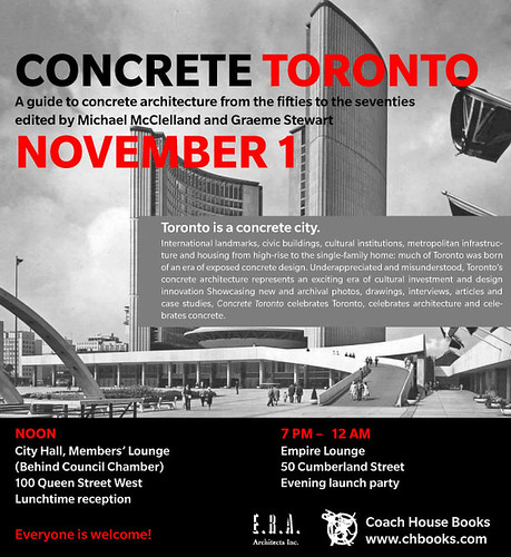
A new book by Coach House and E.R.A. architects called Concrete Toronto — launching today at City Hall and in Yorkville at night — is the first major volume to celebrate what we’ve got here. These great buildings have often being overlooked or disdained in a sort of knee jerk way over the years. Thus concrete (and mid-century modernism in general) is at the same place our celebrated Victorian and Edwardian architecture was in the 1950s — at risk of being forgotten and torn down.
This book gets as close to articulating the feeling Toronto’s concrete gave when I was young and continues to give me. Something a bit utopic in a space-age sort of way sure, but more specifically it indicates a time when there was investment in cities and infrastructure in a major way. And in a daring way — some of the designs that reached fruition in Toronto belie this city’s reputation as being a conservative, boring place the last 40 or 50 years. Where did that motivaton to invest come from? Where has it gone? How can we get it back?
Concrete Toronto might help us figure that out.
I wrote about Sidney Smith Hall in Concrete Toronto, and a number of Spacing writers have contributed essays, including Graeme Stewart, one of the Editors.


8 comments
Haha, your dream of a newfound appreciation for concrete modernism has finally come true!
One day I may see it, but for now I still loathe buildings like the CAHM at College & Spadina or any of the crummy hospitals put up in the same era.
It’s hard to look at the shift in Toronto’s architecture around that time without thinking, “They don’t make ’em like they used to.”
“Do you know what time it is?” “Yes.”
Such is the feeling when we are told there will be two events for an interesting new book, but not told when or where.
Joe – The locations and times are in the poster at the top!
Toronto might be the Florence of brutalism but almost all of the buildings that are universally reviled – and justifiably so – are from that 1950-1970 era, too. Here’s just a sampler: Sheraton Centre, Hudson’s Bay Centre, Jorgenson Hall and the blockbusting robarts library…their crimes are that they meet the street in horribly arrogant ways and make the sidewalk an oppressive, windswept blight. in many cases they replaced older architecture that was more sensitive in scale and, therefore, more of a delight to be in.
I’m not going to forget that there are some real gems like the Central Tech addition, which really fits its surroundings, but too much of brutalism’s legacy in Toronto is brought down by building overbearingly large buildings in what was once a rather delicate, low-slung city. I’ll celebrate concrete with you, but I’ll do it perhaps a little more grudgingly.
The time and location information would be
substantially more convenient and accessible if it
were in text as opposed to an image.
I could, for example, copy and paste it into an e-mail — or get a map to the location in a bright and shiny future of at-least-semi-standard microformats…
Sometimes I’ll just type the 8 letters into the engine to bring up the map. It’s as easy as cut and paste. Not substantially more convienent — just micro-ly.
Please! For God’s sake, let’s stop kidding ourselves. Our hideous brutalist architecture is about as worthy of praise as the cheap, grey, concrete disasters that were built as quickly and inexpensively as possible in the Soviet Union and the Eastern Block.
No one in Eastern Europe in their right mind is saying that these eye sores have any merit. What on earth is attractive about grey concrete slabs. Let’s stop celebrating this massive folly and start thinking of creative ways to hide these eyesores. How about growing ivy on the hideous buildings at U of T or covering that revolting Hudson Bay Centre and Yonge and Bloor. The longer we celebrate these disasters the longer it will take to think creatively about improving them. Remember, the first step to righting this wrong is to ADMIT we have a problem!
They’re attractive in the neutrality of the concrete, the fine details like the way good Brutalism used planks of different woods to create light impressions, and the imaginative shapes they got the concrete into. The womb-like interiors were also unique to the buildings.
There’s no problem at all, and these are mostly interesting buildings.