
Waterfront Toronto has released the 3 competing designs for the public space at Jarvis Slip at the foot of Jarvis Street (Christopher Hume of The Star wrote and videoblogged about them today, and the Globe had an article).
PDF files of the competitors’ panels and written report submissions have been made available at the Waterfront Toronto site. – but since at least one of the PDF’s is 90MB, and there’s nowhere else to just see some images from the designs (edit: torontoist posted images on friday) I thought I’d make some available (click on the link below to continue reading if you are viewing from the home page).
———————————————-
Info on the public presentation and exhibition:
Public Presentation
January 21, 2008
7:00-9:00 p.m.
Metro Hall (Rotunda)
55 John Street
Exhibition
January 21-25, 2008
Metro Hall (Rotunda)
55 John Street, Toronto
———————————————-
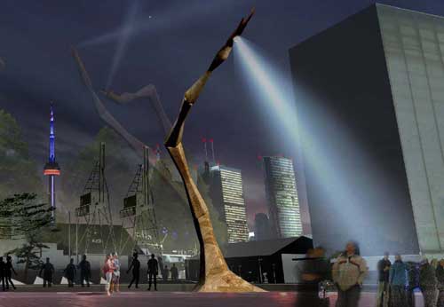
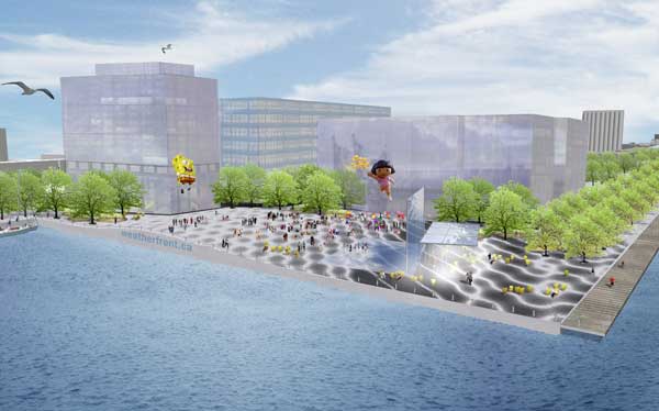
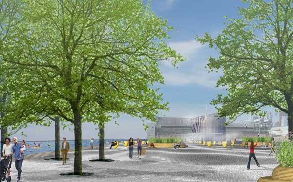
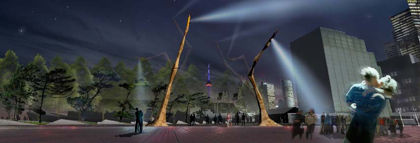
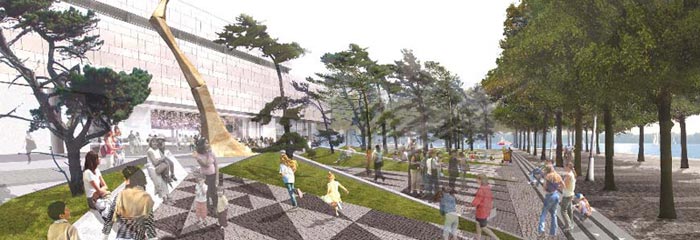
Weatherfront
JRALA with Charles Waldheim and Ned Kahn
———————————————-
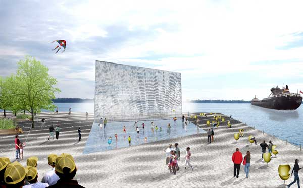
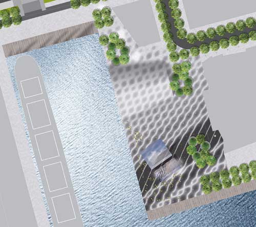
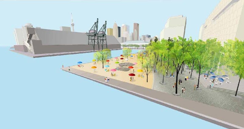
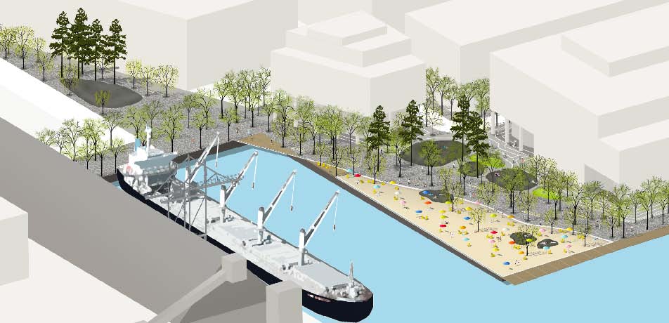
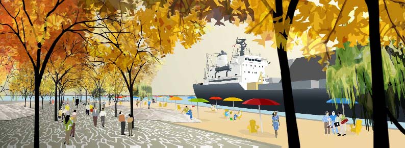
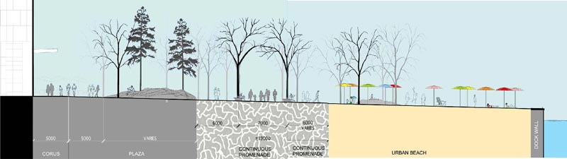
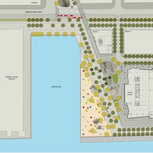
Sugar Beach
Claude Cormier Architectes Paysagistes
———————————————-
Crossposted to bricoleurbanism.org
21 comments
Wow! I say we should just give West 8 a blank check for the entire waterfront by now.
Nowhere else to see the designs? Here’s my article on Torontoist from January 18 and the Star made a video of them yesterday.
For those who want Toronto to look like Halo 3.
whoops, sorry, missed it on Torontoist – though I thought the Star’s video was pretty useless.
Thanks, Robin! Appreciate the edit. I also second that the 90 MB PDF is torture to open, let alone scroll through.
That illustration resembles a scene from War of the Worlds!
Unmistakably, an alien figure with a ‘death ray.’
They’re coming, they’re coming!
Are those two people on the right-hand side of “west 8 – dtah view 1” making out? As in “the death rays are attacking and I never told you I loved you…”?
The Cormier design seems a lot like HtO. That’s not necessarily bad — it seems like HtO stayed pretty busy over the summer, so another “urban beach” would probably get plenty of use — but it’s tempting to pick one of the designs that adds something different to the waterfront. Overall, it’s great to see the effort to create an innovative public space.
The organic and alien shapes look so wonderful. They are exactly what kids (and not-so-kid people) will remember and love to visit repeatedly. It moves, it’s weird, it’s got searchlights, it’s perfect.
Reminds me a bit of Louise Bourgeois‘s strange and wonderful giant spider sculptures she erects (well somebody else does it for her, she’s 96). I first encountered one in the turbine room at the Tate in London a few years ago, and then Canada got one out front of the National Gallery in Ottawa, making a windswept public space by a fast arterial road a lot more interesting.
At the Tate by thynkyr.
Outside the Tate by JJ 2007.
National Gallery by amydawnrose.
I hope as Stephen Harper is driven by this on Sussex Drive each day he might think of it as the election creeping up on him.
The West 8 design has my vote. What a neat idea. It would be added to my must-see monuments in Toronto that I can’t wait to show off to visitors: the ROM Crystal, OCAD, and then this.
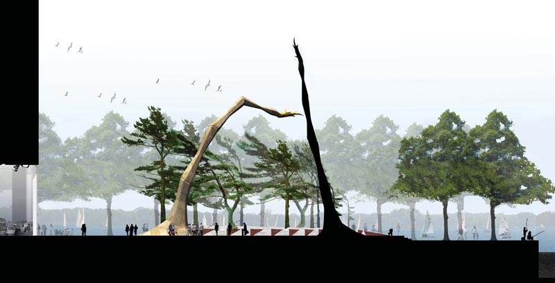
For those who don’t know, West 8 has used similar arms before at Schouburgplein in Rotterdam – having visited, I must say it’s a bit of a gimmick that wears off quickly, though has an interesting effect on a place as frequented as a main plaza in the central area of a major city (compare to say Dundas Square here). What to me is perverse about the design and the configuration is that with the gantries and cranes of the sugar factory and ships directly opposite the site, why these arms don’t mimic in style the industrial character of those facilities (more similar to the Schouburgplein versions) instead of insisting on this fantasy of primitivesque twig-like structures. The other thing that bothers me is their location away from the edge of the water – this is ridiculous, the arms should be right at the edge of the water, combine that with the beach idea from Cormier’s scheme and you’ve got a blockbuster space that relates to its context and history.
there are some photos of Schouburgplein on Flickr, but I don’t seem to be able to add them to my comment… here’s a couple of links:
http://farm2.static.flickr.com/1082/527763447_8119a99639.jpg?v=0
http://farm2.static.flickr.com/1312/897627146_627e6c154d.jpg?v=0
Hmmm good point. Maybe they went for the organic form because the Schouburplein arms were more industrial looking?
I’ve always liked RedPath on the water as a reminder of Toronto’s industrial past. Have industrial looking arms would be a wonderful reminder. The ability to move “over the water” even better.
The DJ booth at the now defunct but legendary Motor Lounge in Detroit (er, Hamtramek), was the operators booth of either a ship or massive crane. So appropriate for industrial Detroit, and a great place for techno pioneers to play from.
from what I read in the globe, the articulated arms are supposed to mimic the ‘group-of-seven’esque windswept-jack pine motif.
I think it would be better if they had gone with the industrial motif of the actual waterfront. Although they do sort of resemble the dead trees at the Leslie Spit.
Oh yeah, and there is a ‘giant spider’ in front of the Guggenheim at Bilboa. I guess it keeps ‘Puppy’ company.
why not just let Joe Pantalone fill the area with trees,have an area for off leash dogs and a couple of fast foot vendors at the entrance.Would save us millions, we wouldn’t have to pay for a $5000 victory party for the winning bid.After seeing how the waterfront has gone to pot except for a few areas lets just get practical.At least it will give Joe and Dave a place to put their statue to commemorate their “contribution” to the city.Joe can even get his friends at CREE lighting to light up the place!!!
George, what you’re suggesting is completely unrealistic.
Now, TEDCO extending their concrete box for Corus on the other hand…
Wow…does West 8 ever love to cram “Canadian Content” into their designs for our waterfront.
1st it was their floating Maple Leaves and thousands of Maple new trees for the Central Waterfront and now this stark and almost frightening homage to the “Canada Arm” from the space shuttle that we are tirelessly reminded about.
What’s next from West 8 and DTAH…a frozen hockey rink made of Maple Syrup?
The big question I have is whether or not Waterfront Toronto even owns some or all of this parcel of land?
The entire property in question is municipally owned, though I believe split between TEDCO and Waterfront Toronto with a deal or swap to preserve this space as public with the development of the Corus building (also on municipally owned land, but just goes to show you, when TEDCO’s involved, that doesn’t mean all that much) as part of the East Bayfront Precinct Plan.
So ownership is not in question – but still, it is the question of appropriateness – West 8 does seem to want the entire waterfront to reflect some kind of cottage-country aesthetic and a stylized relationship to the canadian landscape…. and war of the worlds all at once.
As attention-getting and seductive as the arms are, I am underwhelmed by the rest of the West 8 design – it feels too much like the arms have become a crutch for an absence of any coherent idea for the site….
Yet another set of designs that are incoherent, ridiculous or just plain population unfriendly.
Honestly, is it so hard to create something classic, harmonious and useful?
Looks perfect for our smoggy, dystopic, future Toronto! Are the rays coming out of those things for frying two-headed, homeless mutants? (see pic 4th from bottom)
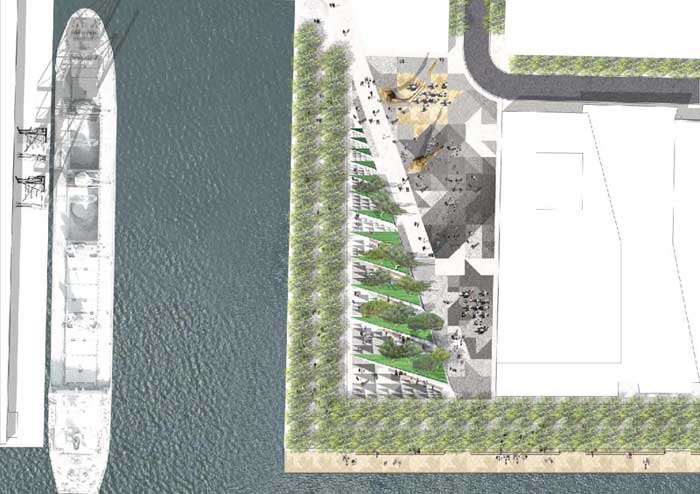
Not to veer too far off the path of the discussion here, but I appreciate the use of geometry in the last submission “Jarvis Square West 8 + DTAH”
http://en.wikipedia.org/wiki/Sierpinski_triangle
There is some definite fracticality to it, especially if you look at the overhead shot.
It seems like the West 8 design seeks to hide the view of the water while the other 2 have spaces that spill out onto the lake. Interesting… It continually surprised how little the beach at Ashbridges bay is used (aside from beach volleyball) so I’m not sure how much use a beach would get but its not necessarily a bad idea.
A few thoughts:
What a stupid place for an “urban beach”–it faces the sugar refinery, and all of the industrial elements that go along with it. Makes me think that whoever came up with that design hasn’t actually been to the site. H2O Park works well because of where it’s situated, in this location, not so much.
The West 8 design, on the other hand, seems inspired by what’s already there. The refinery is rather aesthetically post-apocalyptic (especially its eastern side), and is an interesting mix of nature/culture/economy contradictions (right down to its Robert Wyland whale mural). I like the fact that West 8 builds upon these ideas & aesthetic while adding some much-needed greenery to an area that, at the moment, is nothing but asphalt and concrete. That said, someplace to sit would be nice…and in my mind, should’ve been a requirement for any design put forward. What up with that, West 8?
And what’s with the giant Spongebob and Dora in the Weatherfront design? Makes me wonder what Corus’ contribution to the design will be…ugh.
As far as property ownership goes, I was wondering the same thing during Waterfront Toronto’s East Bayfront information session last week, where they presented their plan for the entire area, including Jarvis Slip (see it here: http://www.waterfrontoronto.ca/dbdocs//478ca8e81b135.pdf). I asked them if they had a map showing the current ownership of the area, which they did. The map is dated 2003, and it shows that the area this design covers is municipally owned. I’ll send the map to Spacing, perhaps they can post is somewhere.