

WORD ON THE STREET
WHEN: Sunday Sept. 27, 2009, 10am-6pm, rain or shine
WHERE: Queen’s Park Circle (Museum & Queen’s Park stations)
This coming Sunday you can grab yourself discounted copies of the new issue of Spacing and any of our back issues (all $5 each, down from the $8 in retail stores!). You’ll also be able to pick up subway buttons of your choice as well as our Toronto Town buttons that replicate the old coat-of-arms and corporate seals of the former villages and towns that now make up Toronto. We also have a new series of buttons dedicated to our current issue which focuses on our local suburbia (follow the link to see the designs).
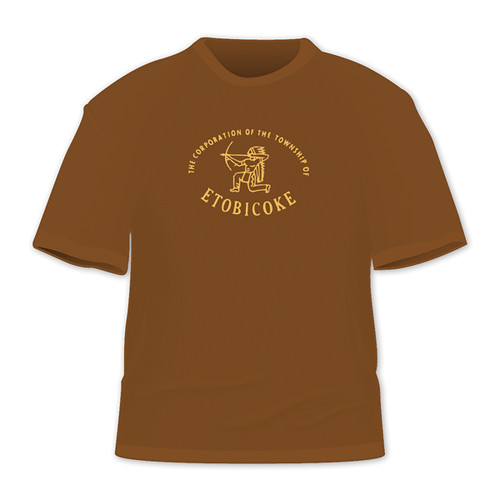
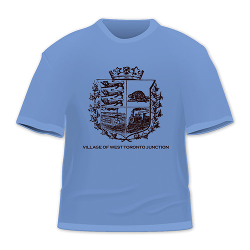
Also, Spacing will unveil a new line of products: t-shirts! (see images below) You’ll be able to purchase a t-shirt with the old logos of the former municipalities of Etobicoke, East York and The Junction (more villages and towns t-shirts to be added throughout 2009). These designs are an extension of our Toronto Town buttons.
See the t-shirts and button designs after the “continue reading” link.

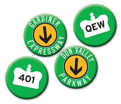
And our new set of buttons dedicated to the highways that ring Toronto.
WOTS photo by poodlerat
5 comments
Great work on the tees, guys! Have the colour choices any significance in relation to the original crests/logos/areas of the city? These would also be cool with black graphics on white tees, too.
$5 back issues? I’ll see you there with lots of $20 bills to get them all! 😉
Great merchandise! No 427 button? I don’t think I’ve ever seen the Gardiner or DVP signs with arrows pointing down. Left, right or straight (up). I could have sworn one of them was blue and yellow at one point. Plus, if Joe Clark doesn’t nitpick it, the arrows themselves seem thinner than the ones used on the actual signs.
Lovin’ my new East York tee, though (thankfully) the fabric isn’t quite so utterly faithfully hideous as to colour-match the pictured version here.
(By the way, your website still says the buttons are available at *sniff* Pages! … http://spacing.ca/buttons.htm )