


A series of posts from Spacing’s editors and contributors celebrating a decade of the magazine
![]()
Whenever I present Spacing to a new reader for the first time there is always a moment where they seem a tad disoriented by the shape. When we started Spacing I made the conscious decision, as the magazine’s art and creative director, that we needed something to make us stand out from the other magazines on the newsstand. I figured that since Spacing was about the urban landscape — and more specifically, that cities grow outward much more than upward — the magazine should be in a landscape format.
What I brought professionally to Spacing in the early days was a lot of magazine production experience. My previous job was as the art director of The Hockey News, where, for over five years, I designed 40 issues a year plus numerous one-off publications. During the last 18 months at the job I was also the newsstand design specialist for Preview Sports which was owned by Transcontinental, The Hockey News‘s parent company. The magazines of Preview Sports were sports fantasy league and pool annuals for fans of the NFL, NBA, Major League Baseball, college football, college basketball, NASCAR, and the NHL. I would develop a template design for the sport and then customize it for 10 to 15 regional covers. That meant there was a cover of a Leafs player in the Toronto region, a Canadiens player in Montreal, and Flyers player in the Philadelphia area, and so on. In total, I designed over 350 covers during my time at The Hockey News and Preview Sports.
The large American newsstand distributor of these publications would come to Toronto and present workshops to Transcontinental’s art directors to tell us where to place text, what kind of words to use, how big numbers should appear. They called it “newsstand school.” As an art director, the process of designing a cover became extremely formulaic for me. At the time, I felt like the covers of our sports publications were very generic and hardly distinguishable from other fantasy league magazines. If you look at magazines on newsstands today you can see that the covers often look the same — especially sports, entertainment gossip, and womens’-focused magazines — because their art directors have gone through the wringer of “newsstand school” and editors have allowed circulation executives to have tremendous input into cover designs. Yet it’s magazines like Time, The New Yorker, and The Walrus, with their use of minimal text, that often have the most striking cover designs.
So when I first began designing concepts for Spacing I took everything I learned from “newsstand school” and more or less ignored it. I placed minimal text on the cover and let the image do the talking, so to speak. I knew newsstand reps would not like the magazine’s shape. But I banked on magazine stores like Pages, Book City, Press Internationale, and This Ain’t The Rosedale Library appreciating Spacing’s hyper-local coverage and giving us a good spot on their magazine racks. And that’s what happened: they didn’t want our “short” magazine to be hidden behind other magazines, so we would often find Spacing in the most primo of spots (locations that are often bought by magazines and distributors). I’ve often felt vindicated for my decision to turn Spacing on its side: for most of our existence, the magazine’s newsstands sales have been twice as high as the industry average and we’ve received five Canadian Newsstand Awards nominations.
But the thing I’ve loved most about designing Spacing‘s covers has been the ability to indulge my fascination with a style, idea, or photographer. below, I’ve compiled the Spacing covers that I like the most and what was motivating me when I was designing them.
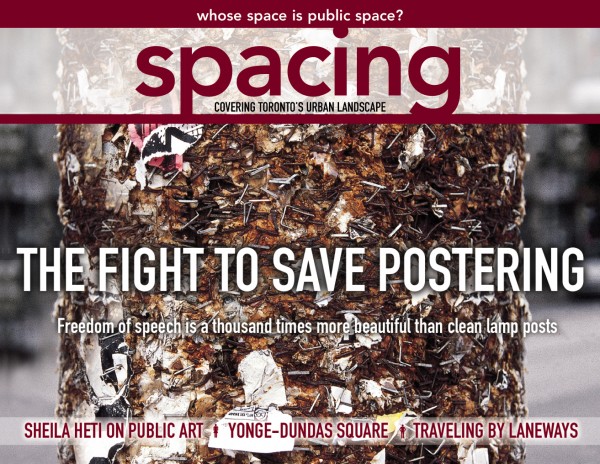
ABOVE: The cover of the first issue (winter-spring 2004) was the first thing ever designed for Spacing. The main design was completed in February 2003, about 10 months before the magazine was launched. Once I showed the concept to the other editors it made the magazine feel more real. We also had two tag-lines for the first three issues: “Whose Space is Public Space?” (which was more of a mission statement) and “Covering the Urban Landscape”, with the top line removed after issue three.
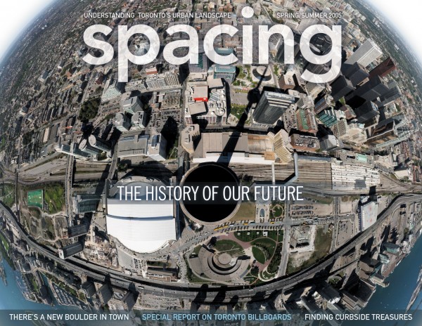
ABOVE: The fourth issue of Spacing (spring-summer 2005) featured a composite photo of 53 images by Stephen Rothlisberger taken from the super-high observation deck of the CN Tower (interestingly, Stephen is a native of New Zealand who took the photos on a vacation). The cover section of this issue garnered Spacing our first — and only! — gold award at the National Magazine Awards. This issue sold out quickly and we only have three copies of it floating around our office. It is fun to look back at this cover and see the areas that have been transformed since this time, such as the CityPlace neighbourhood to the left of the SkyDome and the area surrounding the Air Canada Centre in the bottom right section.
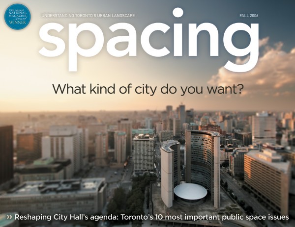
ABOVE: The seventh issue of Spacing (fall 2006) featured our first and only tilt-shift image. It was the first of three covers photographed by Sam Javanrouh, Toronto’s and Canada’s most popular photoblogger. I accompanied Sam onto the roof of the Sheraton Centre across from City Hall. The security guard who led us up to the roof said he’d check on us in 30 minutes. He was noticeably petrified of heights, which explains why he never came back and let us run around on the roof for nearly three hours so we could take lots of other photos.
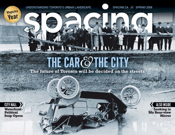
ABOVE: The 11th issue of Spacing (spring 2008) was the second time we used a photo from the Toronto Archives (the first being our transit issue from summer 2006). The image fit so perfectly with our editorial content that we had to use it. The cover also marks the first time I seriously covered up our logo — while it was time-consuming to individually crop out those people, I love the depth-effect it has with a few people standing behind letters.
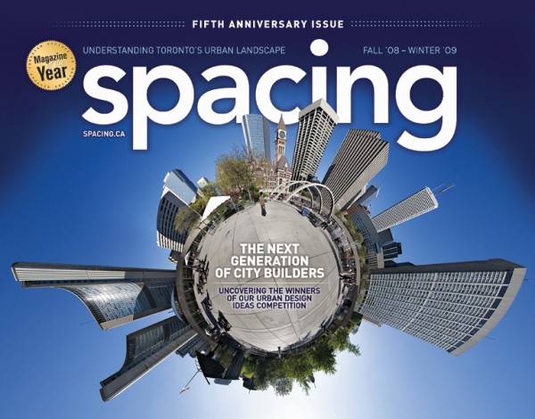
ABOVE: The 13th issue of Spacing (fall 2008-winter 2009) featured our second photo gimmick cover: the “globe” effect of Nathan Phillips Square and Toronto City Hall. The photo by Sam Javanrouh was a great fit for our fifth anniversary issue which focused on creative new ideas for the city’s public realm. And since Toronto is often accused of thinking it is the centre of the universe, the image of a planet Toronto seemed apt.
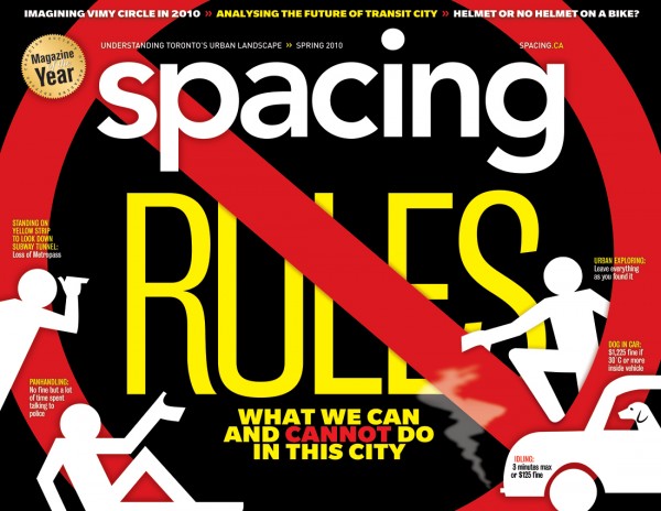
ABOVE: The 17th issue of Spacing (spring 2010) is one of my all-time favourites. Once we decided on the “rules” theme I instantly knew I’d want to use the red No symbol in some form or fashion. The “public man” figures were designed by Marc Ngui — I moved and flipped the figures around endlessly trying to strike the right balance. I know this is graphically the most striking cover we’ve published: I was on a streetcar heading home after work when I looked into a store and could easily read the words RULES on the magazine cover 30 or 40 feet away. I also like how the cover kinda says “Spacing Rules” but has a cross through it, as if we had second thoughts that we don’t rule.
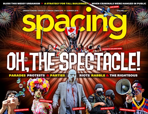
ABOVE: The 18th issue of Spacing (summer 2010) is the second “chaos” cover I designed (the other being the urban animals cover). I used a bit of poetic license with one of the photos along the bottom: the G20 summit had yet to take place but I knew it would be a shit-show. The G20 cops were from the Pittsburgh summit the previous year. My hunch proved to be quite accurate as our issue hit newsstands the week following Toronto’s G20 riots. This would possibly be one of those covers newsstand specialists might like since there was a huge starburst, a top section of headlines, and lots of “entry points,” as they like to say.
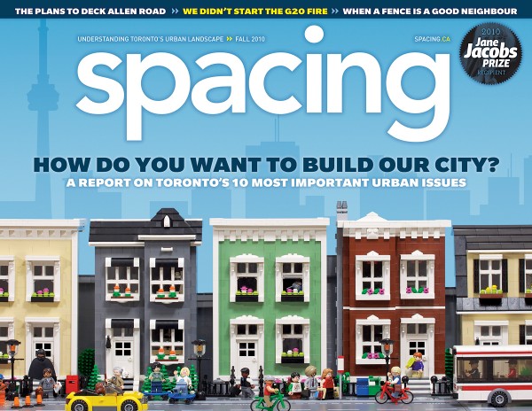
ABOVE: The 19th issue of Spacing (fall 2010) marks a bittersweet time for us: we had just won the Jane Jacobs Prize and produced one of our best issues (it was one of three Canadian magazines nominated for “issue of the year” by the National Magazine Awards), but this edition had little effect on the electoral outcome of the civic election that pushed Rob Ford into office. But the cover… well, I just love the cover. I hired Lego artist Chris McVeigh to recreate a Toronto street scene. I gave him some vague artistic direction and he went away and created an unbelievable scene. He even hid a zombie Lego-man in one of the windows (you won’t be able to see it in this low-res version but check out the printed copy if you still have the issue around).
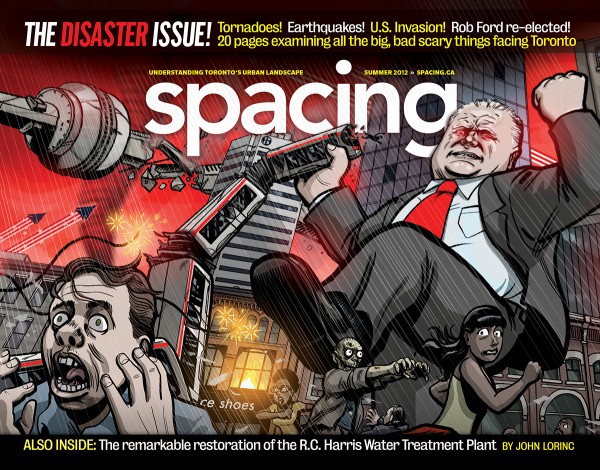
ABOVE: The 24th issue of Spacing (summer 2012) is, by far, our most popular cover. We’ve sold prints and buttons of this image. We could seriously run this cover each time we put out an issue as Ford seems to be wreaking havoc and disaster upon our city by the week. Illustrator Steve Murray exceeded my expectations when his rendering arrived in my inbox. All of the topics in our section were nicely represented in this cover: America attacking us, zombies, the CN Tower falling over, a tornado hitting the city…. We also broke our longest-standing rule about Spacing cover designs: no CN Tower. While we had a shadow of the tower appear on the cover of issue four and in the background of issue 19, we had been able to keep the city’s most iconic structure off of page 1 until this issue. Since the CN Tower is in the midst of being destroyed we felt it was okay to bend on our self-imposed rule. The cover inspired us to do an over-the-top movie trailer for the issue, created by Sam Javanrouh. Also notice that we kept all the text off of the illustration in order to maximize it’s impact.
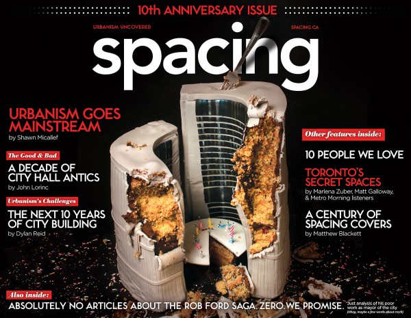
ABOVE: The 30th issue of Spacing (winter 2013-14) and our 10th anniversary issue was super fun to create and eventually eat. We commissioned pastry artist Sarah Fortunato to create a cake in the shape of Toronto City Hall (we have a separate post being published next week about how she made the cake). I had originally imagined the image on the cover would be the cake lit with candles, while the eaten version of the cake would appear on the final page of the magazine. But when the photo shoot was completed and I began to comb through the 300-plus photos, it was the eaten cake that seemed to resonate as the cover image (credit needs to go to my partner Carly for being adamant that this image be used). City Hall is currently in disarray and the idea of “stick a fork in it” seemed appropriate. And, as I’ve written before in the magazine, it is nearly impossible for us to write about current events surrounding Rob Ford as the news seems to come at us in waves by the day or even by the hour: by the time the magazine hits newsstands whatever we have written about would be stale. So we decided to declare what was not in the magazine with our bottom headline “Absolutely no articles about the Rob Ford saga. Zero. We promise.” We also recognize that the city is becoming Rob Ford news-fatigued. Who knows if that will help newsstand sales — it was unimaginable that he was elected in the first place, so maybe not writing much about him will help us too.
While I used to design more covers in a single year at The Hockey News (I was the art director from 1998-2003) than I’ve done in a decade with Spacing, I have to say it has been a rewarding and fun time to experiment with magazine cover design. I hope you have enjoyed looking at our covers as much as I’ve enjoyed creating them.

One comment
Thank you Matt for the explanation and the stories behind Spacing and Spacing covers. Congratulations on 10 years.
Cheers, Moaz