


What better way to start off 2009 than with another map. Given how the unexpected snowy weather seemed to paralyze this fine city of ours over the holidays, I thought is would be more than fitting to see how we all get to work.
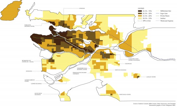
The map here – based on data from the most recent census data, Translink and Metro Vancouver information – depicts the percentage of trips made to work throughout Metro Vancouver via transit, walking and biking (combined). This is shown in tandem with the major transit lines – Skytrain, Westcoast Express, Seabus, and B-Line buses – as well as labels naming areas with high use. This is one of those deceivingly simple but extremely informative maps that speak to all types of issues – from socio-economics to sustainability. The more you study it, the more informative it becomes.
Despite this, I’ll just focus on some of the things I find particularly interesting about it. I’ll begin with the fact that Bowen Island is included in the map. Not only this, but that the same range of people use transit, bike and walk to work as the Vancouver’s south edge.
This includes a large portion of the Westside, despite the fact that the 98 B-line travels across the neighbourhood and sits in great contrast to the neighbourhoods around Broadway’s 99 B-Line. When seen in tandem with density map and related article I wrote a little while back, the relationship is clear. Given that density issues are related to economic status (with the Westside being the home of many of Vancouver’s wealthiest citizens) the truism that the wealthy are some of the largest carbon emitters is clearly shown here. One can’t help but wonder if, and how, the Canada Line will change this pattern.
Also clearly depicted on the map is the influence of the Skytrain Expo Line, slicing a swath of transit use across the region. This pattern is also reflected along the Millenium Line, although to a lesser extent. Although there are several key similarities between the two (for example, in both cases the average distance between stations is approx. 1.5 km) there are several factors that account for this pattern difference. With this in mind, I imagine a large part of this is due to the age of each Line (Expo being the older of the two and, thus, giving the surrounding neighbourhoods a chance to adapt to it) and the types of neighbourhoods that each travels across (with several Millenium stations directly adjacent to industrial areas vs. residential areas).
The Westcoast Express demonstrates a linear pattern similar to the Skytrain although I’m sure the prevalence of the car in the auto-oriented landscapes it serves accounts for the lower ridership. Creating higher density residential pockets around each station would most likely build on the strength of this existing pattern and increased transit use.
Another pattern of note is the difference between the Skytrain and bus routes. Whereas, Skytrain creates continuous “lines” of intense use, bus routes create “nodes” of intensity often focused around bus exchanges where people are given the most options and parking is abundant. Consequently, these exchanges frequently attach themselves to shopping malls, solidifying the age-old relationship between transportation and commerce. If only homes could be more readily integrated into shopping malls….
At its most simple, the overall pattern depicted here shows a hierarchical and radial distribution of transit spokes (and hence transit use) centered on the downtown penisula. We take for granted the limitations of the latter because we are used to seeing and using cities that are based on the central business district where the vast majority of people supposedly work.
Yet the contemporary regions – Metro Vancouver included – don’t necessarily follow this model anymore. More and more regions are a series of multiple centers. This has led to the creation of network (vs. radial) transit patterns like those seen in London’s Tube, Japan’s subway or even Montreal’s Metro. In such cases, systems create more of a non-hierarchical mesh connecting major “centres” in multiple directions. This, in turn, is often a better reflection of how regions are used – with a growing number of inter-suburban travellers, as is the case locally. Food for thought…
 For those of you who simply like eye candy, here is a 3-dimensional version of the map. I’m the first to tell you that this doesn’t tell you as much information as the 2-dimensional annotated map above. But it definitely looks cool.
 ![]()