
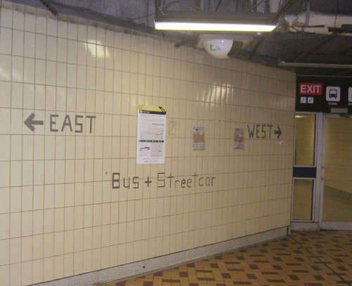
Image courtesy of CDL.TO
Over at Urban Toronto Forum, CDL.TO has documented the latest in TTC signage materials at St. Clair West Station. St. Clair West has been a mess during the last two years. The bus/streetcar loop has been closed off for the better part of a year for construction, and streetcar service itself has been running at an off-and-onbasis as work slowly progresses on the new right-of-way. Buses have replaced streetcars along part or the entire route, and this situation is expected to remain the same until the entire ROW is completed, likely in 2009. But the TTC has sunk to a new low this week – new wayfinding signs directing passengers from the subway to connecting buses and streetcars have been formed out of duct tape. That’s right, duct tape – otherwise known as the handyman’s secret weapon. In the picture below, the duct tape letters have been supplemented with scribbled scrap papers taped to the wall.
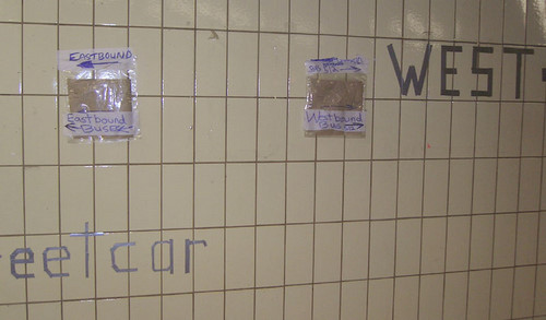
(Courtesy of CDL.TO)
This latest embarrassment comes not long after Joe Clark’s two Type and Tile Tours of the subway system. On the first of these two tours which demonstrated some of the failures of TTC signage, I discovered a station vicinity map at the Walmer Road entrance to Spadina Station (opened in 2001) that pre-dates the replacement of the 77 Spadina bus with the 510 streetcar in 1997.
Recently, further north on the Spadina line from St. Clair West, I found another example of outdated customer information at Wilson Station, where the sign for the 104 Faywood bus still sports a sticker for the Timeline service. Timeline was discontinued in 1999 as the computerized telephone schedule system was not Y2K compliant and the TTC unwilling to pay for the expensive upgrades to the system. Yet all of a sudden this year, the TTC removed all the “Walk left, stand right” signs at escalators within a few weeks.

Note: Jonathan Goldsbie first broke this story over at Torontoist, though I hadn’t seen it until today.


31 comments
“Yet all of a sudden this year, the TTC removed all the ‘Walk left, stand right’ signs at escalators within a few weeks.”
And the background story showed the absolute rediculousness behind it. Glad to see they’ve got their priorities straight.
And I was in St. Clair station tonight-somehow I missed that absolute butchery of amateur signage.
I posted about this on Monday afternoon.
Perhaps they are trying to be poetic and the signage is a metaphor for the amateur job being done upstairs with the bus/streetcar routes. It’s gotten bad enough that ‘m heading southbound to bloor in order to subway across and back up on a northbound bus to get to places in any kind of reliable time.
I thought the point of way-finding signage was to help people find their way. The duct taped directions appear (from the photos at least) to be clearly visible, quite straightforward, effective, low budget AND temporary. It may not be high art, but I’ve seen various levels of government sink far more time, money and materials into far less effective way-finding signage–signage that ends up being a blight on the landscape for years to come. I don’t think there’s anything “low” about focusing on function and ignoring form when you’re dealing with a construction site and a budget crunch.
The worst signage on the TTC is at Kipling station. Where you change from Subway to Bus, you are in a long corridor, maybe 75 metres, and all of the bus stops signs are parallel to the space, so you have to walk back and forth along the length of the space to find your bus. Not an issue for the regular commuter who knows where they are going, but this also happens to be where you catch the airport express. I came up from the subway, walked to one end, then all the way to the other before finding the stop just in time to see the bus pull away.
Perpendicular signs would solve all the problems, not to mention perhaps special signs for the airport express to help guide tourists. I have been in countless major cities over the past few months for work, its interesting to see the varying ease of getting to and from airports. Toronto is probably middle of the pack in terms of time, but much lower when it comes to clarity, I can’t imagine many first timers choosing the TTC option. Not to mention that it has essentially become the commuting bus for all airport employees and it is near impossible to get on during regular hours especially with luggage.
I am wrong in thinking that the Canadian spelling of the plural of bus is “busses,” not “buses?”
The latter is how I learned it, which makes me believe the spelling in the photo is incorrect.
1st Designer: “Wow, you always have so many fonts, where do you get them from?â€Â
2nd Designer: “Oh they come from Monaco, Geneva, Chicago, New York… I get them delivered at various Times throughout the day.â€Â
1st Designer: “Delivered by whom? In what condition?â€Â
2nd Designer: “By a Courier, new!â€Â
Frankly, I’m surprised this even managed to get this much signage done. On the other hand, to echo the above poster, at least they didn’t spend hundreds of dollars on temporary signs that would be left up weeks after they had become obsolete.
I agree that Kipling signage is a real mess and as many people use Kipling on an occasional basis to go to the airport and are thus in need of signage it would certainly be good if the Airport Rocket signage were better. Doubtless it will not change until the whole station is renovated, if then.
One problem with signage and cleanliness at the TTC is that the TTC does not have “Station Managers” who would be expected to look at a station in its entirety. Cleanliness, repairs, signage etc.. London Transport has such positions and they would seem like a good idea; one Manager could, probably, supervise several stations.
World Class.
I disagree – I think the signs are great! It makes me smile to think someone took the time to do this instead of taping a few sheets of paper with directions no one could see unless they walked right up to them. Heck, it’s a lot easier to read than some of the permanent signage.
Yay ducttape! Brilliant example of Toronto’s messy urbanism (a phrase I now use to explain the interior decor in my home…)
Kevin, the Canadian Oxford Dictionary says the plural of “bus” is “buses”. “Busses” isn’t listed at all, which suggests it’s a spelling mistake on both sides of the border.
Unlike the handwritten signs, the duct tape letters are remarkably legible. If I had to guess, I’d say the person who put them up has done this before.
I also see this as good TTC signage, not bad.
It looks temporary and construction related, exactly like it should! It’s a significant improvement over the single, handwritten in pencil, sign that would normally be posted.
At woodbine, there’s a 5×7 cardboard sign with “Beach Bus 92” scribbled on it, taped to the collector’s booth window. As if to say, here, don’t bother asking me which way to the beach – here’s the number.
At Main Station, there’s also a sign taped to the window asking people to “Walk to the front of the booth to speak to collector.” Or something like that.
It’s a transit system for one of North America’s supposedly most cosmopolitan cities. Why are the signs allowed to go so backyard-y?
Kevin > It is “buses” when there are two (noun), and “busses” is an adverb, if I’m correct.
Melissa > Yes it helps you find your way, but for a worldly city it is horrible. It is also not really functional for people who know only a few words of English but understand Bus, Streetcar, East, West, etc..
There are easy ways around this: create signage that allows station operators to using dry-erase markers or have a variety of signs pre-printed to hang. “Eastbound streetcar” etc that can be hung at appropriate times. If they know construction is taking place they should be able to printout some proper temporary signage.
New TTC rationale: If the passengers don’t find it handsome, they should at least find it handy.
Mickey–
I’m curious about how other “worldly cities” deal with similar situations. I suspect that the “worldly standard” that you are demanding the TTC live up to is actually just your idea of what a “worldly city” should be, and that such a standard doesn’t actually exist.
I second the motion for Station “Managers” in Toronto.
I was dumbstruck on a visit to London when I saw that each aboveground station had a sandwich board sign in the station entrance stating “Today’s Station Master is ….”
By putting the name of the individual responsible for the care and feeding of the station out for all to see it both personalized and raised the quality of the experience.
So how to get there….I really think we need an “experience” focused top manager at the TTC who could help make this happen. Workers are only going to show up for their shifts. Adam G. is trying but is severely overtaxed.
I’m thinking a “Not Good Enough” campaign comparing world stations (flickr anyone) and our stations with some attendant publicity. I think today’s gaffer tape signs would make a great contrast to a shot of a London station master sign.
Melissa: I understand your point, but I don’t see why you want to defend this type of poor signage. We should be pushing for the highest standards possible, from both an aesthetic and accessibility POV, and be disappointed at nothing less. Even if no other city did what I suggest it still wouldn’t make it right.
having lived in London for 2 years I saw what they did: dry erase boards that were branded with the Underground logo for specific delays were placed in the operateor’s window, and I saw lots of pre-printed signs that dealt with construction, who the station manager was (an awesome idea!), etc.
In Vancouver the SkyTrain uses pre-printed signage. I saw it in two stations when I was there in the summer.
I spent a week in Amsterdam and saw lots of road construction that messes with the trams and each sign was that was temporary was nicely designed, not a hand-written scrawl.
I’ve been noticing the huge increase in sloppily handwritten signage at many stations over the past couple of months.
Would each station not have a PC and Printer to at least make the temp signs somewhat respectable?
All of this reminds me of failing restaurants that make things worse by adding makeshift signage to their storefront hyping “All You Can Eat” specials or “Two for One Entrees”. Acts of desperation that never work.
I hope this epedemic on the TTC isn’t systematic of even deeper problems than the public knows.
Has there ever been such a horrific collision of bad management and crappy union before? The good TTC employees, of which there are many, are also the victims of both sides. Wish we could fire them all, keep the kind and the hardworking, and start new from top to bottom.
Institutional memory is good, but perhaps in the TTC’s case it’s a lot of bad memory.
Jonathan writes: “I also see this as good TTC signage, not bad.”
Annie writes: “I disagree – I think the signs are great!”
For the love of motherf’ing God, people, will you think for two seconds before you post?
Maybe it would be helpful if you could add to the discussion a bit more thickslab. Right now, you’re not, you just sound like somebody’s angry bad dad.
Thickslab is an often-useful corrective in blog comment threads.
Looking past the normal nearly incoherent mess shown in the images it occurs to me that duct tape signs could actually be quite useful. The East and West signs show how well tape can provide a large easy to read sign. I think that with some sort of standard and some pre-printed icons for buses, stairs, elevators, ect. well done tape signs, could well be “world class” temporary signs that would be unique to Toronto. Well maybe…
See you later.
As crappy as they may look, at least the letters are a decent size… they’re a lot more legible for someone with vision problems than the current standard signs.
(Compare to the “official” sign nearby, where you can’t read the text under the bus pictogram, or the tiny pictograms under the word EXIT for that matter. They might as well not be there.)
Whoever put up the tape needs a pat on the back for having the initiative to understand that the offical signage wasn’t acceptable for patrons and for fixing the problem as best as they could given the materials on hand. Maybe those responsible for the offical signage will see it and realize that they could have done better. It’s more likely that someone in charge will see it and have it ripped down. Besides using duct tape probably saved the TTC $500 that could definitely be better used to put diesel in buses or to clean something.
The “Bus + Streetcar” text looks like it was written by a 6 year old. Write neatly on the line please.
TTC schmucks.
The least these lazy grumpy guys can do (have you ever seen a cheery TTC guy in your life?) is create a nice sign during their cozy $35/hr jobs. No wonder the transit system is always broke. Too many overpaid yokels.
I hope the guy who sticks his head out the window to blow the whistle doesn’t get paid more than $12/hr. If so, a true waste of financial resources.
Yes, I’ve seen many cheerful TTC employees before. It’s just too bad they’re in the minority.