
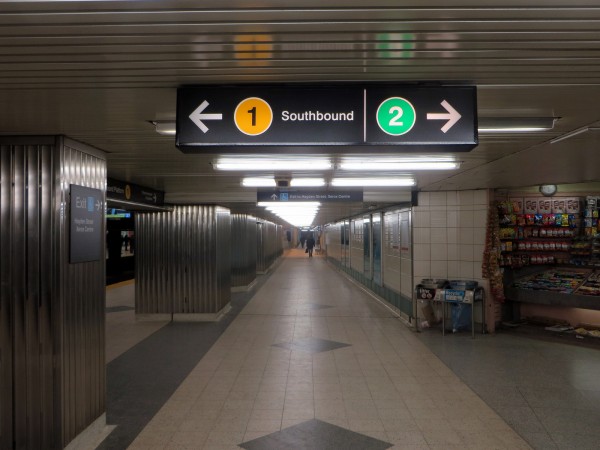
The Toronto Transit Commission (TTC) is currently testing changes to its subway signage. New signs have been rolled out at Bloor-Yonge Station, the busiest in the system, and partially at St. George. While maintaining the basic style of signs installed since about 2000, the most noticeable difference is the use of subway numbers, in large, circular “bullets” — a yellow 1 for the Yonge-University-Spadina Line and a green 2 for the Bloor-Danforth Line. The Scarborough RT is depicted as Line 3, and the Sheppard Subway, the newest subway route, has been designated Line 4. (New subway and LRT routes under construction or proposed would also get numbers — the Eglinton-Crosstown LRT would be designated as Line 5.) There are other changes proposed, including new subway route maps, and there are more changes coming, including revised, simplified system maps and the redesign of bus stops.
Right now, Toronto’s subway is a clutter of many different signs installed at different times in the subway’s 60-year history, including metal white-on-black signs in the “TTC subway font” — an elegant, though somewhat difficult-to-read typeface. In the 1970s, pictograms and a lower-case Helvetica-variant font were introduced; and about 2000-1, around the time the Sheppard Subway was nearing completion, another new signage standard was introduced, with larger pictograms, coloured horizontal yellow, green, blue and purple lines representing subway/RT routes (with red to represent surface buses and streetcars) and platform-length overhead signage. Old signage was replaced on an ad-hoc basis, if at all. Simply stated, wayfinding in the TTC is a mess.
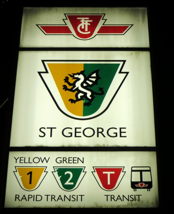
This latest trial, which the TTC does seem to be serious about fully implementing in 2015, is not the first time that the TTC contemplated widespread changes to its signage. In 1993, Paul Arthur, a well-known and respected British-Canadian graphic designer, designed a new wayfinding system for the TTC; this was tested at St. George Station and much of its signage remains to this day; some of the elements were later used by the TTC. The subway lines were numbered, as they are now in the latest wayfinding trial, and given new names according to their colours on maps – the Yonge-University-Spadina Subway was called Line 1-Yellow. Subway line colours were incorporated into signage outside the station. Red was used to guide passengers towards surface vehicles.
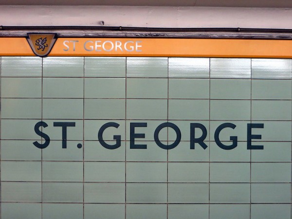
Paul Arthur’s signage at top; original St. George Station sign in “TTC Subway font” below.
As part of Arthur’s plan, each subway station would have its own unique pictograph contained in a shield adapted from the TTC’s logo; these pictographs would have depicted either the station’s name or local geography. St. George Station’s pictograph, the only one completed, features a dragon similar to those used on crests and shields to represent England (though St. George Street was not named for the legendary dragon-slayer). The shield’s background colour would depict the line the station served. The use of unique pictograms is used in the Metro system in Mexico City; there each subway and Metrobus stop has a unique logo to assist passengers with low literacy skills.
Paul Arthur’s system was never implemented, though some elements, such as using red to direct passengers to surface routes, and numbering the subway lines were eventually adapted. But we will never know what symbol would be used for Bessarion Station. (A friend joked a tumbleweed would be most appropriate.)
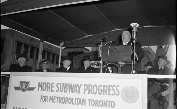
New signs at Bloor-Yonge Station
The TTC has used numbers for a long time, originally assigning 600-series numbers to its rapid transit routes for internal operational purposes. (The only 600-series route used publicly was the 604 Harbourfront Streetcar, which was the first streetcar route in the modern era separated from general traffic; it was depicted as a “rapid transit” route for a short period in the 1990s before it was renumbered 510 and integrated into the Spadina Streetcar that opened in 1997.)
The TTC renumbered (and renamed) the 2 Anglesey and 4 Annette buses in January 2001 to reassign them to the Bloor-Danforth Subway and the new, soon-to-open Sheppard Subway; the TTC began to use the use the single-digit route numbers internally and on some public documents soon after, but not for wayfinding signage or on maps. This is the first time where numbers are given precedence over line names; this does provide a solution to the cumbersome “Yonge-University-Spadina” name, which will be less descriptive of the route that line serves when the extension to Vaughan opens in 2016. When more rapid transit routes, such as the Crosstown LRT (and hopefully more LRT routes and the Downtown Relief Line) open, the TTC will have to renumber more bus routes, starting with 5 Avenue Road, 6 Bay, and 7 Bathurst.
The numbered bullets are similar to those used in the New York City subway system, operated by the Metropolitan Transit Authority (MTA). That larger and older subway uses a complex system of colours, numbers and letters to identify each of its twenty-four routes, each the legacy of three separate operating companies that merged in 1940. Numbered routes are those of the former Interborough Rapid Transit Company. Routes lettered A through G are former Independent Subway System routes and letters J through Z are former Brooklyn-Manhattan Transit routes. Behind the letter or number on the route marker is a colour, which identifies the main subway line through Manhattan each train takes (for example, the dark green used for the 4, 5, and 6 trains all follow the IRT Lexington Avenue Line; the exception is the G train, a light green line on maps, the only route that does not enter Manhattan).
Smaller systems, such as Chicago, Los Angeles, and Montreal primarily use route names based on colours. Yellow and green, the colours assigned to the Yonge-University-Spadina and Bloor-Danforth lines, were first used on TTC subway maps in the 1970s, and on system route maps in 1982. The Scarborough RT was always depicted as a blue line on maps, while the Sheppard Subway is coloured magenta. While Paul Arthur offered both numbers and colours to identify each rapid transit route, the TTC seems keen on empathising numbers. In a multilingual Toronto, that makes a lot of sense.
There are a few minor changes to the TTC’s newest subway wayfinding scheme that I would suggest. There should still be a text reference to Yonge Trains under the yellow “1” bullet and to Bloor Trains under the large “2” bullet in the sign pictured above, especially during the transition period — there will still be many passengers who will refer to the subways by their original names. Exits to street level appear to be de-emphasized. But overall, the plan to number Toronto’s rapid transit lines is a great one.
16 comments
I agree that better signage is needed. My one beef is the use of “Southbound” or “Northbound” instead of the simpler, easier for non-English speaking people, “South” or “North”. What are we bound to “bound”.
MattB: Bound implies the destination, in a convenient simple to pronounce syllable. Is a South train coming from Union or going there? I am certain about a southbound train. (Is a north wind blowing north, or coming from there?)
Of all the complexities to learn in English, I don’t think “-bound” is all that difficult.
R.
On a similar note to MattB, I wish they’d tell you which corner of the intersection you’re exiting a station at instead of which direction a streetcar or bus is bound. If I’m looking for the west side of the street, I often intuitively take the exit for “Streetcars Westbound” and then end up on the NE corner like a dingus.
I love the idea of crests for each station. The new Toronto imagery it could create would be great to see.
There are some major design flaws with some of the new maps in the new system at bloor/yonge…specifically if you look at the “east/west” maps on the bloor line (the ones on the platform posts that show which stations are next)…
1) Are we at yonge station, or are we at sherbourne station? Why do they put the text for the interchange station on the same line at sherbourne, but for every other interchange station it’s on it’s own separate line…it’s also on the opposite side of the map, why the change? The “you are here” sign is pointing at bloor/yonge/sherbourne….which one is it…
2) What’s with the numbers switching sides? Honestly pick a side and stick with it
3) All the stations that you’ve been to are inaccessible…but that’s ok, because it’s really hard to tell anyways…
4) When these signs are on posts but facing the wrong way, they can be confusing…especially if you think “top is the direction ahead of me”….there needs to be some indication for when you are facing the wrong direction…
happy to see we don’t have to say “yonge university spadina” line anymore. what a terrible name for a subway line
I just really want big compasses embedded in the concrete outside the subway stations. I can’t tell you how often I found myself completely lost (and walking considerable differences in the wrong directions) when coming aboveground when I first moved to Toronto.
I’ll be circumspect about my comments, as Signage was a responsibility of mine as TTC CMO, and I don’t want to be perceived as having personal biases, or an axe to grind.
That said, I was only at the TTC 4 years, at a time there was no real interest in a complete changeover in the subway way-finding signage. So, in fact my only real contributions were relatively modest: updating the TTC’s Sign Manual & reviewing the more contemporary Sheppard way-finding signs prepared internally by the TTC’s E&C department; before approving the final layouts.
I always found it delightfully ironic after Sheppard opened that I literally got lost in Yonge/Sheppard station in 2005 unable to find an accessible Yonge/Sheppard exit for over 30 minutes, when I was wheelchair bound for a year. I mean come on… if not me, who?
Overall, I think the numbered signs are simple, clearly visible obvious from a distance, if maybe a bit start. So A+ to TTC CCO Chris Upfold on my first impression.
Would I implement it in 2015 as the TTC is planning? I wasn’t sure what I would write until I separately Image Googled (New York/Tokyo/London) Subway Signs to get a sense of how 3 of the largest subways in the world provide way-finding signage.
Simply while the 1/2 subway signs are very clear, I’d be hesitant to “rush” and commit to a system wide roll-out within a year, almost light speed to the slow, cautious glacial way the TTC normally changes—to avoid expensive mistakes due to unintended consequences.
Looking at Google Image pictures of NYC, London, Tokyo subway signage, it’s clear that numbered signs are a Godsend with densely developed, spaghetti-like subway networks. NYC does the best job IMHO with their overhead signs at each subway entrance stairs. Not only are the numbers obvious, but also they’re colour coded too (an issue for the visually impaired) to further identify them in a glance.
So it seems a bit premature to have the subway reduced to 4 numbers in 2015, without accompanying names or understanding if the numbers alone without supporting text are correctly understood by ALL riders, of ALL languages, ALL ethnicities, ALL abilities and experience with the TTC.
I know I’ll have trouble remembering the numbers, I’ll have to use a mnemonic to relate the # to the order of construction, or I’ll ignore the numbers entirely and just look for the Yellow / Green colour coding that I automatically relate to YUS & BD.
Over time as the Toronto subway system expands and lines approximates Italian spaghetti than today’s N-S & E-W crossed architectural lines, it will make sense to have all the lines numbered and future generations will relate to both number & colors better than I ever will.
The final word it that London & NYC include both numbers & words on their way-finding signage, so I’d want to get some pretty substantive qualitative & quantitive feedback from various linguistic & immigrant communities if they find simple coloured #-only signage easier to follow than more complete, traditional, but more cluttered coloured #/text signs.
The TTC will be in signage hell until the day they stop treating streetcars like buses. Show me another city in North America where you can’t distinguish between a streetcar and a bus on a map. Move the streetcars onto the rail map, move the rail map down to next to the door on the subways, and put a line map over the door. You know, same thing you find in EVERY OTHER CITY ANYWHERE. Why is this so hard?
If they need to free up the 5 from the AVENUE RD. to assign to the Eglinton Line, combined with route restructuring along Eglinton I suggest they just extend the 61 from Downtown to the 401. Keep the AVENUE RD. name but use the AVENUE RD. NORTH’s number.
As for what to do with the 6 BAY and 7 BATHURST, that’d be more problematic. The renumbering of the 2 and 4 was in keeping with the traditional route naming pattern (roughly alphabetical down the list of the first 100 or so routes). If they had used letters instead it wouldn’t have been so bad. I doubt we’d ever exhaust the entire alphabet, even if we skipped I and O for clarity’s sake.
I’ve always though it would be easier for way finding if the Yonge-University-Spadina was split in two, one side Yonge-Union=line 1, Spadina-Union=line 1b/2/3/etc.
Speaking of way finding signage and the streetcars, should the subway and streetcar pictogram at Spadina station also be placed at Dundas West, Bathurst, St. Clair and St. Clair West, and Broadview and Main Street stations?
Would it be more effective if streetcars stayed red while bus routes were identified in black? (Buses have livery where black is dominant, in contrast to the streetcars where red is dominant).
Should we be highlighting the frequent service network with thicker lines as Jarrett Walker suggests?
As TTC slowly replaces E-branch bus routes with ’19X Rocket’ buses (39E now 199 Finch Rocket, 35E becoming 195 Jane Rocket) should they have a separate map that just outlines the ‘Rocket’ routes … Assuming they actually add more ‘Rocket’ routes (there are currently 7…will they have to stop at 10?) and build a more-or-less complete network.
Oh and a minor quibble: “the Yonge-University-Spadina Subway was called Line 1-Green.” should be changed.
Cheers, Moaz
I agree with Moaz (and thanks for pointing out that minor error). The new TTC system map (which is available on the website and linked in the article) does show thicker lines for frequent services, with blue lines for express/Rocket routes. The use of blue is problematic as it is most associated with the “Blue Night” 300-series routes. I would have gone with a dark purple to show express routes – dashed purple lines for limited-service “E” branches, and solid lines for 190-series Rocket routes, which offer at least partial midday, evening and weekend service. With the exception of the 502, 503 and 508, the streetcar system is all frequent service, but distinguishing them a bit more on system maps is a great idea; though I wouldn’t want to see them clutter up a subway/rapid transit map.
Hi Sean
In light of Olivia Chow talking about investing in Express Bus lines, and Josh College asking the TTC to investigate the possibility of more express buses, I think that TTC should seriously consider the following:
1. Consolidate E-branch routes with Rocket routes to create a single ‘Rocket’ network.
2. Transfer Premium Downtown Express buses (and their double fares) to GO Transit. GO can charge the double TTC fare (which is still cheaper than the GO fare) and TTC can reallocate the extra buses.
3. Highlight the Frequent Service Network (both bus and streetcar).
At the end, in order to make TTC service easier for users to understand, instead of the current mishmash there should be 4 daily #TTC daily networks (plus the Blue Night Network). These would be:
1. Local*
2. Rocket
3. Frequent Service*
4. Rapid Transit°
*buses & streetcars °Subway/RT/LRT/BRT
TTC should have a single comprehensive map plus individual maps for each of the 4 networks (they already have separate Rapid Transit and Blue Night Network maps).
This way when I get to a bus stop I should immediately know:
1) The corridor ( eg. Jane Street)
2) The availability and frequency of local services (Details of 35 A, B, C, D branches)
3. The availability, frequency and length of the Frequent Service Network (eg. How far I can go on “any” route 35 bus so I don’t need to wait if I don’t want to)
4. The frequency and route of the parallel all-day Rocket (the 195).
5) The rapid transit stations on the corridor (Bloor today, Steeles West in 2016 and Eglinton and Finch West in “future”).
This way I know where I am and what my options are.
Cheers, Moaz
Sorry “Josh College” should be “Josh Colle.”
Cheers, Moaz
And “Bloor” should actually be “Jane”.
Cheers, Moaz