
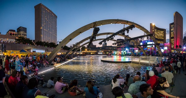
To the delight of many, it was recently announced that the TORONTO sign in Nathan Phillips Square will remain in front of City Hall until its structural expiry date of 2016, when it will be replaced by a more sturdy set of letters.
Installed as part of the Pan Am Games, the sign is one of the most popular legacies of the event. It is a highly photogenic addition to City Hall, offering the perfect spot for selfies amongst the sign’s many Ts Rs and Os.
The old saying is that “life imitates art” — but with the immense popularity of the TORONTO sign, it might be more accurate to say that these days, “life imitates graphic design.”
The dominance of graphic design culture — researchers now estimate we’re exposed to 5,000 ads per day, and the number of graphic designers in Canada has increased rapidly over the last few years — has reached its apotheosis in the 3D TORONTO sign. Photos of Nathan Phillips Square and City Hall now automatically take on the look and feel of a highly designed poster.
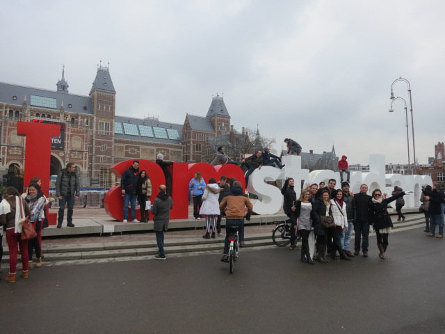
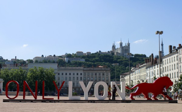
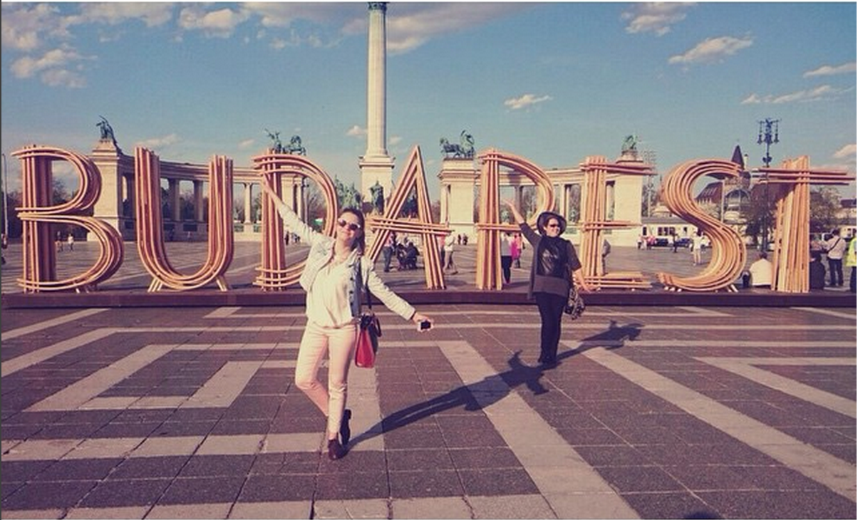
The TORONTO sign is part of a global trend of huge letters in prominent public space. It’s most direct precedent is the I amsterdam sign. Situated behind Amsterdam’s Rijksmuseum since 2005, friends visiting the Netherlands are almost guaranteed to post photos of themselves climbing the iconic red and white letters. The ONLY LYON sign followed in 2010 and the BUDAPEST sign in 2014. It was only a matter of time that big font would come to Toronto.
This isn’t the first time art has affected landscape. Big, wooded parks with meandering pathways like High Park in Toronto, Central Park in Manhattan, and Mount Royal Park in Montreal, were all inspired by Romantic landscape paintings of the late 18th century. Spreading as a park format worldwide (most major North American cities have an equivalent), these pastoral parks are a reflection of what people in burgeoning industrial cities needed from their landscapes — and how they idealized them.
But the blending of graphic design and landscape architecture is evidence of a new kind of relationship we’ve developed with our civic spaces. No longer pastoral retreats à la High Park, with our smartphone cameras always close at hand, a landscape must be striking and photographable to make an impact. And giant, Instagram-able letters are the most effective way to communicate the core of most messages on social media — “I was here.”
Daniel is the Urban Geographer. Check out his website, and say hello on Twitter


3 comments
Add one of Mel Lastman’s moose (meese? mooses?).
EXPO 67 had a large lettered sign, It’s still there I believe.
Yes it did i do remember the sign