
The Bloor-Danforth line turned 50 today.
Five decades ago, on February 25, 1966, the first section of Toronto’s first east-west subway opened between Keele and Woodbine stations. Representatives from four levels of government—city, Metro, provincial, and federal—were on hand that day to throw a ceremonial switch and inaugurate the third new subway line for Toronto in 12 years.
The architecture and interior design of the Bloor-Danforth line firmly reflected the style of the 1960s. Toronto City Hall and Yorkville Shopping Centre were less than a year old, and the shining black towers of TD Centre on Bay Street were nearing completion.
Though there have been numerous changes and tweaks to the buildings and structures of the line since opening day, many of its modernist highlights remain intact.
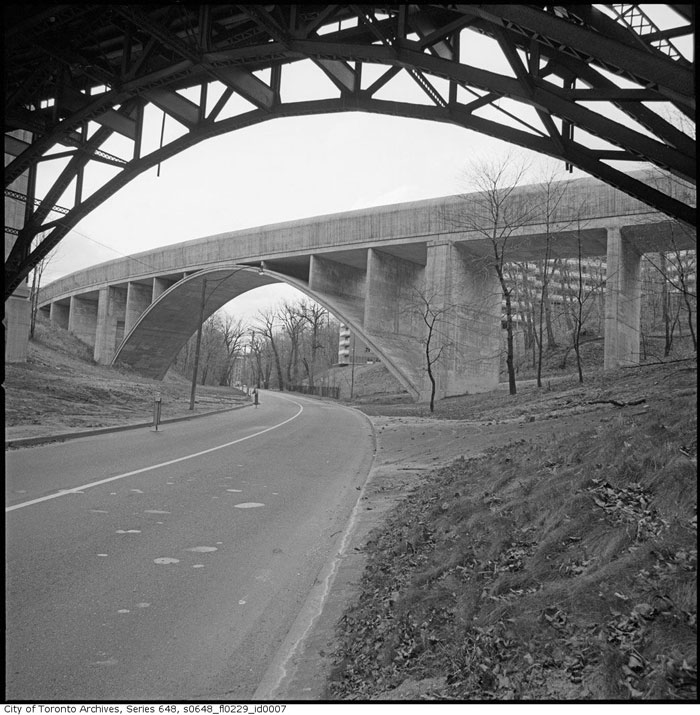
The Rosedale Valley Bridge is one of them.
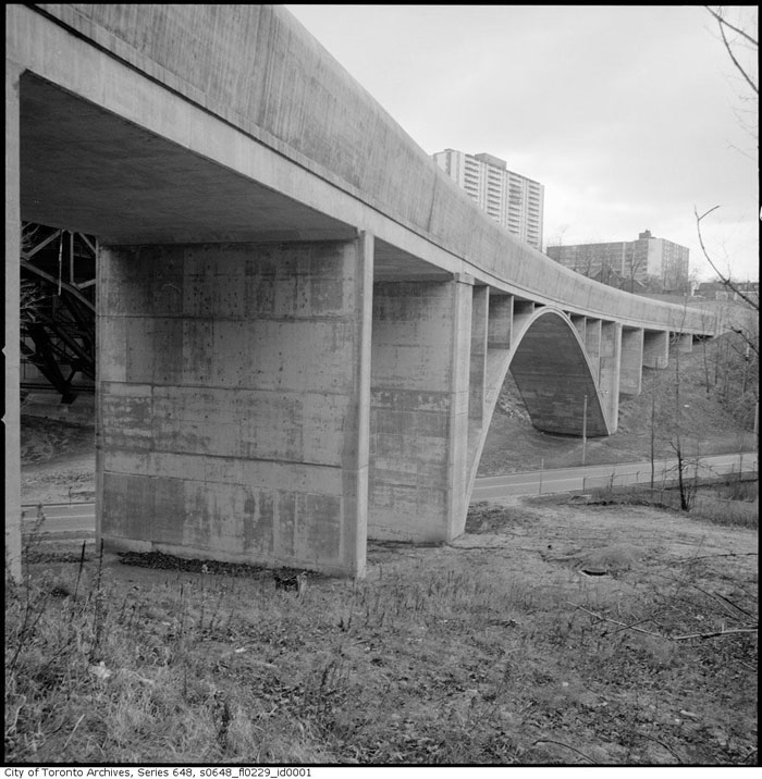
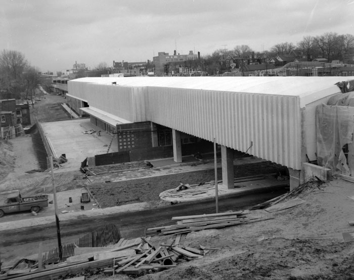
One of the biggest challenges faced by the subway’s engineers was how to connect the Bloor Street and Danforth Avenue sections of the line. Two significant barriers—the Rosedale and Don valleys—stood in the way.
The TTC investigated various options, including tunnelling all the way to the east end, but ultimately chose to use the existing lower deck of the Prince Edward Viaduct.
Built at a cost of $90,000 during construction of the bridge in the 1910s, the lower level was designed to carry streetcars at a time when the city was planning underground lines across the city. Ultimately, the deck sat dormant for more than 40 years before the TTC converted it for subway use.
In all, using the Prince Edward Viaduct cut $10 million off the cost of building the Bloor-Danforth line.
Though there was also a viable subway deck on the Rosedale portion of the Prince Edward Viaduct, the TTC found it didn’t quite line up with the planned location of Sherbourne station, so a new bridge was required.
The solution, supplied by architect John B. Parkin and U.S. engineering firm DeLeuw, Cather & Co., was an open spandrel structure with a sweeping reinforced concrete arch. The deck, almost 17 metres above the valley floor, was almost entirely enclosed to prevent train noise disturbing residents of the nearby Kensington Apartments.
In 1968, city controller Allan Lamport said the builders of the apartments—the Samuel Bronfman family—had pressured the TTC into finding ways to reduce noise with the design of the bridge, which may have resulted in the roof being added.
“If you know who the building belonged to, you’d know how the pressure was put on,”Lamport said.
Two rows of skylights provided ventilation through the roof of the bridge, but were later covered. Now it’s hard for subway riders to discern that they’re traveling high above a ravine, save for an increase in noise as the train rumbles along its concrete guideway.
Just east of the Rosedale Valley Bridge, spacey Castle Frank stands out among the other Bloor-Danforth station buildings. Set in leafy surroundings in south Rosedale, an airy, glass-walled bus loading area connects to a simple brick structure topped by an unusual plastic dome.
Possibly because of its swanky location, the TTC approved several cute design flourishes at Castle Frank. Over the street from the main entrance, for example, a potentially unsightly ventilation shaft was tweaked to incorporate circular bench.
In 1965, the Coupler, the TTC’s internal magazine, said the station was “attractively designed to suit the neighbourhood in which it is located.”
The original western terminus of the line, Keele station, was another a joint project between John B. Parkin and DeLeuw, Cather & Co.
Here, the designers conceived a tough-looking raised enclosure clad in ribbed concrete. The textured exterior softened the impact of the concrete box, which straddled two streets.
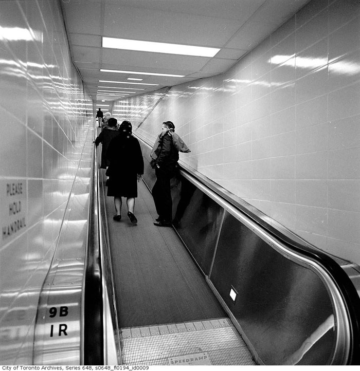
Keele also contained a Canadian first—a “speed ramp” escalator.
The moving walkway shuttled streetcar passengers from a temporary streetcar loop on Indian Grove up a 30-metre incline into the station. The Stephens-Adamson Manufacturing Company of Canada, which supplied the device, claimed it could handle 72,000 passengers an hour at capacity.
Unfortunately, the pedestrian conveyor never had a chance to fulfil its potential.
The TTC closed the temporary streetcar loop and sealed off the walkway in 1968 when the Bloor-Danforth extensions to Islington and Warden opened.
An anonymous grey door just inside the automatic entrance on Indian Grove and an indented section of wall on the subway platform are the only hints of the closed passageway.
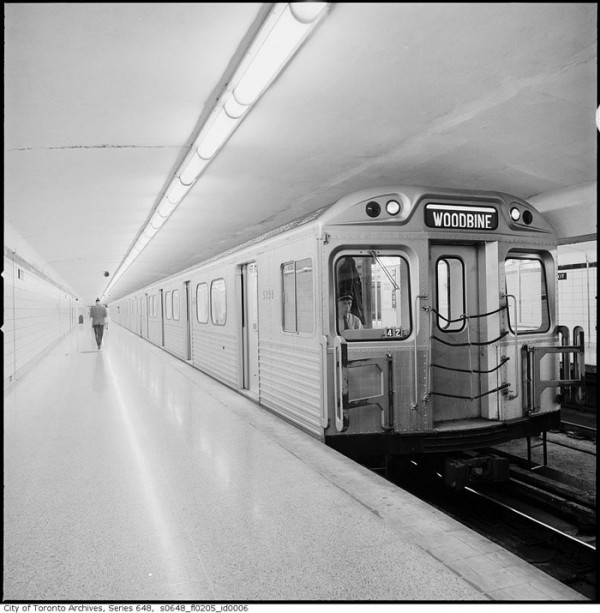
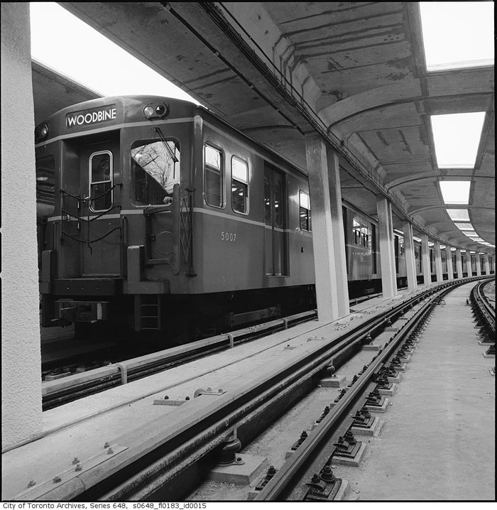
Woodbine, which was for two years the eastern terminus of the east-west subway, also has a closed off passageway between its former streetcar loop and the interior of the station, but this one only ever contained a stairway and corridor.
(Although streetcar service left Woodbine five decades ago, a short section track is still in place on Strathmore Blvd. and Cedarvale Ave.)
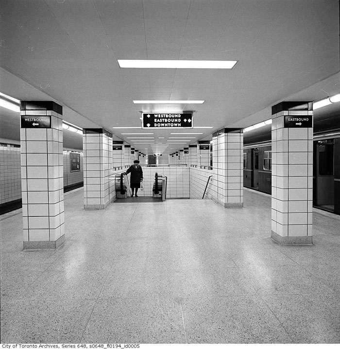
Underground throughout the line, architects John B. Parkin and A. G. Keith delivered a cohesive interior design that referenced Parkin’s earlier work on the Yonge line.
Using the halfway point between St. George and Bay stations as a centre point, the platform wall tiles repeated through a cycle of five colours: yellow, grey, beige, white, and green (assuming the traveler was headed east or west, away from downtown.)
Using just four trim colours—black, blue, green, and maroon—ensured no two stations were identical.
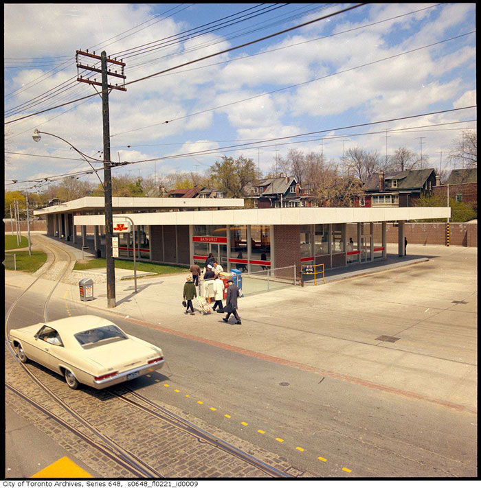
Interiors were sparse with little ornamentation. On the surface, many of ticket halls were simple pavilions with extensive glass walls and illuminated white roofs. At night, they glowed like beacons.
Parkin knew the importance making subways appealing.
A year after winning the contract to design the stations on the Bloor-Danforth line, the renowned architect slammed the overall design quality of Canadian transit systems at a conference in Banff in 1960.
According to the Globe and Mail, Parkin said rolling stock colours were unimaginative, trademarks illegible, and signs indifferently designed. He excepted the Toronto system, which he had a hand in crafting.
Parkin believed desirable public transit was key to combating urban sprawl and coaxing people out of their cars. The buildings he designed on Bloor Street and Danforth Avenue were bright, clean, and inviting.
Even the signage was on point: Station names were printed clearly over the doors and a new illuminated TTC subway insignia was deployed near the main entrance and on nearby streets to guide riders.
The subway font, designed in-house by the TTC a decade earlier, was lovingly used at track level and on wayfinding materials.
Many of the station buildings have been altered since opening day in 1966. A fire on board a train at Christie station in 1976 destroyed some of the original green platform trim, and the TTC, faced with a lack of spare parts, filled in the gaps with maroon tile.
Likewise, when the University line platforms at Bay station were closed to the public, the TTC enclosed the stairwells in surplus green tile—a stark contrast to the rest of the crisp white interior.
The Spadina Road entrance to the Bloor-Danforth platforms was replaced by a building so 1970s it might as well have shag carpeting, bean bag seating, and lava lamps for lights.
Though technically part of the University line, Museum station was, for a long time, an untouched example of Bloor-Danforth subway architecture until it was overhauled in 2008.
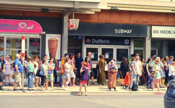
Dufferin and Pape stations have also been heavily altered, with the latter losing its yellow platform tile and green trim.
Today, some subway stations are closer to their 1960s appearance than others. Chester station has remained mostly untouched thanks to its lack of connecting routes and low ridership. Ossington and Lansdowne have kept their lovely pavilion entrances.
On opening day in 1966, Prime Minister Lester Pearson took time to praise the crisp aesthetic of the Bloor-Danforth line.
“It’s a sign of the way Metro is facing the future,” he said. “[This will be] the day the world began to forget the Moscow subway.”

4 comments
Much of the line is lacking in terms of architecture, art and design. The repetitive tile finishes and simple interior spaces make for a monotonous and utilitarian experience. The original line incorporated no public art. Unlike the Montreal Metro, natural light is missing from most underground spaces. The end result is a commute that’s mostly boring. Passing over the Bloor Street Viaduct is a refreshing break from the monotony, though it’s a mere respite.
Keele always struck me as a lost opportunity for architectural expression. It was built above a roadway, but its exterior looks basic and utilitarian on the street. The elevated subway platform doesn’t even have windows, which would have provided for interesting views to High Park, Bloor Street and up Keele Street.
Montreal built more architectural stations with distinctive pavilions, well-designed wayfinding signage, unique finishes, varying interior spaces, interesting artwork and natural light. I heard that officials from both Montreal and Washington visited Toronto and toured the newly subway system while planning their first Metro lines. They decided they wanted more distinctive and architectural stations for their cities. It wasn’t hard to improve on the Yonge and Bloor-Danforth lines.
“It’s a sign of the way Metro is facing the future,” he said. “[This will be] the day the world began to forget the Moscow subway.”
Oof. 50 years later and one still looks great while the other looks incredibly dated…
“Using just four trim colours—black, blue, green, and maroon—ensured no two stations were identical.”
Actually there were a quite a few shared trim combinations:
Royal York/Greenwood
Old Mill/Donlands
Jane/Pape
Runnymede/Chester
High Park/Bay/Broadview
Keele/Castle Frank/Warden (expecting the terminal trim)
Dundas West/Sherbourne
Lansdowne/Yonge
St. George/Woodbine
Bathurst/Islington (expecting the terminal trim)
Another trace of the past can be seen at Main Street station, whcih was part of the 1967 extension from Woodbine Stn. to Warden. At that time the TTC still had in place its 2-zone fare system, in which a fare boundary was in place that was roughly equivalent to the old City of Toronto limits. Passengers crossing that boundary were required to pay a second fare. However, the whole of the subway system was the inner zone (Zone 1). Passengers on buses operating in zone 2 (the suburban areas) had to pay the extra fare when they transferred to or from the subway. A number of these buses came into the Main Street subway station.
That station has an unusually large concourse level (between the surface and platform levels). The space was necessary to accommodate the turnstiles used to collect these fares. A close inspection will show where the turnstiles were bolted to the terrazzo floor and where the collector’s booth was located. You can also see the grooves worn into the terrazzo by passengers flowing through those turnstiles.
The 2-zone fare system was abandoned by the TTC a few years later and the turnstiles were moved to the street entrance as free transfers were now provided between the subway and all connecting routes.
The year after the zone system was eliminated the TTC started running a deficit on operations and the rest is history.