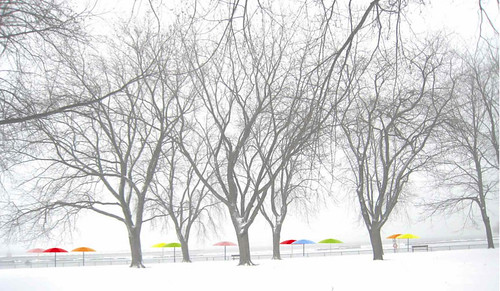
On Friday, Waterfront Toronto announced the winning design for the Jarvis Slip Design Competition. The winning team, Claude Cormier Architectes Paysagistes Inc., designed the “Sugar Beach” proposal (Warning: large PDF file), which is similar to HTO Park a little west of the Jarvis Slip. The proposal most prominently features a number of multi-coloured umbrellas along a sandy beach that lead up to the water’s edge, and also creates a strong connectivity between the space and the streetscape to its north.
Waterfront Toronto’s news release states that the jury appreciated “the establishment of a larger greater system of beach designs throughout Toronto’s waterfront.”
Although the design is a good one, I’m not sure this was the best proposal for the site. I may be in the minority, but I’m not 100% convinced that “urban beaches” are the most creative use of new public spaces along the waterfront. First, they are less useable in the winter months than in the summer ones, leaving fewer social uses for half the year. Second, to me, a large part of the charm of a beach is being able to swim, something that will be impossible at Sugar Beach for reasons of water cleanliness and traffic. Toronto already has a number of swimmable beaches, so adding a non-swimmable one seems to me to be a counter-intuitive use of the space.
The design also aims to remind us of the industrial heritage of the site by invoking the adjacent Redpath Sugar Factory in its name. While the gesture is nice, I feel like the presence of the factory itself is reminder enough, and that the other designs displayed a little more imagination in creating a new kind of place on the waterfront. Having now looked over each of the designs a few times, I would have liked to see Janet Rosenberg & Associates’ proposal (again: PDF) win for its commitment to sustainability, artistic education, and year-round use.
Having said that, and given the popularity of HTO Park, this urban beach will likely be a well-loved space and a key part of the new East Bayfront community. I’m curious to know what Spacing readers think of urban beaches: do you think they’re a good use of waterfront space, or would you rather see a different kind of public space?


15 comments
I am very disappointed with this choice since it seems a direct copy of the HTO urban beach (co-designed by the same firm). I love the HTO urban beach since it is so unique; but do we really need two of them so close together on the waterfront??? This is particularly disappointing since the other two concepts for the area were both exciting and creative (I also preferred Janet Rosenberg’s design although both of them were great). Harbourfront’s success will be created through the variety of its spaces, not just recreating successful elements in multiple locations.
I agree with the choice of Sugar Beach for several reasons (to the chagrin of friends at DTAH who think I have a conflict of interest, though I had nothing to do with the design). I think it’s true that it may take some selling for the idea of a beach in this location to be given credibility, but personally I think the juxtaposition of industrial and recreation uses could be exciting and interesting.
As to the year-round use, it hardly feels like the site would be a place for people to naturally convene in winter anyways – how much effort should be expended on attracting people in winter to exposed west-facing sites bound to be windswept and cold? The location of the site next to the potentially inanimate private use of the Corus building hardly bills it as the Dundas Square of the waterfront.
I think if you only ask 3 teams for submissions (all of whom have already done work along the waterfront) you’re really handicapping the possibilities of the location – in this case, as exciting and attention-grabbing as the West8/DTAH scheme was, it failed to really evoke or respond to the specific place of Jarvis Slip and, without the gimmick of the arms, didn’t have a leg to stand on…
I think there’s a little bit of genius simply to the name “Sugar Beach” – I can imagine years from now, with the Redpath plant long gone, the subtle evocation of the relationship carrying on in the identity of this place – “meet me at Sugar Beach” sounds so much better than “meet me at those big arms that stopped working years ago down by the waterfront”. While the name HTO was clever but gimmicky. I feel it will eventually fade as a name through lack of use, Sugar Beach as a name seems like it will have lasting power and be able to become part of the physical and psychological landscape of the city.
Beyond the name, the design for the Sugar Beach scheme itself was well-thought out – not too complicated or cluttered, and just seemed to be a natural extension of the city and waterfront. In particular, the use of the angled waterfront promenade continuing the line of sight from Jarvis from the original East Bayfront Precinct Plan seems highly appropriate in guiding most pedestrian/active through-traffic in a direct desire-line to continue along the east bayfront, while the more passive use of the beach wedges in on the water side of the promenade.
While some people seemed against the use of rock-mounds (maybe it depends on whether or not you like the Cumberland Park version…) I think the way that they’ve been used in the Sugar Beach scheme is appropriate and a more subtle evocation of the canadian landscape than the West8/DTAH version which seemed to be trying too hard to be canadian. The rocks coming out of the sand of the beach seems like a great idea too, while larger rocks in front of the face of the Corus building seems like a good response to the future private nature of that building.
I think Sugar Beach will be a great place, appropriate to where it is, and with the potential to be an interesting hiatus on a walk along the waterfront. I think it’s worth remembering that too much glam and style in landscape architecture rarely tends to be long-lasting, but is too easily convincing in renderings and models. Old parks maintain their charm because they’re timeless, not because they were gimmicky. While certain key, central locations can more than withstand a glam and style design, Jarvis Slip is not this location, because people have no reason to be here – given that reality, Sugar Beach wins out…
I don’t mind duplicating HtO because it’s a long walking distance away and natural beaches do continue.
Think I like the natural rock idea borrowed from Cumberland Park in Yorkville.
However, a beach urban or otherwise should allow us to walk into the water. This is an industrial slip folks. No wading here.
Also…usual fine presentation renderings but what we are up against are those who will steal, wreck and deface property. Where did HtO Muskoka chairs go?
So far a lack of imagination to draw people down there.
Think Chicago and all I see in my mind is that parabolic sculptural reflection cast in steel. So simple but so much fun!
Where is the fun?
Not convinced but wanting so muich to believe…
Montreal architectural firm Daoust Lestage was also initally short-listed for the Jarvis Slip competition; not sure why they pulled out.
I walked through HtO yesterday and was surprised by the number of footprints through Friday’s snow — it’s still getting a fair bit of winter use, even if only by dog walkers. As for the Muskoka chairs, they were always supposed to be temporary — though that in itself was a very odd and silly idea. I believe given how much people liked them, the parks dept was looking into how to provide chairs on a permanent basis.
As I said before in response to an earlier post on the topic,
“What a stupid place for an “urban beachâ€Â–it faces the sugar refinery, and all of the industrial elements that go along with it. Makes me think that whoever came up with that design hasn’t actually been to the site. H2O Park works well because of where it’s situated, in this location, not so much.
The West 8 design, on the other hand, seems inspired by what’s already there. The refinery is rather aesthetically post-apocalyptic (especially its eastern side), and is an interesting mix of nature/culture/economy contradictions (right down to its Robert Wyland whale mural). I like the fact that West 8 builds upon these ideas & aesthetic while adding some much-needed greenery to an area that, at the moment, is nothing but asphalt and concrete. That said, someplace to sit would be nice…and in my mind, should’ve been a requirement for any design put forward. What up with that, West 8?”
Anyway, the area in question is not very big, but I would very much like to seem some greenery there. Perhaps something similar to the Music Garden, but with a post-industrial aesthetic and designed to take advantage of the waterfront location (in such a way (a stepped edge down to the water perhaps).
What’s interesting about H2O park by the way, is that its minimalist design provides no shelter from either the elements OR from prying eyes. It seems like a space designed to facilitate both tourist activity AND surveillance. I wonder if a desire to regulate behaviour is a key consideration in the design of these new public spaces, and if an overenthusiastic interest in security and discouraging particular people from using these spaces (homeless people, for example), is going to result in a very sparse, uninteresting, and antiseptic landscape.
One last thought: Why couldn’t the beach incorporate a water feature, like a splash pad or a fountain???
BTW, I’m not equating the sugar maples with “greenery” because it’s going to take an awfully long time for the trees to grow to the size seen in the photo above. In the meantime, the park will be full of little matchstick-sized trees, like H2O.
This was my least favourite proposal. My first impression was “another half-assed Christo hommage.” In hindsight I’m not suprised it got chosen as it is probably the cheapest proposal!
Robin does bring up some valid points on timeless design ensuring longevity of a park. I’d hate to think that a cool interactive sculpture might break down and stop functioning due to lack of forsight (ex. Yorkdale Station).
At the same time, Sugar Beach looks boring! Why can’t we have something more radical like Park Guell in Barcelona?
Sand = Dirt… Cheap… Easy
Rosenburg & West 8 – Large, High Maintenance, & Expensive
Sand = Winner!
My preference was for the Sugar Beach proposal. It seems like it will grow into the space … the others seemed like they’d wear out.
As for your question about urban beaches, they seem like a novelty. To me, something better would be “urban docks” nestled beside and through strips of trees and rocks.
Wait a second Robin Chubb. Are you calling out one of the design firms who participated in the competition in this blog? Could you elaborate on your supposed conflict of interest? Do you work for one of the other teams or the one that won? Bad form. Bad form.
Maybe Cormier et paysagistes are going to keep trying until one of their proposals is actually realized. HtO falls far short of its original promise. No doubt due to the ministrations of litigation lawyers and insurance hand-wringers, the “beach” does not have a sloping shore that actually meets the water .. unlike the original proposal. And there are no water features in the interior space, as proposed.
But Ian Malcewski brings up another point that I think is crucial to all public landscaping in Toronto. Almost without exception, these projects ignore winter. Notably, all trees are deciduous .. meaning they’re naked for half the year. A few coniferous plantings would provide year-round green relief from all the pavement .. and at the waterfronts, windbreaks for those of us who enjoy a walk .. a jog .. or a bike ride .. along the lakefront. And by the way, the same oversight applies in the proposed makeover of Nathan Phillips Square.
Do all landscape architects spend their winters in Palm Beach?
all the other proposals featured crappy things that would cost money in terms of ongoing maintenance + upkeep (flower gardens???) or security (large digital screens???) Claude cormier managed to submit something that is usable, and maintenance free. As for a non-swimmable beach – who the hell swims in lake ontario without a dry-suit?
i am sure they could augment the design with a few conifers. that’d be a cool beach.
I agree with many of the comments above….
The sand option also provides extremely poor accessibility to the site. Wheelchairs, strollers, walkers etc. will not be able to access most of this park and will only be able to view the water from the north side. A re-think of this design should occur to improve access. A sandy beach in a highly industrialized concrete area, without direct water access seems odd to me…
What happened to site specific design? Why block the view with a screen (as in the other option??)
Surely Toronto can come up with something more original, and site appropriate….
I just had a cursory look at the drawings and what struck me immediately was the enormous lack of vegetation. Anybody seeking to escape the heat of a torrid summer day will find little relief (not to mention mega eye-squinting glare)from the acres of pavement. The young trees in their tiny pools of earth will give scant shade. But then, maybe I’m old fashioned – I hate Dundas Square for the same reason!
Wow, when will we all come to realize that a trendy name, sand and beach umbrellas do not make a great public space. It was done at HTO and thanks but once is enough. All of these dandy waterfront designs bring to mind the ‘skydome effect’ where everybody goes along with the experts who say ‘what a great place’. With the passage of time people will feel duped and unafraid to express their opinion that this is a dumb ass idea. I can just hear Torontonians saying “Hey honey, lets go sit down by the dock wall across from the sugar plant in the blazing sun and relax above the gray water”. Go to the web site and take a look for yourself. Looks like a 10 year old kid got loose with the design machine. http://www.claudecormier.com/project/sugar-beach-jarvis-slip/