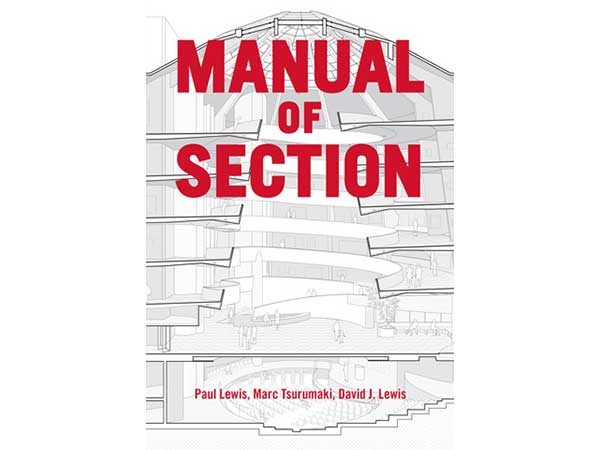
Authors: Paul Lewis, Marc Tsurumaki, David J. Lewis (Princeton Architectural Press, 2016)
Drawings and different types of visual representation are an important part of the architectural design profession. From using them to develop design ideas and communicate concepts, to documenting a completed work as well as being used by building contractors for construction purposes, drawings are utilized for a wide range of purposes. And like any other tool, each type of drawing has its own evolutionary history—some more documented than others.
One specific type of drawing that has constantly fallen under the radar, despite its common use, is the cross-section. Often abbreviated as ‘section,’ this type specific form of representation is characterized by a vertically cut through an object or structure, depicting the cut surface typically as a bold line and/or a solid fill (often black or white), or drawn elements representing the built components/structure. Although the lay person may not know this type of drawing by its technical name, we see them quite frequently, especially in reference to anatomy—one of the first disciplines to use the visual technique, in the fifteenth century.
In the architecture discipline, the role and significance of the section has ebbed and flowed with the development of different technologies and tools. And despite its significance over the centuries, few have attempted to put together a comprehensive analysis of this drawing convention and its history…until now, with the recent release of the Manual of Section by Paul Lewis, Marc Tsurumaki, David J. Lewis, of the award-winning architecture practice LTL Architects.
Wonderfully singular in its intent, the book focuses solely on the section technique and its relationship to architectural design: exploring critical issues such as its history, its effects on use, space and form, and how it has been used as a generative tool.
The book is divided into three large parts—Essays, Sections and an Appendix—each of which is subdivided into a series of smaller chapters. The book as a whole is dominated by a wide variety of section drawings of different buildings, big and small, with the majority of the written content gathered within the three essay that comprise the Essays part of the book—The Vertical Cut, Types and Performance of Section, and Excerpts from a History of Section. Quite dense in its content, these essays provide the foundation of the Manual.
Although the History of Section essay provides a critical context for the development and evolution of the drawing type (one that, I would argue, every architecture, interior design and urban design practitioner must read), it is LTL’s description of seven distinct section types—Extrusion, Stack, Shear, Shape, Hole, Incline and Nest—that are the mainstay of the book, as each of these is given their own chapter in Sections segment of the Manual.
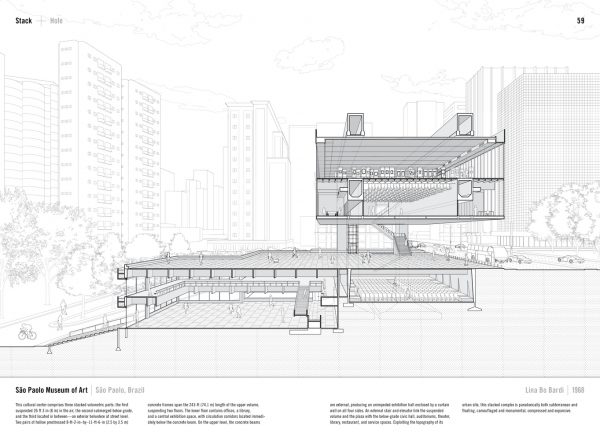
Known for their extensive use of beautiful section-perspective drawings within their own practice—drawings that combine cross-section and perspective drawing types—the incredibly researched Sections part of the book provides sixty-three magnificently detailed black-and-white section-perspectives of a variety of significant buildings from the past century. The examples are organized within eight chapters by type (the seven outlined above, plus one more called Hybrids), with two-page spread provided for each single drawing and a brief write-up of its significance.
The precedents depicted range in scale and across time, from Rudolph Schindler’s Bennati Cabin and Herzog & de Meuron’s 1111 Lincoln Road parking structure, to NADAAA | John Wardle Architects’ Melbourne School of Design and Lina Bo Bardi’s São Paolo Museum of Art.

The Appendix provides a series of black-and-white section samples from LTL’s own work (ones that are much better appreciated in colour within LTL’s monographs, Opportunistic Architecture and Intensities) followed by Sections by Height: a great spread showing simplified versions of all sixty-three sections drawn at the same scale, with corresponding page numbers below each project. An excellent bookend to the Manual.
Although one would be hard pressed to strongly critique such an amazing and long overdue reference book, one small and easy improvement in the Types and Performance of Section essay, that describes each section type in detail, would be the inclusion of references beside projects described within the text, that are drawn in the Sections part of the Manual. A simple page number in parentheses would suffice. This would better integrate the content within the essay to the larger book, as a whole.
Similarly, one may consider dividing the Types and Performance of Section essay into smaller pieces that introduce each Section chapter, to further tie the content together—not unlike the structure of Cartographic Grounds, another excellent book on visual representation by Princeton Architectural Press.
Lastly, the simple addition of providing all sixty-three projects within or near the table of contents, would really facilitate using the book as the excellent reference that it is. Currently, one has to casually flip through the book and attempt to pick out the name, architect, or year, in order to find a specific project. Or, somewhat counterintuitively, refer to the Section by Height at the end of the book to get the page number, if one can recognize the project by the simplified cross-section. Again, this is easily rectified by placing some form of reference at the beginning of the book.
Despite these small shortcomings, I don’t hesitate to say that the Manual of Section is a must-read for all designers associated with the built environment and should surely be on the library shelves of every architecture, urban design and interior design school. Not only does it provide an important and critical understanding of the cross-section historically as well as provide a strong framework to discuss and critique designs, but also, the intricate drawings provided by LTL are sure to inspire all those who have the privilege of cracking the spine of this amazing reference.
***
Be sure to visit the Princeton Architectural Press website, where you can read a number of pages from the Manual of Section vis ISSUU.
**
Erick Villagomez is one of the founding editors at Spacing Vancouver. He is also an educator, independent researcher and designer with personal and professional interests in the urban landscapes. His private practice – Metis Design|Build – is an innovative practice dedicated to a collaborative and ecologically responsible approach to the design and construction of places. You can see more of his artwork on his Visual Thoughts Tumblr and follow him on his instagram account: @e_vill1.


