
New bus stop signs are currently being installed on the 94 Wellesley bus route, a trial of the TTC’s new wayfinding strategy. These new signs, while providing more useful information, are an evolution in the TTC’s bus/streetcar stop design history.
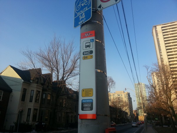
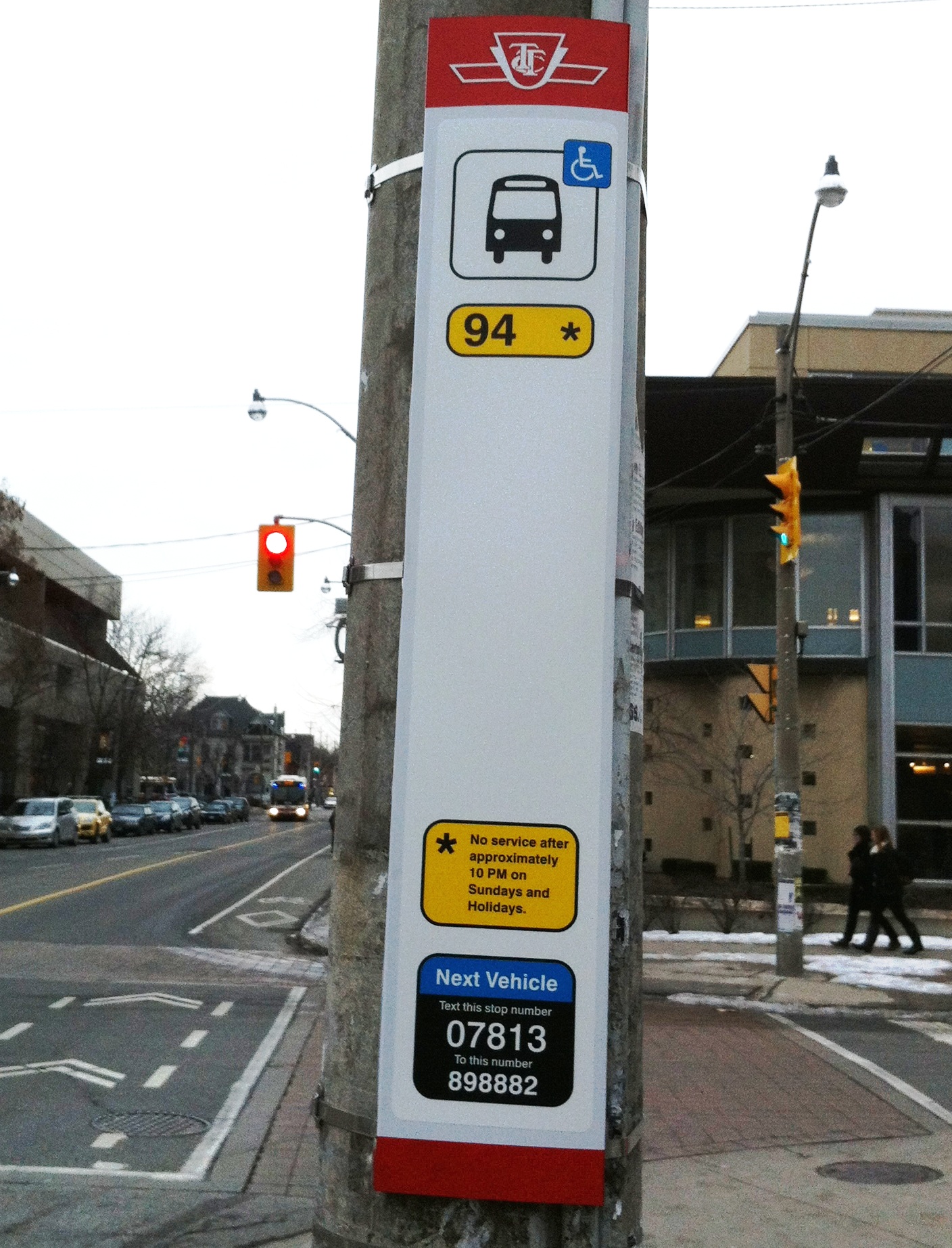
All bus/streetcar stop signs, while retaining their traditional white-with-red-stripes design, will now include the route number and applicable branches that serve the stop, with colour coded bubbles to identify regular routes (black), limited service (yellow), express (red) and Blue Night services (blue). Asterisks, such as that shown for the through 94 branch, point to more detailed service information. Thew new signs also include the TTC logo and next vehicle text-back service information.
New maps, an idea imported from London (and also used by Translink in Vancouver), will be installed in shelters and other TTC info-posts. These “spider maps” (example here) show in detail the routes serving that stop and immediate connections (with a helpful “you are here” marker), but for the sake of simplification, the rest of the surface network is removed. As eloquently stated by Jarrett Walker in the blog Human Transit,
…there’s a more specific issue with spider maps or “buses from here” maps. They promote single-seat rides while concealing connection opportunities. More generally, they discourage people from discovering how to navigate the complete network. [link]
Spider maps can be quite useful (they are clear, simple and show destinations en route), but the TTC is a huge network. If these maps replace the current system maps found in shelters and stations, it will create a different wayfinding challenge. BlogTO has a good post that illustrates how these new spider maps will look.
While the new signs are, in my opinion, a big improvement with the additional information, I still feel tweaks can and should be made. The route’s ultimate destination would be a useful addition to stop signage, especially on a route with multiple branches. This is particularly important if there isn’t a shelter displaying one of those new spider maps.
The bus stop on Wellesley Street in the above photo is somewhat confusing and incorrect. The main 94 route runs from Ossington to Castle Frank Stations via Wellesley and Harbord, and as correctly shown above, it runs at all regular service times with the exception of late evening Sundays. The 94C is a short branch that duplicates the route only on its eastern side, between Wellesley Station (on the Yonge Subway) and Castle Frank Station, and operates during rush hours to supplement the through 94 and after 10PM Sunday, when the full route no longer operates. Therefore 94C itself isn’t a full-service route. It also isn’t clear what the difference in routing is between the 94 and 94C. As I am well-informed about the TTC, I understand the intent of the above information, but I doubt a novice customer or someone unfamiliar to that route will understand this very well.
As this is still a pilot project, I hope that the TTC is open to public input and revisions to its new surface routes maps and signs. At least with the surface stops, I feel that the TTC is on the right track; I am less enthusiastic about the planned spider maps.
 Top photo by Christopher Livett, bottom photo by Sean Marshall


9 comments
The stop pole should include (on the bottom red bar) either the compass direction (IE: W for westbound) or the route direction as used on the paper transfer (IE: U for up).
I like how MiWay has next stop signage posted to each bus stop. It helps riders plan ahead in unfamiliar settings. Of course, they have to get on the correct bus first.
Cheers, Moaz
They could add one of those images for phones to scan as an option as well as the number to text for the next bus — I think they’re called QR codes? A lot of people now have phones that can use them.
I think they should also specify whether or not the bus goes to an accessible station. An accessible bus is great, but it doesn’t do me much good if I end up at a station without an elevator (like any of the stations that the otherwise-useful-to-me 94 bus goes to).
How many decades after the last low-floor vehicle arrives will we have to continue to use the blue handicap sticker? Especially, after ALL the vehicles will become handicap-accessible.
WK Lis: Some bus stops are not accessible, even if the bus itself is. For a stop to be fully accessible, there needs to be room for the bus to lower the ramp and a wheelchair user to wheel on, and a hard surface (such as concrete) for the ramp to deployed on.
WK Lis: Route directions would be nice (my preference would be for cardinal directions and not the transfer Up or Down as I doubt many people will understand the significance), but I’d advise against placing it at the top of the stop. In the event of multiple routes it would get confusing. Using the 94 as an example, a westbound stop on Parliament between Bloor and Wellesley that is shared with the 65 would have both a West (or Up) for the 94 and South (or Down) for the 65. If you want to put the cardinal direction affix it to the route number badge. Either with a hyphen to distinguish between an “E” route branch and East or spelled out in full.
Good article, with lots of links to further interesting information.
One comment on the sign:
What I’d prefer is that the ‘next vehicle text-back service information’ be at the TOP of the sign, where it can be seen, especially from a distance or when there’s a crowd waiting.
Aesthetically pleasing, but will they be removing the schedules on posts? I hope not– I like being able to read when to expect the next bus without texting to find out, and if there isn’t a specific time to expect the next one I like to know if it’s “FS” frequent service or not…
Yes, the new design is better – though why stops have not had route number up to now remains a mystery. As each stop needs to be individually made (because of the NextBus number) it hardly seems too hard to add the DIRECTION. The lack of direction (or the name of the subway station it ends at) was always a problem when I firest moved to Toronto and I am often asked by tourists (I assume) “which direction is this bus/streetcar going?”
The schedules at the stops also clearly need attention. I hope they move to the Montreal version that is really very clear. See: http://blog.fagstein.com/2008/11/16/stm-increases-service-to-st-laurent-industrial-park/ Of course the TTC then needs to have proper ROUTE MANAGEMENT and probably to move towards adherence to ‘spacing’ rather than to schedule.