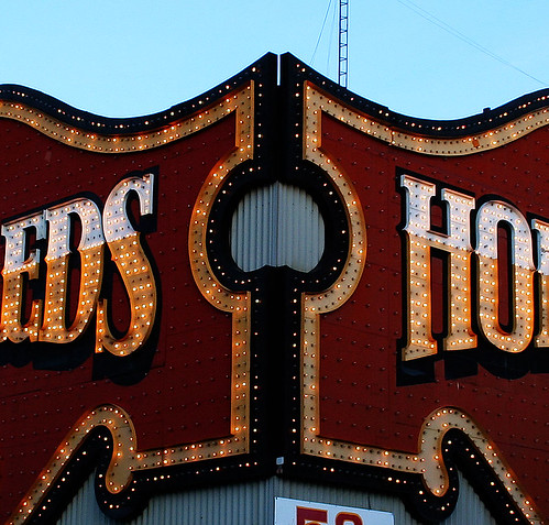
Okay, so there’s been immense coverage this past week about Ed Mirvish and his varied impacts on our city. But what are his impacts in the public space realm, good or bad? I know it can go both ways here; some people love that crazy sign, others hate it. I know it’s certainly a useful marker for people newly arrived to the city–though, of course, once you’re inside it’s hard to know where the heck you are. Then there’s the whole Mirvish village thing… it’s a pretty nice block but feels a bit strange that it exists just because the Mirvishes happen to own all the buildings there.
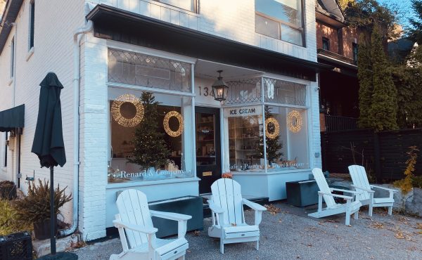
One thing that has provoked a mixed reaction of both horror and enjoyment in me are the low-rent Ed’s window displays. Seriously absurdist; if they were in a gallery context–which is a very different context, granted–all I can say is that they would be seriously like Arte Povera for the 21st century. The good ones at least. They also represent, likely in an unintentionally public way, a very different class demographic than the window displays further east on Bloor.
I had an opportunity in the Sunday Star to talk a little bit about way the Honest Ed’s window displays add a certain kitschy je ne sais quoi to the corner of Bathurst and Bloor, but I’m interested if there’s any other way that people think about the impact of Mirvish’s store and life on the city, good and bad.
photo by Little Dragon


4 comments
Overall I think the Honest Ed store is a pluss for the neighbourhood for two main reasons. One is that the signs, though gaudy, are composed of dozens (hundreds?) or witty little puns and jokes that are in that way quite interactive. It’s something that few other stores have, especially in Toronto, and is a signifier of place. There is no other Honest Eds. Other important thing is that it keeps that neighbourhood “grounded”. Bathurst and Bloor is no longer a cheap area but Honest Eds, with all its working class chutzpah, ensure the area still has somewhere students and new immigrants can but Tupperware in massive amounts without going to Wal-Mart. Oh and those Elvis heads.
Why does it have to be a class thing? The signs and the window displays at Honest Ed’s give you an accurate sense of what you’ll find inside. If you’re on a tight budget, you know this store won’t be a waste of your time. Or, if you’re on your way to Pottery Barn, the exterior tells you this is where you go for the things where you don’t want to spend the big bucks. “Rich people” can be bargain shoppers too.
As for getting lost inside, most stores want that to happen. This store is just more honest about it.
Honest Eds will be redeveloped no doubt. If you have visited the store recently there are few customers and it seems you have gone back in time. Like Knob Hill Farms it must be hard for Ed’s to compete with the stores, box and otherwise, that have copied the formula and can compete thanks to China.Retail has changed and Ed’s, as odd and quirky as it is, is part of the past, sadly like Sams.
I picked up 1970s-era postcards (was it here that I learned about it) from Ed’s a few weeks ago – I loved the images of the CNE before it was destroyed with the removal of the Shell Tower, the gondola, the Flyer and the addition of the trade centre and the soccer stadium.
It’s a great store to get lost in – so many little surprises, but not much I’d buy there, unfortunately. I’d almost be in favour of a bargain-basement retailer with buying power (even, shudder, Giant Tiger, but it’s at least Canadian), taking it over as long as the exterior signage remains, even incorporated into a chain with a different identity, like World’s Biggest Bookstore.
Giant Tiger is as gaudy as Ed’s but in a different way.